Do you think newsletters are outdated? In fact, with a newsletter design, you can engage and covert your target audience. Businesses use newsletters to send subscribers updated information about their business, products, or services. It allows them to tap into their customer base while fostering relationships.
In this blog, we will share essential newsletter design tips, examples, and trends to help you out.
What is an email newsletter design?
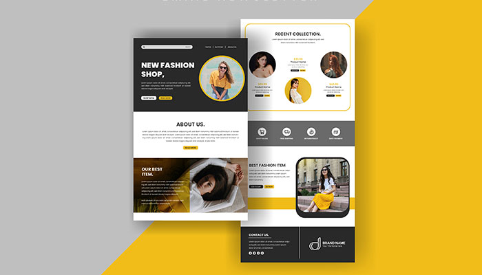
You must be thinking about what is an email newsletter all about. Well, it contains updated information about a brand’s products, services, events, or special offers. A newsletter consists of textual and visual information. It visualizes a text, image content, and message. While a newsletter design features a subject line at the top along with the brand logo, the mid-section includes the body text and relevant information for the customers.
Tips for designing a newsletter
As stated earlier, if you get the newsletter design right, it’s easy to engage and convert the target audience. The newsletter starts working as an effective marketing tool. If you don’t know how to make newsletters, here are some tips to consider.
01. Get inspiration from reliable sources
Before working on designing your newsletter, drive inspiration from reliable sources. Go through various types of newsletter design ideas from your competitors or other companies. Then, find out what elements make those newsletters stand out. There might be some newsletters that are performing well. Such newsletters are inspirational designs, and you would like to design something like that for your brand.
Explore online sites having newsletter examples for better ideas. Even some platforms provide free newsletter formats with examples that you can customize with your brand elements.
02. Ensure the design reflects your theme
A newsletter is about promoting a product, service, or social cause. That is why its design must also be based on the main theme. If yours is a marketing newsletter, design it specially to promote your brand.
Therefore, your newsletter design should align with the objective. Its colors, fonts, tone, voice, and other design elements should be the same as those used in social media, emails, websites, and other channels.
Consider your brand style so your target customers and readers can identify it as your email newsletter. Moreover, when customers can instantly relate your newsletter design with your other visuals, they find it familiar. That helps in building readers’ loyalty.
03. Ensure the layout is simple and clean
The layout of the newsletter matters the most. Since it features all the info, its layout should be such that readers can find it easy to navigate. A clean, simple layout will help them quickly locate the updates along with other info.
Your email newsletter design and the type of content that has to be used will be a deciding factor for the layout. A single-column layout is the right option if your newsletter is dedicated to a particular message. But if your newsletter has a variety of content, prefer a multi-column design.
Whichever layout you prefer should be mobile-friendly. All the main design elements must be visible cleanly on a tiny mobile screen. This is because most people today use mobile devices to access information, including newsletters. Typically, a three-column newsletter layout looks good on mobile phone screens.
Use proper section lines and spacing to separate one section from the other for clear visibility. Also, keep the text short to accommodate mobile screens perfectly or it will take a long and tiring scrolling.
04. Make your newsletter visually appealing
A visually appealing newsletter design drives attention instantly at a glance. It encourages custom loyalty. Decide on a newsletter layout that looks impressive and professional. The arrangement of images and text should be such that it breaks the monotony of reading a long block of content.
Ensure that a ‘hero’ image carries your key message of the issue discussed in the newsletter. This should be the most attractive image and be placed above the fold.
Think of placing your high-quality product photos to get more views. But ensure that you pair down the color to match the nearby design. That is the way to catch viewers’ attention toward the images.
Clever use of typography also makes newsletters visually appealing. The ‘hero’ part of the newsletter design will look even more impressive and professional with the strategic use of fonts. 3D typography is trending these days, and you can experiment with it at the top of your newsletter.
05. Visualize your CTA button
A Call to Action button is amongst the most essential elements of the newsletter design. This is because a newsletter owner would like to increase its subscribers. Therefore, make your newsletter CTA visualized at the right spot.
Place the CTA so that the readers see it right away and are drawn to it. The CTA should be either an image or a button that is easy to notice. Avoid a text-based CTA with a link only. The readers may not notice it.
Ensure that your newsletter CTA is concise in two words only. Some compelling examples of the CTAs include – ‘Subscribe,’ ‘Submit,’ ‘Get Updates,’ ‘Sing Up,’ etc.
Place the CTA button above the newsletter fold, which the readers see first after opening the email. Then, repeat the CTA at the end of the newsletter.
To visualize the CTA, leave sufficient space around it. That is how to distinguish it from the rest of the content blocks.
06. Make it navigational
A newsletter has a lot of text and image-based content. Due to a block of content, the reader can get lost easily if not directed efficiently. Moreover, the readers only go through some email newsletters from top to bottom. They generally start from the top left corner, then subject lines and images. Then, they focus on bold text before reading the rest of the content. A newsletter design idea should include all the navigational elements to guide them through the content.
Some studies have shown that readers first pay attention to the images and words on the left side and then read small-letter content. This is also known as an F-shaped pattern of reading. So, place the most essential images with text on the top left side of your newsletter.
07. Place your brand logo at the top
A logo is an identity of the brand it represents. Put your company logo at the top of your email newsletter so the reader can instantly verify that it is genuine content.
Some brands use a menu bar at the top, and you can place the logo around it. The header may also feature small dotted lines and information about free return and shipping. Put the logo around this information.
The header can also include social media icons. Try to include all the major social media icons or a few per the space available at the top or bottom.
08. Create an effective email footer
A footer placed at the bottom is another significant element of newsletter design. The footer contains legal details, terms and conditions, privacy policy, FAQs, unsubscribe button, etc.
When putting all such information at the bottom of the newsletter, ensure it is neatly placed with sufficient space between the buttons. Go through some footer trends before finalizing the footer space design.
09. Choose fonts strategically
Typography is another crucial element that reflects the personality of a design. A newsletter design depends heavily on the font choice to make the newsletter visually appealing. The font choice for headlines and other content will matter the most.
Usually, the email body has text in font size 14-16 px. While 14px text is ideal for larger paragraphs, 16px is good for short paragraphs of few sentences. The font size for headings is generally within 22-42 px.
Arial, Georgia, Verdana, Helvetica, Tahoma, Lucida, and Trebuchet are among the popular fonts used in newsletter design.
10. Include background images
With background images, a newsletter appears professional and appealing. Though it is not an essential design element to include, it still gives the newsletter a special look. It also helps stand out from others. The right background image stirs up one’s interest and encourages them to navigate further.
However, use background images carefully to support the content. Make sure that you use a solid background color so that the design does not look awkward.
11. A/B Test your newsletter design
Once you have finalized your newsletter design, test it to find out if there is room for improvement. Send your test email newsletter design to your inbox. Then, open the mail on both desktop and mobile phones.
That will show you how the design responds to both screens. Since most customers open emails on mobile phones, the newsletter design must accommodate the screen and should appear readable. Ensure that the design looks impressive on both screens.
Top newsletter design trends
Now that you know how to design your newsletter, find out what design trends are currently make a wave around. A newsletter design that aligns with contemporary design is easily relatable for the readers. So, keep the design trends in mind.
Here are some key newsletter design trends to follow:
Use of interactive elements
Most newsletter designs today include multiple interactive elements to engage readers and target customers with the content. These interactive elements include videos and moving images. Other components include AMP dynamic content and APNG images. In fact, 93% of marketers admit that that interactive content is effective for educating potential buyers.
Clean, minimalist design
Minimalism is one trend that most designers follow to create a simple, clean, but unique newsletter design. Avoid including elements for their sake. Instead, use only those elements that are essential to the design and discard the rest.
Still, bright colors, contrasting colors, and dark backgrounds are making a comeback. So, do not hesitate to use such elements.
Personalizing newsletters
Personalizing a newsletter design is also a trend that is emerging fast these days. The designer includes elements that interest the readers and customers. That ensures higher open chances and engagement for the newsletter. They can also explore dynamic content and segmentation to personalize newsletters.
Legible and accessible
You should also consider accessibility and legibility when designing newsletters. They will, for instance, keep in mind people who read newsletter content in dark and light modes. Many newsletters ensure easier accessibility by using alt text for images. The use of color contrast also relieves eyes while reading the content.
Visual storytelling
The emphasis in designing newsletters today is on visual storytelling. More is needed to post great, helpful content. It should also come along with visually appealing elements. You can use animated visuals and mixed media collages to create a visual impact. That also will improve your readers’ engagement.
So, these are the top newsletter design tips that will help create an impressive and unique newsletter to promote your products or services. Pay attention to each point and implement it in detail using a newsletter maker tool.
You can also rely on Designhill, a leading creative marketplace. You can access a unique newsletter design template here or launch your design contest to get dozens of unique ideas to choose from.
Wrapping Up
Newsletters are excellent tools to market and promote products or services. However, your newsletter design must engage readers and target audiences by placing images and text in strategically aligned sections. The use of colors, typography, and other elements also matters. Follow above mentioned contemporary design trends to make your newsletter relatable for today’s audience.

