Today’s one of those days where I can’t stop doomscrolling, or whatever the term is for compulsive longform doom reading. Luckily, it’s also book cover day here at PRINT—each of the jackets below provided a delightful drop of dopamine back into my depleted brain. It’s strategic escapism, sure. But isn’t that what the best books offer at their core, anyway?
Anyway! March brought copious cover design riches, starting with freelance designer Kishan Rajani’s take on Helen Oyeyemi’s A New New Me, a conceptual problem he solved with a giant physical button—and below, he details just that. The rest of our favorite cover finds unveiled or published this month follow!
Publisher’s description:
Kinga is a woman who is just trying to make it through the week. There’s a Kinga for every day: On Mondays, you can catch Kinga A deleting food delivery apps. By Friday, Kinga E is happy to spend the days soaking, wine-drunk, in the bath. Kingas A-G, perhaps unsurprisingly, live a varied life—between them is a professional matchmaker, a scent-crazed perfumer and a window cleaner, all with varying degrees of apathy, anger, introversion and bossiness. At least three of them are Team Toxic. It’s an arrangement that’s not without its fair share of admin, grudges and half-truths. But when Kinga A discovers a man tied up in their apartment, the Kingas have to reckon with the possibility that one of them might be planning to destroy them all.
What was the cover brief for this book?
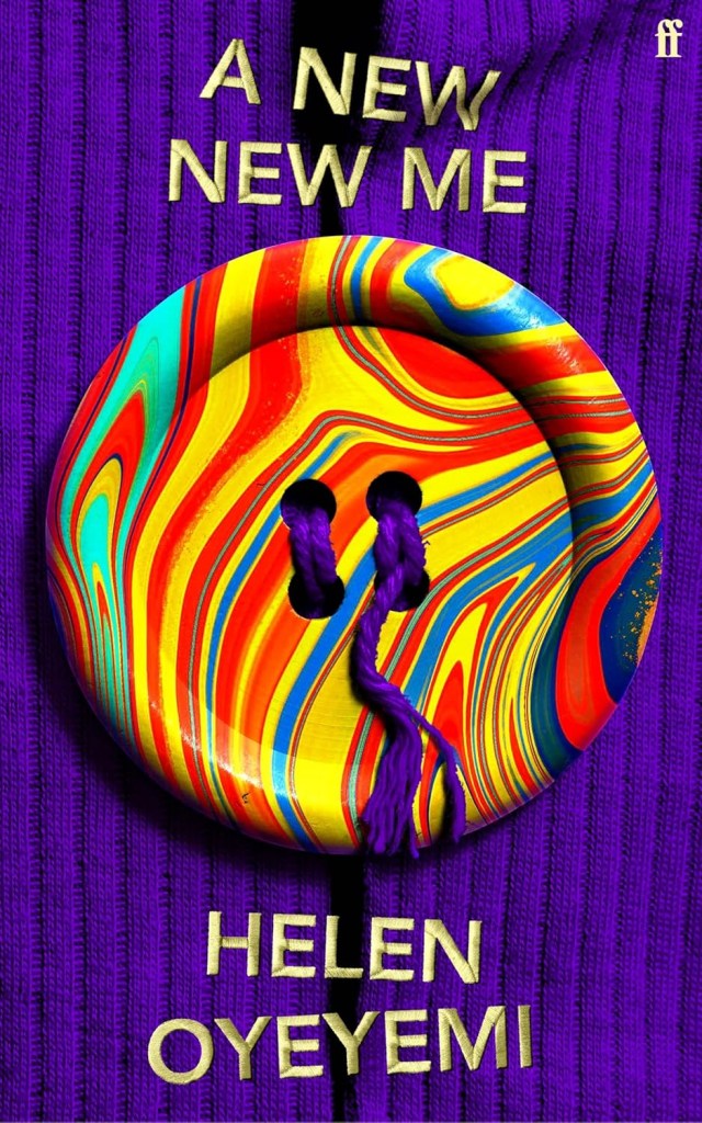
I appreciated the generosity of this project’s brief, as it encouraged me to lean into everything I naturally enjoy exploring, creating a cover that is bold, colorful and playful. However, the heart of this project lies in the book’s protagonist, Kinga, who embodies seven distinct personas—one for each day of the week. The challenge, then, was to represent these identities in a way that feels bold and striking while maintaining a visually simple cover.
I love that the button is physical. How big is it, and where did you source it?
Thanks! When I was at Faber, my art director really encouraged designers to create physical elements for cover designs when applicable. It often helps sell the concept more effectively when an object feels grounded in reality, and this button is very much real—albeit with some Photoshop enhancements. I sourced it from an Etsy seller who specializes in comically large buttons. The one I purchased is about 10 cm in diameter. Who is wearing a button that big?!
What does it represent in the context of the book?
After exploring various ways to represent seven distinct personas, I found that my designs often felt too busy, and I wasn’t happy with them. I realized that rather than illustrating each individual persona, it was more effective to convey the promise of them—something that suggests multiplicity, while remaining tied to a single individual. The technicolor button felt like a nice expression of that idea, and when placed on a cardigan, it inherently connects back to a person, Kinga.
What were you going for with the color palette?
I had many conversations with the book’s editors, and one thing that kept coming up was the scent of lavender. One of the Kingas is a perfumer who works with lavender, so I chose a rich purple for the cardigan as a nod to her. Beyond representing the many Kingas the readers will come to know, the technicolor button also reflects the fun and brilliance of the reading experience.
Tell us where you sourced that background.
The texture for that cardigan is actually from my dad’s old jumper. I had asked a couple of people for jumpers, including the designer who sat next to me at Faber; bit of a weird request on my end, but if I was going to photograph the button, my thoughts were that I might as well photograph everything else! My dad’s cardigan ended up being the right knit size relative to how big I wanted to feature the button, as well as creating a backdrop that would allow my type to read out well. A real goldilocks kind of situation!
I should really return my dad’s cardigan back to him, but being a great cover design prop, it’s pretty comfy!
Tell us about your approach to the type. Is it digital or physical?
The type, going against everything I just said about making things physically, was actually from an embroidered alphabet I sourced from an image library. I had toyed with the idea of having the typography embroidered, but I just ran out of time. I hope I’ve still sold the concept of this idea, even though I now feel like a cheat.
What was going on within the other comps you explored?
Some of my early explorations included a collaged cover featuring images of lavender, textile patterns and snakes, all coming together to form a T-shirt. Another concept depicted a hanger with glimpses of seven different garments hanging from it. These were all really fun to explore, but none captured the essence of the book as cleanly and iconically as the final cover we landed on.
The post 20 of the Best Book Covers for March 2025 appeared first on PRINT Magazine.