This summer, Rolling Stone rolled out a comprehensive redesign. Managed by an in-house team led by Creative Director Joe Hutchinson and CEO Gus Wenner, and working with external studios Food (Richard Turley) and c-ll-ct-v-ly (Mark Leeds), the team looked at everything: the overall design, the pacing, the trim size, even the paper (choosing a grittier stock, because, well, the metaphor lands). Invariably, type came into the conversation. The team tapped Commercial Type; Partner and Co-Founder Christian Schwartz Schwartz has been a longtime type collaborator since the late 90s.
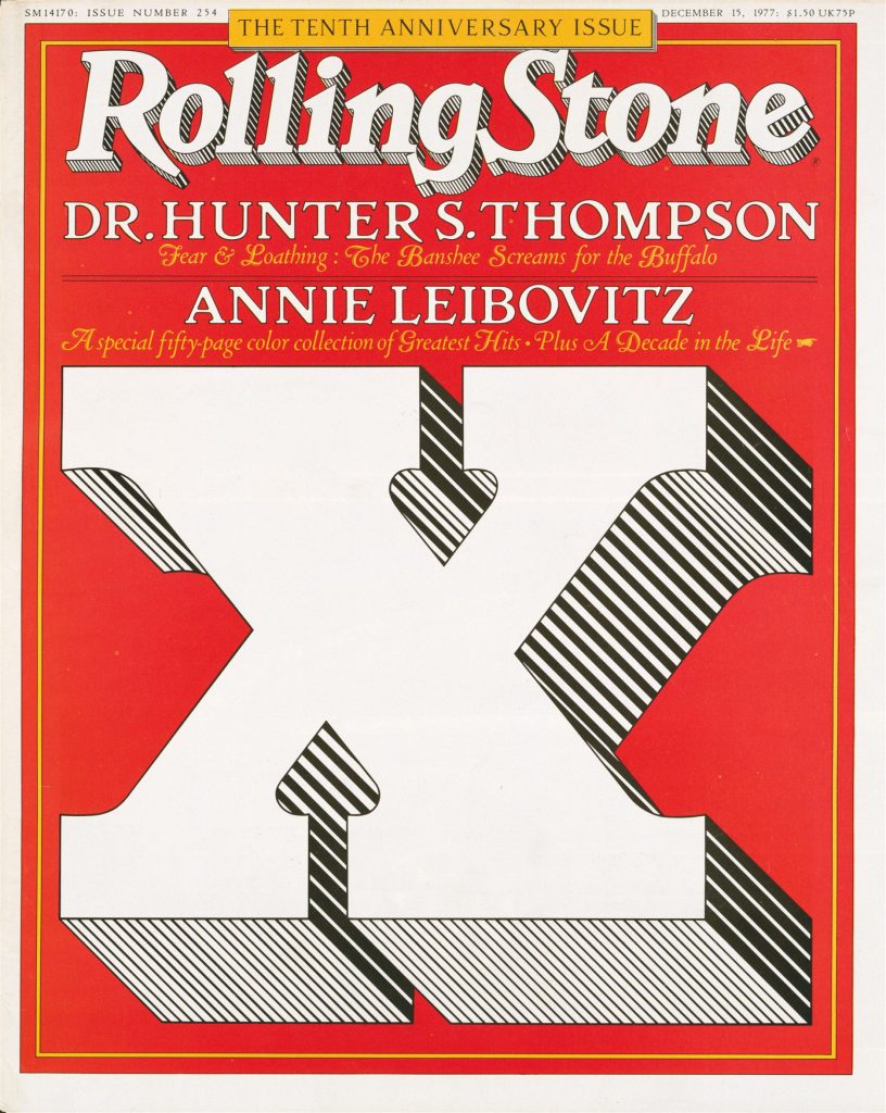
The new type palette pays respects to its successors (Dennis Ortiz-Lopez’s condensed slab serifs with high contrast display of the 90s, and Jim Parkinson’s enduring and curvaceous 1981-2018 wordmark) but takes the overall aesthetic in a new direction. The team’s ethos for the redesign: “Make it look like Rolling Stone, without directly sampling bygone issues,” said Schwartz.
It would have been easy to slip into nostalgia for this project, but we didn’t want to go that route. Nostalgia engages only superficially with history, trafficking in tropes of an idealized past.
Christian Schwartz, Commercial Type partner and co-founder
For headlines, Tim Ripper designed Rolling Stone Slab, softening the potential for solid walls of screaming text with subtly rounded serifs. This is an evolution of his work on the condensed weights of Commercial Type’s Successor typeface, a reinterpretation of the 19th-century English slab serif (aka Egyptian or Antique). The italic version gets its personality from curvy tails and cursive-like detailing, harkening back a century or so.
French calligrapher Julien Prez, a relatively new addition to the Commercial Type team, designed the body text and subheadlines, riffing off the team’s Feature Flat and Deck typefaces. Prez added swashes to both the italic and Roman versions; the result lends a whimsical note to artist names, in particular.
I have redesigned Rolling Stone at least four times now and this is my absolute favorite.
Joe Hutchison, Rolling Stone creative director
For more, read Commercial Type’s case study.
Images courtesy of Commercial Type.
The post Commercial Type Samples Custom and Off-the-Shelf for the Best “Rolling Stone” Redesign Yet appeared first on PRINT Magazine.

