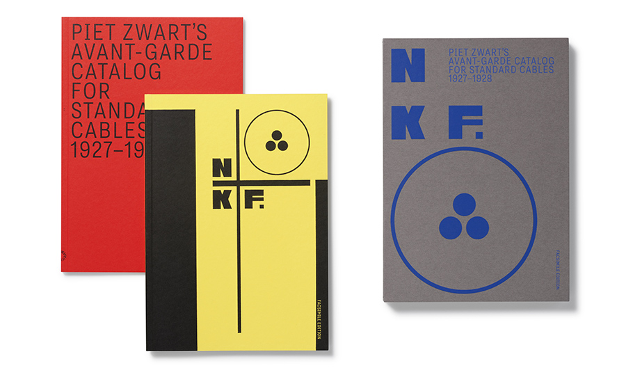
Piet Zwart (1885–1977) was wired long before the term referred to the digital world or a day at Starbucks. One of the most progressive graphic designers of the 1920s and ’30s, he was among the pioneers of the New Typography, the international movement of advertising and editorial designers and typographers who challenged traditional conventions. He is known for many iconic period works that continue to influence designers today, mainly because they appear so contemporary—in fact, knowingly or not, many follow Zwart’s principles published in his era-defining essay “from old to new typography”:
“The new typography is fundamental. It rejects a predetermined formal structure, but builds up forms according to the function; it constructs a page with white and black in a way that expresses tensions in the text: explicit or plastic form. In advertising, with its intrusive active text, it employs all form-values that embody the compressive and tensile stresses of communication. Not only with black and white, but also with color … the new typography incorporates active red as a functional element: as a signal, an eye-catcher.”
Among his many memorable artifacts—including “The Book of PTT” for Dutch postal, telegraph and telephone service, and cover designs for the series Monografieën over filmkunst—were catalogs for Nederlandse Kabelfabriek Delft (NKF), which turned conventionally formatted graphic design for industry on its ear. Inspired by Constructivism and De Stijl, and using stark product photography, photomontage, skewed typography, geometrical shape and repeated word patterns integrated into layers of overlapping primary colors, Zwart produced designs that underscored the argument that the new typography was not some faddish, impractical avant garde experiment but a disciplined, functional document that was accessible for technical (otherwise bland) business requirements.
Zwart’s continued work from the 1920s and early ’30s for NKF doubtless influenced the similarly innovative catalog designs that Ladislav Sutnar produced for Sweets Catalog Service in the 1950s, and Paul Rand‘s 1942 Autocar Corporation “Mechanized Mules of Victory.”
As part of its robust publishing program, Letterform Archive has rereleased Zwart’s classic—and rare among antiquarians—1927–1928 NFK catalog (Piet Zwart’s Avant-Garde Catalog For Standard Cables). Faithfully printed, it appears as though designed today, yet retains the original luster of those early years of The New Typography. The two-volume boxed set includes the facsimile edition and a supplement featuring three historic and historical essays by the late Philip B. Meggs, Paul Stinton, and Zwart’s own “From Old to New Typography,” as well as translations from the Dutch catalog texts.
This edition and guide is essential to studying the continuum of Euro-modern typography. But as important is that rather than mere reproduction, the facsimile provides the user with a hands-on, tactile virtual original. For me, it has another benefit …
I once owned a tattered but nonetheless rare copy of the catalog. In moving from one place to another it somehow disappeared. Maybe it is hiding in a box somewhere in storage. I could not afford the high prices of what was offered on the antiquarian book marketplace, but for now and forever, this new facsimile edition is as close to the old as possible … and I don’t have to worry about its whereabouts.
The post The Daily Heller: Piet Zwart’s Best Client appeared first on PRINT Magazine.

