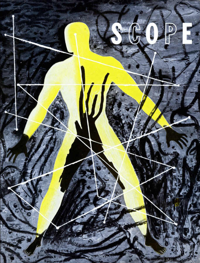
There is a debate among some scholars and connoisseurs of graphic design history regarding who was the first American modern designer. Should it even make a difference? Perhaps not, though it is fascinating to track Modernism’s journey through Germany, England, France, Russia, Holland, Switzerland, and Italy, as well as Spain and Eastern Europe, to the United States via trade and commercial art magazines, design exhibitions and books, and ultimately emigre artist/designers. America was the destination for various progressive, radical, and fashionable, theories and ideas, schools and movements — and also the vortex where, given the USA’s commercial and industrial global centrality, new theories and concepts of advertising, promotion, and graphic design were adopted, adapted and transformed to serve business systems and institutions, prior to and following the Great Depression.
I’ve spent a few years examining how the slippery idea of “modernism” was Americanized and soon, thanks to the work of design historian Prof. Christopher Long, whose book on Lucian Bernhard was a boon to our knowledge of early modern practice, there will be more ingredients for the origin-story-stew. Long’s forthcoming book Modern Americanness: New Graphic Design in the United States 1890-1940 (which will be assessed in depth in a future DH column) questions the mythology and truth of modernism as a tool kit of tropes versus what Paul Rand said was modernism’s fluidity and adaptability. In his view, there was a modern spirit rather than modern commandments. Nonetheless, certain principles fortified and underscored that spirit.
So, back to the debate: Who did what and when is a rabbit hole that I’ll avoid for now. In The Moderns: Midcentury American Graphic Design by me and Greg D’Onofrio, we wrote:
Throughout the mid-thirties and forties, Lester Beall was one of the two most influential American graphic designers—the other was Paul Rand—for having introduced European avant-garde concepts of visual expression into an otherwise decorous American graphic design scene. Beall was fluent at translating into American the Constructivist style of the twenties and early thirties, which was characterized by an asymmetrical layering of words and images, dynamic use of flat color and block type, experimental photography, and iconic/ironic photomontage to achieve both an identifiable style and clarity of message. He developed a personal style, exemplified by the three series of Rural Electrification Administration posters he created for the U.S. government between 1937 and 1941, that was exceptionally and emblematically his own.
In a November talk at Poster House New York focusing on Lester Beall’s iconic Rural Electrification Administration posters, Mark Resnick, a leading Beall collector, asserted that Beall was the outlier of modernism in the USA. Rand said that modernism was not composed of one, but many attributes, notably the rejection of conventions, sentimentality, and cliche; it was an approach that embraced the best of the new and re-imagined old methods. This is best illustrated through these covers of Scope magazine, published by Upjohn Pharmaceuticals, designed by Lester Beall between 1944-1948, employing a range of distinctive styles under a wide modern umbrella that rejects dogma, sentimentality, and cliche in favor of new and old imagining. Scope was a hot house for Beall; its editor, Dr. A. Garrard Macleod, gave him freedom to experiment with photography, montage,, illustration and bespoke typography. In the spirit of “modernism” Beall said he goal as a designer was to “pave the way for a new visual approach” that advocated the Bauhaus and The New Typography in America.
The post The Daily Heller: The Scope of Lester Beall’s Art and Design appeared first on PRINT Magazine.

