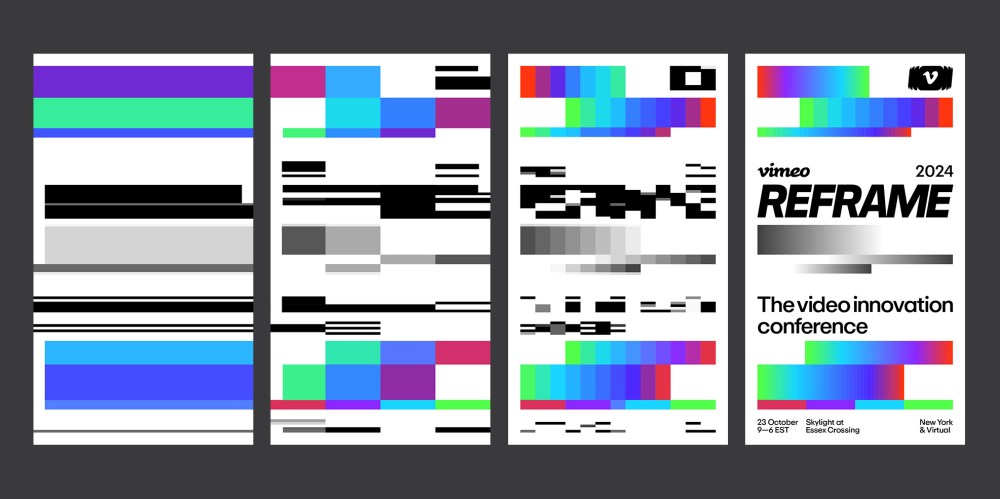
As a designer, it’s always exciting to see a brand identity push boundaries, and the work Uncommon Creative Studio recently did for Vimeo does just that. The new design system reimagines a core aspect of video — resolution — not just as a technical feature but as a bold design choice.
Vimeo, the pioneer of high-definition video sharing, sought a brand identity as innovative as its platform. The result is a dynamic design system where resolution isn’t merely a visual detail but a central, functional element.
Uncommon’s approach involved creating traditional brand components — logo, color palette, and typography — but with a twist: they employed generative tools to modulate the resolution of these elements. This concept was vividly brought to life during REFRAME, Vimeo’s inaugural video innovation conference.
In the lead-up to the event, outdoor media installations showcased posters with resolutions that varied based on their proximity to the venue. Distant locations featured low-resolution images, which progressively sharpened to ultra-high-definition as one approached the event site. This clever use of resolution not only mirrored the evolution of video technology but also engaged audiences in a playful, interactive narrative. Fascinated by this activation, I reached out to Nils Leonard, Uncommon Creative Studio’s co-founder. Our conversation is as follows (lightly edited for length and clarity).
How does incorporating ‘resolution’ as a core element of the design system challenge traditional branding conventions?
Without knowing it, we all often work within confines we don’t question. There are the common and accepted tenets of design systems: logo, typography, colour, layout, etc., but when we approached this project with true innovation in mind, we really asked ourselves how we might challenge the very nature of a design system rather than begin a process inside of it. We landed on a very simple insight, which is that if Vimeo were the original video innovator then surely our design had to represent that in an innovative way. Rather than try to create something within the existing framework of a design system, we sought to redefine the system itself. The task then became working out how the system might be able to play with resolution in an additive and remarkable way and how it might feature in the storytelling for the event and the brand itself.
We loved the idea that media could work like vision, or like resolution itself – that the closer you got to the venue, the sharper and more hi res the executions would get.
The proximity-based resolution concept for outdoor media is unconventional. What inspired your approach, and how did you ensure it would resonate with audiences attending REFRAME?
We loved the idea that media could work like vision, or like resolution itself – that the closer you got to the venue, the sharper and more hi res the executions would get. It was the perfect canvas for the resolution part of the identity to play in and was a game we felt the Reframe audience would enjoy as they made their way to the event. Once we had created the various executions using the generative web-based tool we developed, the task was then to plot the media along the routes to the venue we knew the audience would take. Some careful planning and media scouting took place, then we ensured each execution occurred in the right place for the overall effect to be felt. We weren’t worried about the lower resolution executions making little sense to people as we knew the repetition of the media and the buzz around the event would land the idea through the media mix and the noise around the idea. It was fun, though, seeing completely indecipherable posters around town. They were strangely beautiful and simple in comparison to overloaded and messaging-saturated posters. A little like Vimeo, nothing tried too hard: the overall experience was premium, simple, remarkable.
How did the partnership between Vimeo’s in-house design team and Uncommon Creative Studio influence the project’s outcome?
Dan and the excellent team at Vimeo really understood and shared the vision of the idea from the first moment. Of course, the identity had to work hard inside the venue and across all of the event’s touchpoints (including beautiful merchandise, publishing, and the myriad screens and media present). But we all recognised the power of the idea behind the branding to further reinforce Vimeo’s credentials as the original video innovator to everyone that came across the identity and the event. The project was a balance of pragmatism and trust as we went about the task. The design practice within Uncommon always strives for the work to have a deeper story, a more famous narrative, and something that could become a reference point – the team at Vimeo had desired an idea like this from the start and the partnership flourished in this shared ambition.
How do you anticipate the resolution-based design system will impact audience perception and engagement during the REFRAME festival? How does this approach align with Vimeo’s broader goals? And how did you approach crafting a visual narrative that embodies the evolution of video in the 21st century?
Whether new or old, branding always has conventional tasks to fulfill. The approach here was to satisfy those needs, but go further finding a narrative in how we branded the event to create deeper conversations around Vimeo and its place in the world. This role is usually reserved for internal comms or marketing tasks, but we saw the opportunity for the body language of the brand to say something that most marketing couldn’t: If the simple design of our event is this innovative, the brand must live and breathe this commitment to the future of video in every aspect. More than answering a brief, this work asks a question, where else could video go? What else could it do? What else could be a screen? Magic in design can exist in more than a clever logo or the beauty of a typeface. What you make can be magical, but so can how you make [it].
What is the potential for applying the resolution-centric design concept beyond REFRAME? How might this approach influence future branding strategies for Vimeo or other platforms in the digital space?
Vimeo is a true innovator, whether through our partnership or in countless other ways, they will never stop showcasing the power of video to challenge, change, and improve our work and lives. We look forward to asking the questions inside this work of other media, environments, and opportunities as the studio moves forward.
Dan Brooks, Vimeo’s VP of creative & brand, remarked, “For REFRAME, our first video innovation conference, it was great to partner with Uncommon, a studio who embodies inventive thinking and design. It was a great collaboration between Vimeo’s in-house design and production team, a bold, flexible design system with a core idea around ‘resolution’ at the center.”
This approach not only reinforces Vimeo’s identity as a leader in video innovation but also exemplifies how design can transcend aesthetics to become an experiential journey.
The post Uncommon’s REFRAME Identity for Vimeo Challenges Design Norms Through Resolution appeared first on PRINT Magazine.

