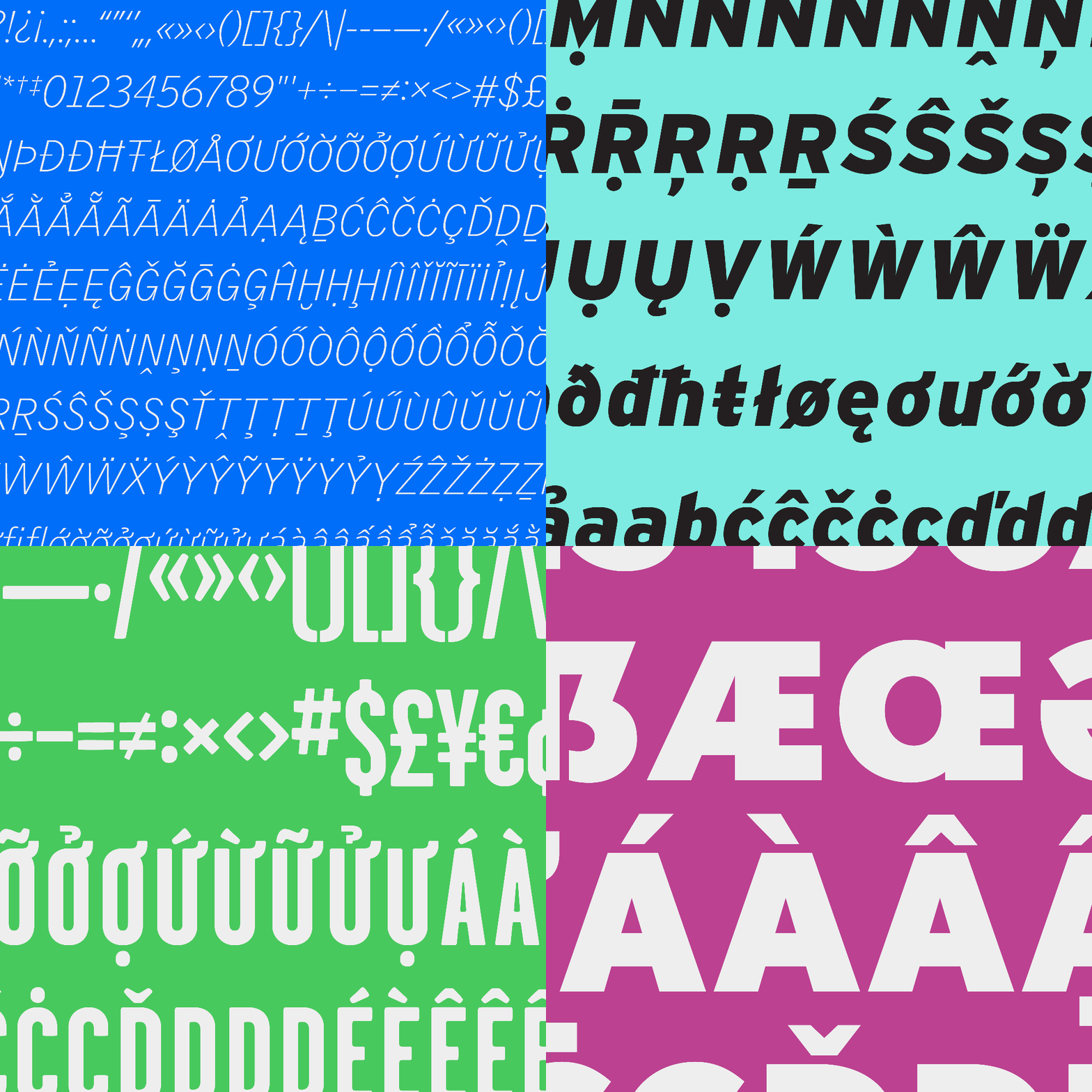
Tobias Frere-Jones is more than a familiar name in the world of type design. The award-winning typographer is behind some of the most enduring typefaces of the last two and a half decades, with work in the permanent collections of MoMA and London’s Victoria and Albert Museum. As Frere-Jones Type celebrates its tenth anniversary this year, 13 typefaces from Frere-Jones’ earlier career are formally joining the foundry. The classics will live alongside Community Gothic, Mallory, and Supermassive. Frere-Jones calls it a “homecoming.”
The team added many new characters to match FJ’s current standard of 200+ languages using the Latin Alphabet.
Frere-Jones and the foundry team never shy away from what has come before, reviving historical contexts and finding new ways to iterate on beloved typefaces. So, the integration gave them a perfect opportunity to review and update each of the 13 classic typefaces, starting with the most popular families: Interstate, Nobel, Garage Gothic, and Griffith Gothic. Each font family includes an expanded glyph set and retooling for all standard web formats. We’ve included a taste of some of the updates below, but you can learn much more about the ongoing work and type inspiration in this blog by Frere-Jones.
It’s satisfying to see these families come home.
Tobias Frere-Jones
Interstate
Interstate, from the 90s, emerged as a reinterpretation of Highway Gothic, the official typeface for U.S. highway signage. Some of the recent updates include upper case punctuation, the addition of fractions, and refined placement of symbols such as parentheses and colons.
Nobel
The revival of Nobel was born “unofficially” out of Frere-Jones’ RISD degree project in the early nineties. He unearthed a type specimen of Sjoerd Hendrik de Roos’ 1929 typeface of the same name, which Frere-Jones joked was like, “Futura cooked in dirty pots and pans.” The family of eighteen styles has added features much like the updates for Interstate, with some additional exploration of spacing and the rendering of diacritics.
Griffith Gothic
Fred Shallcrass recently reviewed and updated the entire Griffith Gothic family (see the expansion below). The original was a revival of Bell Gothic (1937)—the thin lowercase joints sought to defend against ink spread on press—celebrated for its rhythm and movement.
Excerpt from revision proof of Griffith Gothic
Classic versions of the remaining nine families are also available at frerejones.com. Updated and expanded versions will go live in the coming months.
Read more about the individual updates to each family and a bit more of the backstory here.
Header image: Frere-Jones’ 21 font families. All imagery © Frere-Jones Type.
The post Frere-Jones Type Welcomes Home & Revives 13 Classics appeared first on PRINT Magazine.

