The Brooklyn-based creative agency Saint-Urbain has announced the launch of a comprehensive rebrand for Tezza, the innovative photo and video editing app preferred by content creators, photo enthusiasts, and celebrities alike. The rebrand aims to position Tezza as more than just a tool; it’s an essential artists-first mecca that empowers users to elevate their visual content.
Since its launch in 2018, Tezza has proved a massive hit with creators worldwide, inspiring users to reach new heights with their artistic potential. With over 2.5 million active monthly users and over 25 million downloads, Tezza has always championed the creative influencer with an eye for aesthetics and curated high-end looks that add a heightened sense of art direction to users’ images and videos.
However, the brand wanted to position itself for the future as it sought to branch out into new worlds and categories as it grew its business. That meant Tezza needed branding and a visual identity system that would lend itself to future growth and help separate itself from competitors. What’s more, the brand’s visual identity was lacking consistency, so they needed a ground-up strategic process to create firm brand guidelines.
Tezza is about making every moment beautiful, and to build their revamped POV, we needed to ensure that the brand felt more aspirational but with mass appeal.
Alex Ostroff, founder of Saint-Urbain
“Tezza is about making every moment beautiful, and to build their revamped POV, we needed to ensure that the brand felt more aspirational but with mass appeal,” says Alex Ostroff, founder of Saint-Urbain. “Essentially, it needed to be as beautiful as the work their community produces on a daily basis.”
The agency started with the central premise that Tezza empowers and ignites the artist within all of us, honing in on the idea that this is a destination for lifestyle-minded creators and influencers. Tezza originated with an “artists first” mentality, as Tezza Barton and Cole Herrmann built the kind of app they would want to use as they are also photographers and content creators. The new identity reflects the brand’s commitment to fostering creativity and providing a platform for users to express themselves without limits.
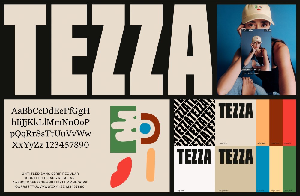
The world of fashion magazines and their impeccable editorial layouts inspired much of the brand refresh. The revamped custom wordmark has a chic, contemporary edge and confident personality that feels both elevated and robust. Additionally, the logo reinforces and emphasizes the humanistic nature of the app. The sharp, square angles echo the app’s square photo format. That produces a sense of cohesion, but it contrasts with the photos, which are often more dreamy and organic by nature.
Similarly, the brand system also has a stylish and elegant feel. Cream and tan colors evoke the aura of a fashion-forward magazine and the tactile touch of paper, giving the brand a lived-in quality that’s accessible. Added pops of bold colors also bring confidence and a touch of playfulness to the brand’s personality, as do the agency’s human illustrations that can be found throughout the branding system. That same magazine quality is on display throughout the brand’s newly redesigned website and motion graphics from Saint-Urbain as well.
In fashion magazines, typography is crucial in creating a timeless editorial feel. Saint-Urbain chose Untitled Serif because it has a heritage quality that’s uniquely suited to print. They contrasted this with Untitled Sans to give it a more modern look and add much-needed balance while complementing the text layout.
Saint-Urbain embraced the idea of bringing the face [icon] to life and incorporating playful elements, as it helped to maintain the artist’s hand in the graphics, which helps Tezza from feeling too “tech.”
Because the Tezza team is also close to their community, they retained the original Tezza face icon designed by Zhenya Rynzhuk. With the brand evolution, human contact—and knowing that there’s a human at the other end of the app—was critical for Tezza and its users. The agency embraced the idea of bringing the face to life and incorporating playful elements, as it helped to maintain the artist’s hand in the graphics, which helps Tezza from feeling too “tech” as most photo and video editing apps have a cold, clinical feel. Moreover, the branding appears in many of Tezza’s pop-up activations, reinforcing the notion that the work was designed to live in the real world.
Saint-Urbain also helped design merch based on the new design, with new phone cases, candles, and collage kits dropping soon. The team wanted to expand the Tezza universe with the intention that the brand could become something ownable or wearable and greatly influence and nurture the relationship between product and community. The brand’s tonality and highly collaborative positioning are reflected in the merch, as the founders also used some of their new assets to create fun products for their community.
“Tezza has always been so much more than just another app; it’s an experience and a place for anyone to find the artist within. The business has been moving so quickly for the past six years that we felt we needed to take a step back and create a cohesive visual representation of the world we’ve been building,” says Tezza Barton, Co-Founder of Tezza. “We think our new brand identity captures the magic of Tezza. We’re artistic but not gated, confident but not pretentious, a place where anyone can explore their creativity and be inspired.”
Photos by @lian.benoit
Face icon: @synchronized.studio
The post Saint-Urbain’s Brand Refresh for Photo App Tezza Encourages Expression Without Limits appeared first on PRINT Magazine.