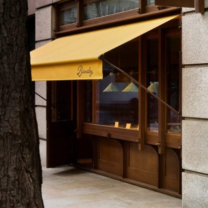
Wood panelling and glossy floor tiles bring a nostalgic feel to this chocolate shop in London’s Covent Garden, which design practice Morrisstudio and architecture firm Built Works have designed to invoke a golden age of confectionery.
Barnaby produces gourmet chocolate bars inspired by childhood favourites and the shop on St Martins Lane aims to reflect the sophistication and timeless appeal of the products.
Morrisstudio and Built Works have completed a chocolate shop in Covent Garden
Founder Barney Goff approached Tom Morris‘s studio to work on the interiors and creative direction for the new brand, with Built Works providing architectural services and Irving & Co working on the brand identity.
“We tried to create something relatively serious but high on charm,” said Morris, who set up his studio after working as design editor at Monocle magazine and branding agency Winkcreative.
The interior design draws inspiration from Arts and Crafts architecture
“A lot of current confectionery brands are aimed at Gen Z – big on colour, bling, shiny things,” he added. “We wanted to appeal to a slightly older crowd – someone for whom the nostalgia of a typical chocolate bar would resonate – to create a longer lasting consumer base.”
The interior design references Arts and Crafts buildings and the Edwardian model village of Bournville, which was built around the turn of the 20th century to house workers at the Cadbury chocolate factory.
The pendant lights reference a copper-verdigris clock tower
“Bournville is an incredible relic of practical, clever Arts and Crafts architecture,” Morris explained.
“While we never wanted to pastiche it or create anything that felt too themed, it was a great research tool to help steer our design and give us a few design codes to work with.”
The colour palette of the tiles used on the shop’s floor was informed by vintage 1930s posters promoting Bournville as a place to live, while the pendant lights above the counter reference a copper-verdigris clock tower in the middle of the town.
The colours of the floor tiles are drawn from vintage posters
Morris told Dezeen that the Bournville references contribute to an overall scheme rooted in British tradition in order to differentiate Barnaby from other brands on the market.
“Although it’s become a bit of a dirty word now, we wanted it to feel peculiarly ‘British’,” he suggested.
“The chocolate industry is quite binary – either in a colourful, playful kitsch American way or in a more sober, luxe Swiss way,” he suggested. “Taking the British route felt a bit more natural.”
The shop features stained oak cladding and tiled flooring
The shop features joinery and a remodelled facade developed by London studio Built Works, which involved removing the existing shop front and rebuilding it entirely in solid wood.
The revamped facade features tusk and tenon joints that enhance the traditional feel as well as an oriel window housing a display counter that evokes the look of a classic sweet shop.
Morris brought Built Works into the project after seeing a woodland sauna the firm completed in East Sussex using similar construction methods.
The stained oak cladding used for the shop’s interior was informed by Japanese joinery as well as Edwardian panelling. The material choice aims to bring a sense of warmth and historical detail to the space.
The flooring also evokes the chocolate-making process, with tiles hand-made by ceramics studio Common Objects to evoke the image of Barnaby bars lined up to be glazed.
The machinery for enrobing the chocolate bars is visible to customers
The compact 33-square-metre shop features plenty of storage alongside the machinery for enrobing the chocolate bars, which is visible to the customer and brings a performative element to the space.
The interior forms part of a project that includes the brand strategy, naming and concept design. Morrisstudio oversaw every aspect and commissioned a team of specialists to develop the different elements.
The identity was led by food and beverage branding experts Irving & Co, who drew inspiration from Victorian confectionery brands and traditional signage as well as post-war Americana typography.
Timba Smits designed the crocodile that acts as Barnaby’s mascot
The logotype was created by calligrapher Peter Horridge and Melbourne-based illustrator Timba Smits provided Barnaby with its crocodile brand mascot, influenced by familiar characters such as Frosted Flakes’s Tony the Tiger and Japanese yurichara mascots.
The Covent Garden shop is Barnaby’s first retail space, with further sites in London and Paris currently in development. According to Morris, these outlets will feature signature details such as the wood panelling, tiled floors and a cohesive colour palette.
Other confectionery shops that have been featured on Dezeen include a cafe and sweet shop in Funamachi that is “an extension of the park” and a sweet shop with a courtyard in Maebashi.
The photography is by Ollie Tomlinson.
The post Barnaby opens London chocolate shop with “peculiarly British” interior appeared first on Dezeen.

