Trucking is a profitable business. However, you need to check several truck logo designs to decide the face of your brand. While a unique trucking logo drives customer attention, a common or general logo fails to grab their attention.
Almost every business needs a logo as it plays a crucial role in brand marketing and promotions. In this blog, we will discuss various truck company logos for ideas and inspiration. So keep scrolling.
Logos of leading trucking businesses for inspiration:
Below are some of the famous trucking company logos. You can drive attention from them by studying their colors, fonts, and other elements, conveying their brand messages.
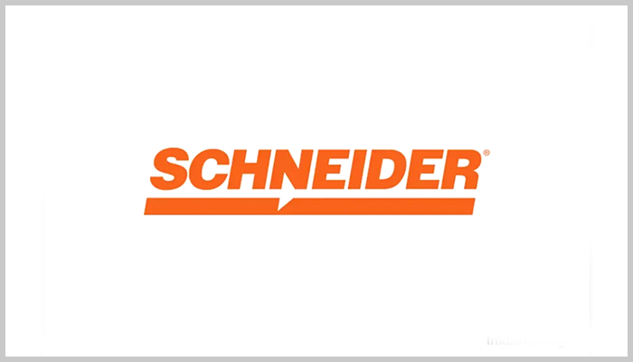
01. Schneider National: Color as visual identity
The Schneider logo stands out for its unique use of a bright orange color, which is the color of the company Schneider National trucks. The wordmark also has a thick, distinct line underneath with a sharp cut in the middle.
A vibrant orange and white color scheme gives the logo its identity and makes it easily recognizable. It is an ideal example of how a logo can stand out based on its distinctive use of color. Slightly italicized custom font conveys motion and helps the design stand out from the crowd of other truck logos.
02. DHL: The Red and Yellow logo
DHL’s logo design comprises some parallel lines that stand for fast and secure delivery of products through its trucks. It is a simple logo with the brand name and the lines underneath.
The vibrant yellow and red colors drive attention quickly. Both colors represent the optimism and energy a trucking company wants to convey to its consumers.
Look closely, and you’ll find a line crossing the brand name, and three other lines underneath are for the motion and precision of the trucking industry.
03. UPS: A consistent design
UPS logo is amongst the popular vehicle logo designs. It is a shield-shaped design that makes it easily recognizable and popular. The logo has been unchanged for decades. The shield shape of the logo reflects a message of security and protection to the consumers.
The dark brown color is popular with the trucking industry, helping the brand become instantly recognizable. It surely is a clean and simple vehicle logo design, speaking volumes about the company’s fleets and services.
04. FedEx: Clever use of white space
FedEx’s logo is among the most popular logos, and it is known for using white space to convey the hidden brand message. A hidden arrow exists between the letters ‘E’ and ‘x’. The arrow signifies the speed and represents the company’s fast courier services. This clever design has made the logo and the company popular amongst its target customers.
Other characteristics of the FedEx creative trucking logo design are its colors and typography. The purple and orange combination of colors gives the brand a unique identity and makes the logo bold and memorable.
05. Scania: Using mythology
The Scania logo represents the Swedish truck manufacturer Scania Company. A key feature and attraction of the logo is its use of mythology, which is rare in the trucking industry.
The logo depicts a mythological creature with the head of an eagle and the body of a lion. The beast symbolizes the vigilance and strength the trucking company wants to project itself to its target audience. It conveys reliability and power simultaneously.
The bold red color of the creature evokes the passion and energy of the trucking business.
06. Volvo Trucks: Clean and timeless logo
Volvo is a Scandinavian trucking company. Its logo is a clean and classic ‘Iron Mark’ twisted in a circular shape. On the top right, an arrow represents the chemical symbol of iron from ancient times. Thus, the arrow and the logo symbolize the trucking company’s durability and strength.
The color used in the logo design is deep blue to convey reliability and trust. It is a simple logo design and works well at any scale. This creative trucking logo design has been unchanged since 1927.
07. DAF: A classic and modern logo
DAF Trucks hails from the Netherlands. Its logo is a simple design with the company name in deep blue and a thick red underline. The logo represents the company’s progressive thinking in the trucking industry.
DAF logo appears simple and classic due to its uncluttered design. Bold letters indicate the company’s authority in its sector and business. Red and deep blue color palette builds the company’s identity and establishes it as a credible business.
08. MAN: Artistic lion logo
MAN Truck & Bus travels from the savannah of Africa to European regions. This black and white logo is a versatile and classic design. Its key feature is a lion figure, which stands firmly in a roaring pose and symbolizes the trucking company’s leadership and strength.
While the lion gives the logo a classic look, the design’s overall appearance is modern. The lion motif’s artistic representation helps the company stand out.
09. Iveco: A simple logo
Iveco is an Italian commercial vehicle manufacturer. Its logo is a simple and refreshing wordmark in a blue color scheme. The logo depends on the creative use of typography to convey the company’s personality and underlying message.
The strategic use of sans-serif font makes it impactful with a clean look. The color scheme evokes customers’ trust in the trucking services of the company.
10. Renault Trucks: The Diamond logo
The Renault trucks’ logo is amongst the modern trucking logos that exemplify how a mix of classic and modern design makes it an outstanding symbol. The logo is both robust and elegant in its design.
The diamond shape of the logo makes it unique, signifying quality and precision. The element of 3D logo design makes the brandmark appear modern and resonate with today’s audiences.
The robust and metallic feel of the logo conveys the company’s toughness in the trucking business.
Emerging trends in trucking logos
Trucking may be a conventional business, but its logos are modern. Modern trucking logos are ever-evolving designs that convey the brand message with changing times. Here are some emerging logo design trends for the trucking industry.
Simple logos
The trend is gaining momentum toward designing simple trucking logos that clearly depict the underlying brand message. The designers are inclined to use minimum elements such as the company name, limited color palette, and a single symbol to depict the business visually. The use of minimalism helps catch the attention of those who see the logo on a moving truck.
Telling a story
Another emerging trend in designing trucking logos is storytelling. The designers now use logos as a visual way to tell the brand story. It is sometimes through a cleverly hidden element, such as an arrow in the FedEx logo. Other times, it may be through symbolic imagery, such as a mythological graphic in the Scania logo.
Scalable designs
Trucking logos appear on various vehicles, which speed away and leave a few moments to catch viewers’ eye. So, when printed on the side of trucks and other vehicles, the logos should look large.
However, the logos appear smaller on smartphones and other promotional items. That means the logo design should be scalable without losing its visual charm.
Ready To Make Your Logo?
Significance of trucking logos
Trucking logos may appear in many shapes, sizes, and colors, but their sole purpose is to grow the trucking business. Here’s how a vehicle logo design is important for trucking brands.
Builds brand identity
The sole purpose of a trucking logo is to build brand identity. The logo serves as the identification visual that the target audience use to recognize the trucking business. With regular exposure, it starts resonating with the audience and compelling them to explore more about the brand. Upon witnessing the logo at any marketing material, people start recalling the brand.
Evokes trust
A thoughtfully designed trucking logo builds and evokes trust in the company’s services. When people and target clients see a trucking business logo, they find the design aesthetically pleasing. That, in turn, translates into building confidence in the company’s services. That is why professionally created logos matter a lot to businesses.
Gives employee pride
Employees feel proud of working with a trucking company with a recognizable logo. They consider themselves employees whom others envy for working with a famous company. Since the logo is the company’s identity, employees are proud to wear it onto their shirts or uniforms.
Quick tips for designing your trucking logo
Here are some time-tested tips to design your trucking logo all by yourself using your design skills or design software:
Keep the logo design simple
Simplicity is a key to making your trucking logo visible and likable. Avoid stuffing the limited logo space with too many colors, fonts, and images. Instead, use just your brand name with one color, font, and element. That is usually enough to create an effective logo.
Create with a purpose
Avoid designing a logo randomly. While you can experiment with different logo ideas, ensure they have a purpose. Ensure your trucking logo has a personality and conveys your specific brand message.
Ensure scalability
Your logo will appear on different big and small online and offline platforms. So, ensure the logo looks impressive when scaled up or down or printed on other products.
Design it for the long term
Redesigning a logo more often is not suitable for a trucking brand. People want to build loyalty toward the brand through its logo. So, instead of designing a trendy logo, opt for a standard one that can last for many decades.
Be unique
Make sure that your vehicle logo design stands out in the industry. That means the logo should not resemble any of your competitors’ brandmarks. So, first, study dozens of logos from the trucking businesses and then create a unique custom logo for your brand. Choose colors that evoke emotions like most Fortune 500 companies choose the color blue. So be unique in your color selection, too.
The color psychology in trucking logos
Colors are crucial elements for any design, including logos. When designing your trucking logo, pick colors to evoke the intended emotions from the consumers.
Each color stands out for its specific set of emotions. The designer can pick the right colors to express a particular feeling. Here is a list of colors and the emotions they evoke.
Red: Energy, passion, urgency
Blue: Trust, reliability, professionalism
Green: Growth, environmental consciousness
Yellow: Optimism, clarity, warmth
Black: Power, sophistication, authority
Orange: Friendliness, confidence, affordability
Future of trucking logos
Trucking logos have already gone through a lot of design changes. In the coming years, these logos will come in different shapes due to evolving technology and changing consumer perceptions. Here is how the logos will appear in the future:
Logos for digital platforms
Trucking logos will be designed more for digital interfaces as the world switches to online services in the coming years.
Animated Logos
As animation is increasingly used for brand promotions, more and more truck logos will likely get transformed into animations in the coming times. Animated logos will also be common due to digital displays of products and services.
Environmental concerns
With the trucking industry and other sectors moving toward sustainable practices, truck logos will be designed accordingly in the future. Future logos will have more nature-inspired elements than ever before.
So, consider the various aspects of truck logos before creating one for your business. But ensure that the logo is unique and stands out in your industry. It must be capable of building your brand identity from scratch.
Designhill, the leading creative marketplace, can help you own an outstanding truck logo for your new business. You can work with a talented designer at this platform or launch a trucking logo design contest to have several logo ideas.
Wrapping Up
For a successful trucking business, you need more than the fleets and vehicles. You need a well-designed trucking logo that reveals who you are in just a single glance. Take ideas from other trucking logo designs to get yourself a brandmark that’s unique and memorable.