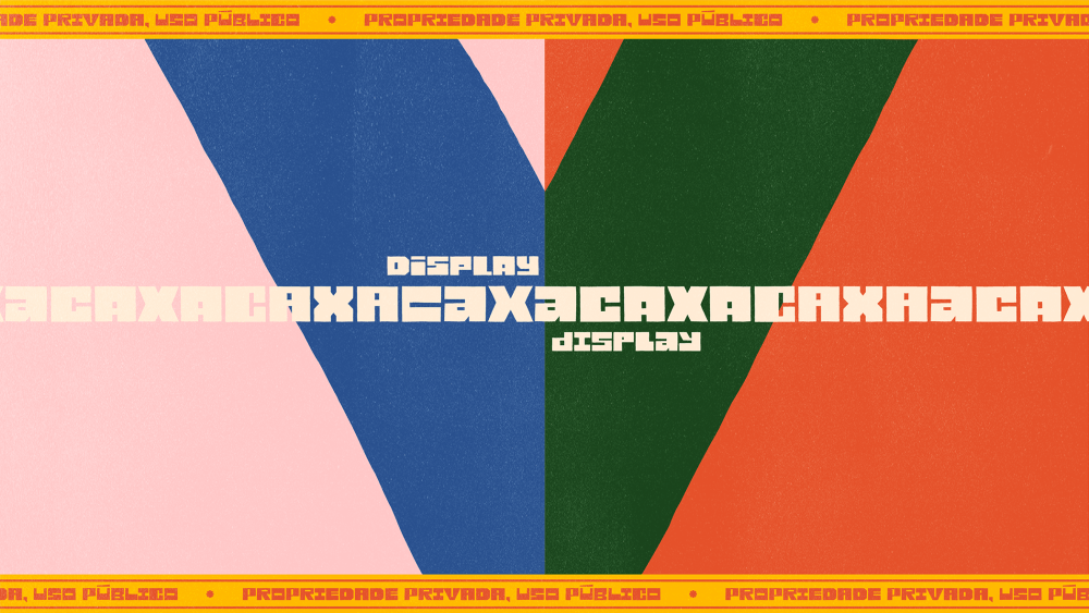
The challenge with doing a once-weekly column on typography is that you can’t possibly cover it all. So, you miss things. Like Caxa Display, a new-ish typeface (October) out of Brazil’s Estudio Caxa.
Caxa Display eventually crossed my feed, and I’m so glad it did. This vivacious typeface has texture and personality to spare. Caxa’s extroversion makes for bold titles and headlines, functioning as letterforms-as-art-objects rather than any old font.
The typeface’s shapes and texture remind me of the embroidered, geometric patterns one might see in South and Central American textiles. But I was curious to learn more. Estudio Caxa’s partners, Vitor Brito Pereira and Renato Brito Mamede, were kind enough to answer a few questions. Our conversation follows.
How did the concept for Caxa Display come about?
We started designing this typeface many years ago, from some ideas and sketches we created for a special beer made for the studio, back in 2016. During those experiments, we developed what is now the studio’s logo. At the beginning of 2023, we felt the urge to try something different. The studio had already done all kinds of work—packaging, key visuals, visual identities, animation—basically everything related to graphic design. But we had never designed a typeface.
During our brainstorming sessions, the idea emerged to create a typeface with the characteristic of stretching to fit layouts more effectively. We realized that the structure of our logo was perfect for this and that it would also establish a conceptual connection with the studio. This reflects our approach of always maintaining the flexibility to adapt to different illustration styles, project types, and clients.
What was your aesthetic inspiration for Caxa Display?
We are Brazilians with strong influences from the northeastern part of the country, where there is a rich tradition of artists working with woodcuts. Additionally, we always strive to incorporate influences from various things we encounter into our projects, and Latin American culture has always been a significant part of our lives and daily consumption.
For years, the studio was physically located in São Paulo, the largest city in South America—a city that is a true melting pot, absorbing a bit of everything happening in Brazil and across Latin America. Our experiences and travels throughout Brazil and neighboring countries have also greatly influenced our graphic style.
We are Brazilians with strong influences from the northeastern part of the country, where there is a rich tradition of artists working with woodcuts.
Sometimes technical limitations help define the brief and bring new solutions to ideas.
How do you think the process of developing a typeface as a team of not-exactly-type designers differs from a foundry’s process? What was the Caxa team’s relationship with type prior to this?
We’ve always drawn letters, whether for logos or to add text to layouts. But we were limited to that. We had even designed complete alphabets before, but never with usability in mind—never thinking about programming or carefully addressing spacing and kerning as you would with a typeface. That made this a very different step for us.
Unlike a type foundry, since we focus heavily on illustration projects, we only cared about the letterforms’ design and how they could look interesting when used at large sizes, almost as a complement to an illustration. Text legibility was never our priority. Caxa Display is more like an editable graphic element. I believe foundries are much more focused on legibility and technical details.
That’s also why we didn’t create a modular typeface. The fact that the stretched letters are simply vowel ligatures reflects a technical limitation. And sometimes, technical limitations help define the brief and bring new solutions to ideas.
The partners were enthusiastic when asked if there is more type design on the horizon for the Caxa team. “Absolutely,” they said. “It was a highly motivating experience, and it’s been amazing to receive layouts from people using Caxa Display in so many different ways.”
The team plans to start a new type project next year, saying, “We’re hoping to dive deeper into technical aspects, but we’re also aiming for something even more exotic and challenging to use practically. If people want to read information clearly, there are already thousands of excellent fonts out there. Our goal is to push the boundaries, becoming ever more experimental and distinctive – this is the fun part of personal projects.”
If you’re late for one thing, you will likely be right on time for another. Last week, Caxa Display won a Bronze Medal at the 14th Edition of the Brazilian Design Awards in the Craft for Design category.
Learn more about Estudio Caxa and Caxa Display.
The post Caxa Display’s Graphic Impact Needs No Translation appeared first on PRINT Magazine.

