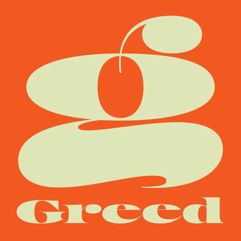
Greed, the typeface, is good.
Greed is pompous, ostentatious, and rude—a critical expression of our basest societal instincts. It is a bold, big-shouldered, unapologetic, and maximalist typeface, perfectly positioned for 2025, the year of more is more. Gordon Gekko would be proud.
Greed’s designer, Positype’s Neil Summerour, began his research twelve years ago after a friend and fellow designer suggested that he create a series based on the seven deadly sins. Wood type influences anchored some of the series, but for Greed, he turned to the intricate lettering of US currency. (The deadly sins series never took shape as prompted, but the prompt more than served its purpose for the eventual development and release of Greed.)
Honestly, I feel that so much of politics and society today is driven by Greed. Call it what it is.
Neil Summerour
Summerour’s process is research-heavy, absorbing all he can about his chosen influences, including, he admits, “too much time studying US currency under a loupe.” He wanted to create a lowercase version (is it surprising that US currency communicates in ALL CAPS?) and find his point of view within the many inconsistencies he found in US currency lettering, so his research went into a drawer, and he started sketching.
In typical Summerour fashion, there are a lot of quirky extras, glyphs, and features. Greed encompasses a complete Latin set, including Vietnamese. There is a full set of numerals (because, money!). Designers can play with stylistic alternatives, small numerals, super- and subscripts, Open-type-enabled fractions, cap height numerals, and a large selection of global currency symbols. Adding to Greed’s flexibility, Summerour took care to finesse the gaps inherent in wide, large serif typefaces. If your Open Type Standard Ligatures feature is on, you’ll find a set of alternate lowercase letter sets, such as ‘n-n,’ to help you adjust your designs quickly and efficiently.
Greed was released on inauguration day, which Summerour admits was intentional political sarcasm. There’s no better symbol of greed than the gilded buffoon currently occupying the White House. And while we dread what tragic and terrifying form the human impulse will take in the years to come, we’re looking forward to seeing the evolution of the typeface. Summerour says it was a challenge to take on, and he is devising ways to push Greed even further.
Learn more about Greed and Positype.
The post Greed is a Maximalist Typeface Inspired by US Currency appeared first on PRINT Magazine.