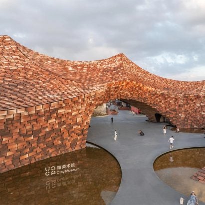
In this week’s comments update, readers are discussing a museum in China with a peaked form clad in handmade ceramic tiles by Kengo Kuma and Associates.
The roof of UCCA Clay Museum is defined by a series of peaks, cloaked with 3,600 handmade ceramic tiles in various shades of brown, intended to celebrate the “warmth of craftsmanship” and the history of pottery production in the area.
Kengo Kuma and Associates cloaks Chinese clay museum in handmade tiles
“Why do the tiles need to hang from the surface edges like wobbly teeth?”
Commenters were unsure of the project – “museum or Insta/selfies backdrop?” asked RK.
“Kuma = cladding mania,” determined Anindya Basu, before asking “why do the tiles need to hang from the surface edges like wobbly teeth?”
Cyrus also concluded that “Kuma is obsessed with cladding, no matter if it’s a good choice of not”. They added “the building’s oversized tiles give off a low-fi vibe”.
But Henry wasn’t standing for it – “the tiles are too big? Ha, seriously?” they disputed, exclaiming “this is a masterpiece!”
Commenter Duckusucker saw both sides of the coin, acknowledging “yes, it’s innovative, original and distinct” before adding “it’s also an eyesore”.
However, commenter Insensitivity was fully in favour of the project, questioning “what kind of soulless people are finding ‘reasons’ to dislike this – this is beyond beautiful”.
Have commenters been too quick to criticise UCCA Clay Museum? Join the discussion ›
David Thulstrup converts 19th-century Copenhagen warehouse into apartments
“Beautiful and hopeful seeing conversion rather than demolition”
Readers were also left undecided about a 218-year-old canal-side warehouse in Copenhagen renovated by David Thulstrup to create four apartments defined by ‘quiet luxury’.
I M Slei raised their concerns about the price of the apartments, writing “I dread to think what these would cost to rent/buy – a leather-clad lift!! And essentially, for studio apartments! Welp”.
“But that brick floor on the ground floor – totally gorgeous,” they acknowledged.
Grant Macdonald found the design “very dull and bland – I imagine after the first hour enjoying the nothingness, an urge to escape will come over the owners”. Although they did suggest “possibly good for those amongst us who need to meditate or suffer from sensory overload”.
Other commenters were less cynical about the project, with Souji writing “beautiful and hopeful seeing conversion rather than demolition”, while Richard Porteous simply called it “very lovely”.
The Truth thought “the general colour scheme and texture make for very warm and inviting interiors”.
Are you a fan? Join the discussion ›
Louis Vuitton flagship store disguised as stack of luggage trunks
“Make it permanent!”
Also stoking plenty of debate in the comments section this week was the news that Louis Vuitton has covered its NYC flagship store in a facade that resembles luggage, as part of a multi-year renovation project.
Some commenters were in favour of the design, with Richard Waples branding it as “classy!” In the same boat, Henry called to “make it permanent” and Baid Isle also thought it “would be nice to keep this forever”.
Marcus Springer also argued that it “looks a lot better than the scaffolding that would otherwise be there”.
However, not everyone was quite so smitten. “It’s disturbing that this thing looks right at home,” warned Jb.
For Diana Gardiner it was “excess and makes me think of the end of Rome – it’s a celebration of having too much money, and so of inequality”.
Whateverandeveramen also cautioned that “the problem with ‘temporary’ stuff like this is that it has a tendency to stick around longer than intended”.
Are you in favour of Louis Vuitton’s NYC facade? Join the discussion ›
Comments Update
Dezeen is the world’s most commented architecture and design magazine, receiving thousands of comments each month from readers. Keep up to date on the latest discussions on our comments page and subscribe to our weekly Debate newsletter, where we feature the best reader comments from stories in the last seven days.
The post “Innovative, original and very distinct – it’s also an eyesore” says commenter appeared first on Dezeen.

