When a movie poster really hits, it can become a timeless icon of the film that is immediately recognized for the rest of time. Whether hastily taped up on a dorm room wall or lovingly hung in a family TV room, a great movie poster can be a piece of art in and of itself. No one better understands this than Kenny Gravillis, co-founder, CEO, and CCO of the LA-based design studio Gravillis Inc.
Gravillis cut his teeth designing album cover art for the likes of The Notorious B.I.G.—most notably for his Ready to Die album under the art direction of Cey Adams—and The Roots’ Things Fall Apart, among many others. He then pivoted to movie poster design in the early 2000s after launching Gravillis Inc. I was recently able to chat with Gravillis about his impressive career and creative journey, where he revealed some lessons he’s learned along the way. Our conversation is below, edited lightly for clarity and length.
What’s your graphic design and art background?
I was born and raised in London, and when I grew up there, for whatever reason, the job out of high school was bank teller. But I had a cousin who worked in magazine design, so one day I went to work with him. I was 14 years old, and it was just the coolest thing. This was pre-computers, so there were people working on drawing boards everywhere and joking around; it was just such a vibe. And I was like, This is so much cooler than a bank.
I ended up getting into art school, but I didn’t love it; I could have done four years, but I only did two. I wanted to get out and work. My dad lived in New York at the time, so I ended up going for the summer after I graduated college and started my design career. I got a job in New York at a packaging place and staying, and then I got “New Yorked.” In the next two years I got fired like four times. It was really nuts, it was just the worst!
What I loved more than anything was music and film, but the jobs I was getting fired from were packaging design, like Mott’s Apple Juice, panty shields—I just wasn’t connecting. I had so many CDs at the time, and I looked at one of Luther Vandross’s CDs called Give Me the Reason, and I turned it around, and it said Columbia Records and it had the address. I was like, I’m just going to call them.
So I called Columbia Records, and I don’t know if it was the accent or whatever, but I ended up getting an interview with the head over there. It was wild. I’m showing him my work, my Mott’s Apple Juice artwork, and he’s looking at my work, and he keeps flipping. Then he looks at me, and he says, “We design album covers here.” And I said, “Yeah, I know! That’s why I’m here!” And he’s like, “But there’s nothing in this portfolio that shows me that you want to design album covers.” Then, “I’ll tell you what: why don’t you go back, and over the next two weeks design some album covers. Choose some albums that you like, and come up with your versions, then come back.” And honestly, it was the best two weeks ever.
But could I get another meeting with this guy? It was a miracle that I got that first meeting. So I had these covers ready to go, and then I couldn’t get a meeting. I had this other album called Fear of the Black Planet by Public Enemy, and I turned it around and saw Def Jam Recordings on it, and “distributed by Columbia”— the same company I went to before. So I called Def Jam, and they were like, “Sure, come in.” So I went into Def Jam with my regular portfolio which had the Mott’s Apple Sauce in it, but I also brought my new one. I showed them the Mott’s Apple Sauce because that was the most professional thing I had. He was not impressed. So I said, “Hold on, I also have this!” and I showed him all of the covers I had designed for all of the people I grew up with like Fine Young Cannibals, Depeche Mode, and Elton John, and that’s what got me the job at Def Jam.
How and why did you make the pivot from graphic design for album covers to movie posters?
After Def Jam, I worked at MCA Records for like five years, so all together, I spent 10 years at record companies. Then my wife at the time and I started out company in 2000, and we started off just doing music. But then, in 2004, music started going downhill. Between iTunes and Napster, people just didn’t want to spend the money. So we had to pivot, and for me, movies were the only things that made sense. It felt like the right progression; it felt connected, but it’s a totally different industry. We thought just because we were doing all of this cool music stuff—we were doing stuff with The Roots, Mary J Blige, Mariah Care, Santana—we were just going to walk right into doing these films. But it’s a completely different marketing process, the types of people are completely different from music people, it was a whole different world.
The very first opportunity we got was a Jay Z documentary, which made sense, but we were really nervous about being pigeonholed. Obviously, we had done all of the hip hop stuff, and we’d go speak to studios and they’d say, “You guys are really urban, huh?” and we’d be like, “Well, yeah, that’s part of what we are, but we do other things too.”
Thankfully—I know it’s like saying “Voldemort” right now—the Weinstein Company were the first people who really gave us a shot. It was a dark comedy called Daltry Calhoun by Johnny Knoxville. We were dealing with the marketing people there (who were great), and from that we became their people. We kind of became the “indie kids,” which is much better than being the “urban kids” because it was less pigeonholy in a sense, and it was more creative as well; people were very open to us pushing our stuff. Our album stuff made more sense on the independent film level.
Is it common within the movie poster design industry to bid against other studios for projects?
Especially on really big films, there will be three to four different agencies. Just to give you an example, on Game of Thrones season two, there were like 11 agencies that worked on that. It’s super competitive. For independent films that don’t have that much money, they might only be able to hire one agency to work on it. But when you start getting into the Dunes of the world, then there are multiple agencies working on it. And they’re working on it until the end, by the way. You don’t even know if you’re gonna get the final post; it’s pretty wild.
What project have you gotten that was the most rewarding in that regard? That you wanted the most, and you beat out the most people for?
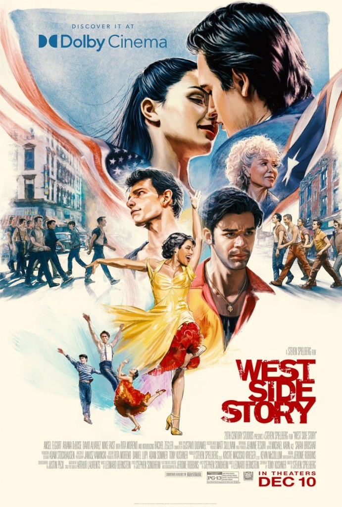
Recently, we worked on West Side Story, and I was just really happy with how many pieces we had on that and how, culturally, it felt like we really hit the mark. So that was something that we won and was pretty big.
We also came in on Captain America recently, and we ended up getting the final poster, but we only worked on it for two weeks. That means there were like three other companies on it for like six months, and then we came in for the last two weeks. So, sometimes that happens.
There’s something about getting that main poster in our industry; it’s called “the finish.” Personally, a lot of the time I think it’s hard for the finish to be really amazing because so many people are involved. You have a better chance of doing more interesting things on some of the other designs related to the movie that people aren’t paying as much attention to. But the main poster has a lot of cooks in the kitchen.
That makes total sense. The poster is quite literally the face of the film and really defines it. So what’s your team’s creative process like for coming up with the ideas for your movie poster designs?
At Gravillis, we have two design teams, and, depending on how big the project is, we’ll have both teams work on something or just one team. When it comes to TV and streaming, there are usually more strategic decks to follow in terms of the brief. But with film, it’s a little bit more old school: “Let’s have a conversation; let’s get on a Zoom, let’s have a chat.” There isn’t really a brief, per se. A lot of times, the first thing they do is they send us a screenplay; so all the designers that don’t like reading…bad news. I have three scripts to read right now. And a lot of times, if it’s an indie film, we’ll get a screener.
We try to ideate a lot before we execute. We want to go over the idea and really beat it up and see if it makes sense. It usually takes about two weeks to come up with a first presentation, and it’s only in the last few days that we execute. Most of the time, it’s just thinking about stuff. Spending more time thinking about it works better for us; it’s how we can get more interesting work.
We’re approaching things differently … there are a lot of other agencies on it, and we have an idea of what kind of work they’re doing. So we’re always trying to do work that feels a little subversive of that.
I would imagine that coming up with the concept itself is the hardest part. The idea is king!
We get chosen a lot for that, specifically. A lot of our stuff isn’t commercial. We’re approaching things differently, and we’ve managed to hold onto that. We know there are a lot of other agencies on it, and we have an idea of what kind of work they’re doing. So we’re always trying to do work that feels a little subversive of that. Even if it doesn’t get chosen as the final thing.
We’re a smaller company, there’s 30 of us. A lot of our competitors are 100-people deep. We can’t really compete when it comes to volume, so we have to compete in other ways, and usually that’s with our ideas.
In your expert opinion, what qualities make the most powerful or most successful movie poster designs?
“Intrigue” is the word I would use. Now, you can’t really count on a big star to sell a movie as much. There are some people that still can, but it’s rare. I think we’ve become more sophisticated in terms of how we look at imagery, so for me, the best posters are the ones that make you think and that don’t answer all of the questions.
The poster is an entryway. I don’t need to know the whole movie from this poster. You have the trailer for that. That’s where it can get tough. “We want to show this part of the film, and there’s that part of the film…” But it’s one image. How am I supposed to tell you all of these uniques? Decide on one thing, one unique idea that speaks to it.
The best posters are the ones that make you think, and that don’t answer all of the questions.
I also think successful movie posters can exist as standalone pieces in their own right, outside of their attachment to a movie. A graphic image or design that you might want on your wall or you find compelling simply because it looks good.
100%. The thing is, every filmmaker cares about their poster. There’s not one filmmaker that’s like, “Whatever…” Because it’s the face of the film. As great as trailers are, they’ll probably be forgotten. Nobody says, “I remember the trailer for Rosemary’s Baby or the trailer for Alien.” They’re like, “Oh, my God, the Alien poster!”
We live in a world right now where there’s so much out there that I think it can hurt us in terms of marketing. A lot of times, marketers want to be redundant in the message because they want people to know exactly what this is. And I think about how you can stand out in all of that. Usually, it’s doing something subversive, something that doesn’t feel like you know what it is, but a lot of times, that’s a hard sell.
What are some of the films you’ve designed posters for that you’re proudest of?
We do a lot of work with Spike Lee; we actually do all of his work, pretty much. We did a poster for his documentary, I’m Not Your Negro, and the independent film company Magnolia, who we had a really great relationship with, came to us and said, “Kenny, we’re going to be real with you, this title is uncomfortable, and we don’t know what to do with it and we just want your take on it.” And that was unheard of for me, especially as somebody of color. I was like, wow, that’s pretty awesome, that they were even willing to be vulnerable and say that.
A lot of studios would have immediately been afraid of that title and want to bury it, or put it in a way to make it “prestigious” — small and serif-y and pristine. But this was a James Baldwin documentary, and Baldwin was bold as all hell. So when we showed them the poster design, which was 90% the title with Baldwin’s eyes, basically, they were like, “This kind of makes us uncomfortable, but we also realize that’s okay.” It was a beautiful thing.
People have asked me, as a Black person, if I feel like I make any difference on the marketing for Black film work, and that was the one time where I feel like we actually did. It felt like we really made a difference on that particular one. We have a lobby at our offices with three posters, and two are what we’ve done right now, but I Am Not Your Negro just stays there.
What’s surprised you the most about your career thus far?
I didn’t know that I was going to move to America, but I always loved American television and pop culture. I hate to be so “land of opportunity,” but I do feel like America provided me a different opportunity than if I had stayed in England. Someone recently asked me if I thought I would still have this agency if I was in England, and I don’t think so. It’s more because of the marketplace. In America, that opportunity was way more attainable.
Sometimes, I’m surprised that I have an agency and that I’m working. That’s quite shocking! I don’t take that for granted. I have a lot of friends from school who ended up dropping out of design to do other things. But we’re about to celebrate our 25-year anniversary! That surprises me too, that we’ve managed to stay in it for as long as we have.
The other thing I’d like to say is that it never gets old. The other day, I went to see Captain America, and our poster was in the lobby. Seeing the stuff that I’ve worked on out in the world just never gets old. If it ever does, I think I’ll call it a day.
The post Movie Poster Designer Kenny Gravillis Aims to Leave You Asking Questions appeared first on PRINT Magazine.