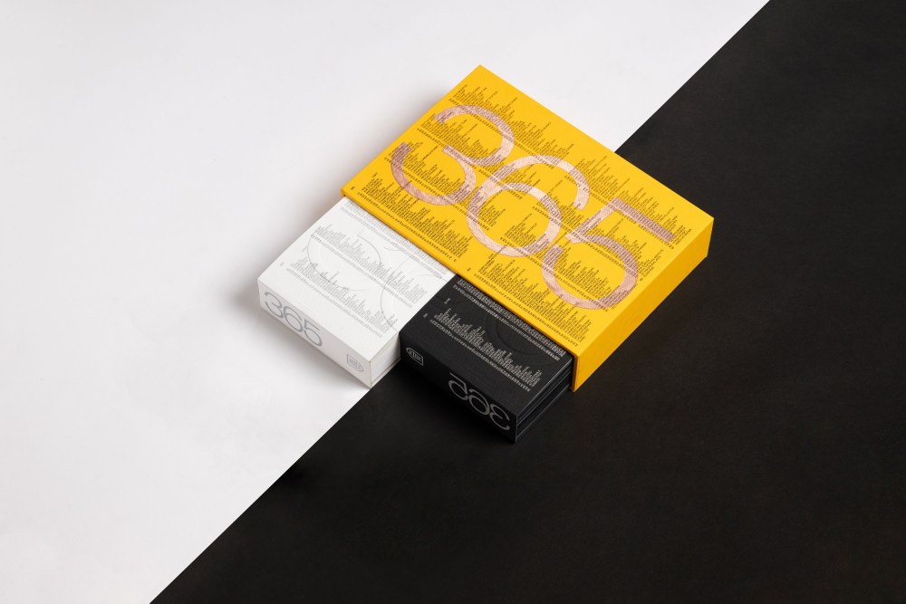
In a world increasingly divided, Fedrigoni 365 2025 offers a refreshing perspective. This year’s calendar, themed “Opposites,” invites us to celebrate diversity and embrace the beauty of contrast.
Over 700 creatives from around the globe contributed to this ambitious project. Each designer was paired with another, tasked with interpreting a specific date through opposing concepts. The result is a stunning visual exploration of duality, presented in two volumes: one dark, one light.
Designer collaborators include Katharina Saurer of Germany’s Heine Warnecke Design, Belgium-based book designer Tina de Souter, Mashael N. Alajmi of The Royal Institute of Traditional Arts (the first-ever Saudi participant), Margarida Rego from Lisbon’s Ilhas Studio, Q’s Magdalena Cardwell, and Aaron Levin out of Paris, as well as some of the below-quoted creatives.
The book is a work of art, printed lithographically in one special color (877 silver) to a variety of 28 different Fedrigoni papers. The tactile experience is as captivating as the visual, with each page inviting you to touch, feel, and appreciate the nuances of paper. The publication was printed and foiled by UK-printer Pressision with binding by Diamond Print Finishers.
My task was to represent the word “fix” using the number 26, a unique challenge since “fix” is hard to show without illustrating “break.” My solution: 26 ‘fixed’ to a wall, with a nod to the U.S. phone repair brand UBREAKIFIX. A fun exercise in the moderately absurd—thank you, Fedrigoni!
Naomi Usher, Studio Usher (NYC)
Sarah Bloor, account director at Pressision Creative Print & Packaging said the company was thrilled to collaborate with Fedrigoni on the 2025 Fedrigoni 365 project. “Printing on both the white and black paper ranges with silver ink showcases Pressision’s specialist printing capabilities and highlights the unique qualities of each material,” Bloor said. “It’s a privilege to help bring this project to life, blending innovation with craftsmanship to celebrate the creative potential of paper.”
This year, the theme of exploring opposites offered an intriguing challenge. I was fortunate to receive a thought-provoking word, which inspired me to take a fresh, more conceptual approach, breaking away slightly from my usual style. I’m excited to see how people interpret it!
David Sedgwick, Studio DBD (UK)
There’s something about the equation “calendar + paper + typography” that makes it one of those perfect design exercises on par with an LP record sleeve, a beverage can or a paperback book cover. So, I was thrilled to participate.
Aaron Levin (France)
Each designer had a unique process of homing in on their interpretation of their opposing concept. “When I discovered my word was “Universal”, I was very intimidated,” said Aaron Levin. “I thought, wow, that’s a pretty broad subject, how can I do something that screams out ‘universal’? In the end, I tried not to convey the theme but to think about it in terms of a universal language. I realised that even though what we call “Arabic” numerals are recognized throughout the world, they are far from universal. You have only to go to any market in Japan or Kuwait and you will see their own number system scrawled on cardboard price signs. Initially, I thought of sign language but, after researching it, saw that it was language-dependent. Braille, on the other hand, seemed to be consistent everywhere, so that ended up being the basis of my design.”
The designers knew they were working in two-person teams, but they didn’t know who in the world they were partnered with. “My unknown partner has to illustrate my opposite, “Particular”. That could turn out to be equally daunting,” Levin said of how this additional layer informed his process and thinking. “How do you make something look particular without comparing it to a set of “non-particulars”, or “other-particulars”? I’m going to go out on a limb here and speculate that it will be something pretty elaborate and odd, maybe even dissonant or provocative? But who knows! I’m eager to discover it!”
I was tasked with designing the 10th of February. The seed word “Stressed” inspired me to draw a distorted, stressed number 10 that visually conveys inner tension through typography.
Laura Markert, Büro Bungalow (Germany)
Positive and negative are simply frames of mind. Our artwork for the Fedrigoni 365 (black) brings this philosophy to life, using the block to communicate the beauty in contrast and balance.
Anup Agarwalla, Azure Communication Pvt. (India)
By showcasing the work of so many talented designers, Fedrigoni 365 2025 reminds us that creativity knows no bounds. It’s a testament to the power of design to inspire, challenge, and unite.
The post Opposites Attract: Fedrigoni 365 Explores Duality in Design appeared first on PRINT Magazine.

