I dare you not to fall in love with the work of VJ-Type. The Parisian foundry, born of the design studio Violaine & Jérémy, founded by Violaine Orsoni and Jérémy Schneider, has been putting out typefaces since 2017, each one charming, beautiful, and ready to fully immerse you in its world. PRINT featured the 2023 release Category in the Type Tuesday column. Peruse VJ-Type’s full typeface library.
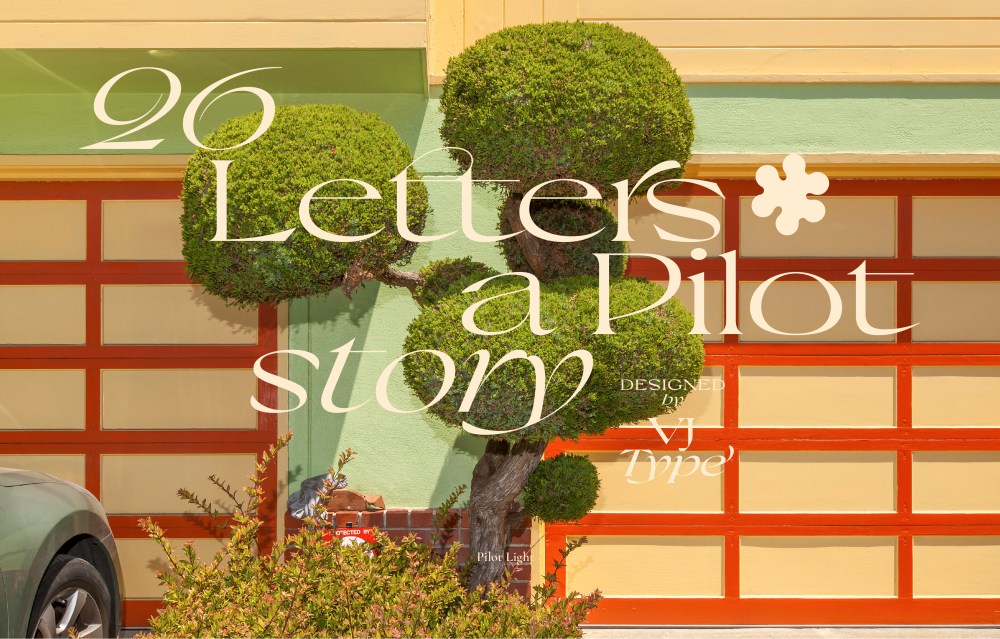
Pilot is VJ-Type’s latest release (early 2025). Designed by Jérémy Schneider, the typeface is all about balance (a key tenet of the studio’s aesthetic approach). In Pilot, masculine meets feminine; grown-up style meets expressive experimentation; angular meets fluid. The studio calls it a “timeless wardrobe staple,” capable of gracing the pages of a fashion spread yet with enough utility and craftsmanship to stand the test of time. Pilot feels completely fresh but also like it’s been around for a while.
The display serif is offered in 10 styles from light to black, with Roman and italics. This release was the team’s first foray into italics, and that joy of experimentation definitely shows. Pilot also comes with graphic flourishes in an expanded glyph set, with 77 symbols and a set of 18 stylized arrows.
When I approached the team about featuring Pilot, Schneider was kind enough to indulge my questions (find those and his answers below, lightly edited for length and clarity).
I have the sense that your typefaces arrive on big shoulders—they are meticulous and fully realized, but they are grounded in something that came before. What inspired Pilot? Is there a gap that you were trying to fill or an old typeface or design reference that inspired you?
Thank you for your question. We take it as a wonderful compliment because it means that you clearly see and understand what we want to convey through our work. Timeless, rooted yet fresh designs. This is the direction we always try to go in, for Pilot, but also for VJ TYPE in general. Experimenting, drawing with enough style, and finding the right balance to make the typography last over time.
I think ‘was there a gap you wanted to fill’ is the right question. We’ve been wanting to work with a very elegant, contemporary extended serif for a while. We experimented with this in an identity commission, which opened up a creative window for us.
Everything is a place to find inspiration for new typefaces. Our travels (we just got back from Hong Kong), our phones are full of shop fronts, book covers, vinyls, old books from the museum…
Speaking of places to find inspiration for new typefaces, do you have go-to’s, i.e., a favorite archive or a creative process that helps you mine the sparks for your next idea?
Everything is a place to find inspiration for new typefaces. Our travels (we just got back from Hong Kong), our phones are full of shop fronts, book covers, vinyls, old books from the museum…
But our creative process comes from elsewhere. We come from a graphic design background, and lettering has become very important in the studio in recent years. For identity projects, we design a lot of directions, many of which aren’t chosen by the client. Over time, we’ve come to realise that this is a good thing because it creates a virtuous circle where not all graphic and typographic experimentation goes to waste.
It builds up a stock of designs, some of which could potentially be added to the VJ TYPE catalogue.
I think what gives Pilot elegance is its balance. It has both masculine and feminine energy, and it has function while also retaining design-forward flourishes. How do you go about designing a typeface that has a good balance of masculine/feminine or any other dichotomy?
We focus a lot on balance in our work. It is one of the words we use most in the studio. It is inherent in our work. The balance between past and present, the balance between feminine and masculine features, the balance between blank spaces and decor. It is very difficult to intellectualise this approach because we only see and judge whether we have achieved a nice balance or not. It is a sensitive work, not a technical one. But the fact that we don’t work on the same typeface every day and that we come back to it often allows us to have a fresh eye and gradually correct problems of balance and consistency.
For identity projects, we design a lot of directions, many of which aren’t chosen by the client. Over time, we’ve come to realise that this is a good thing because it creates a virtuous circle where not all graphic and typographic experimentation goes to waste.
What is your (your team’s) design philosophy?
Very simple: PLEASURE. We started the foundry because it’s a space of creative freedom for us. No client to give us a brief, no deadlines. It is a space where we can express and experiment with our aesthetic as we wish.
What’s next for your team? Are there any juicy projects in the pipeline?
We love the freedom typography gives us. So we want to grow the foundry business. The thing is, we can’t do it alone, so maybe we’re looking for the right person to come on board and help us with the business side of things. Let’s keep our fingers crossed for 2025 to make it happen!
All imagery © VJ-Type.
The post Pilot Is an Elegant and Expressive Display Serif appeared first on PRINT Magazine.