This year was a wild ride. We’re on the precipice of something we can’t yet articulate. There’s fast-moving AI (we’ve embraced it, but its impact on our society remains a big fat question mark). There’s our nightmare-ish global socio-political atmosphere (with no end in sight). Closer to home, there’s fatigue and burnout and so much noise.
In our 2024 Typography Report, published in February, Meg Farmer forecasted:
Designers will turn to type escapism. Typography will be the balm in an increasingly irritated society.
Did typography provide a balm in 2024? Perhaps! This year, our most-loved features celebrated craft and had a little fun. Quite a few of them also discussed typography’s role in communicating and connecting in a version of the world that leans towards access, justice, and progress.
The Curious Case of Cursive
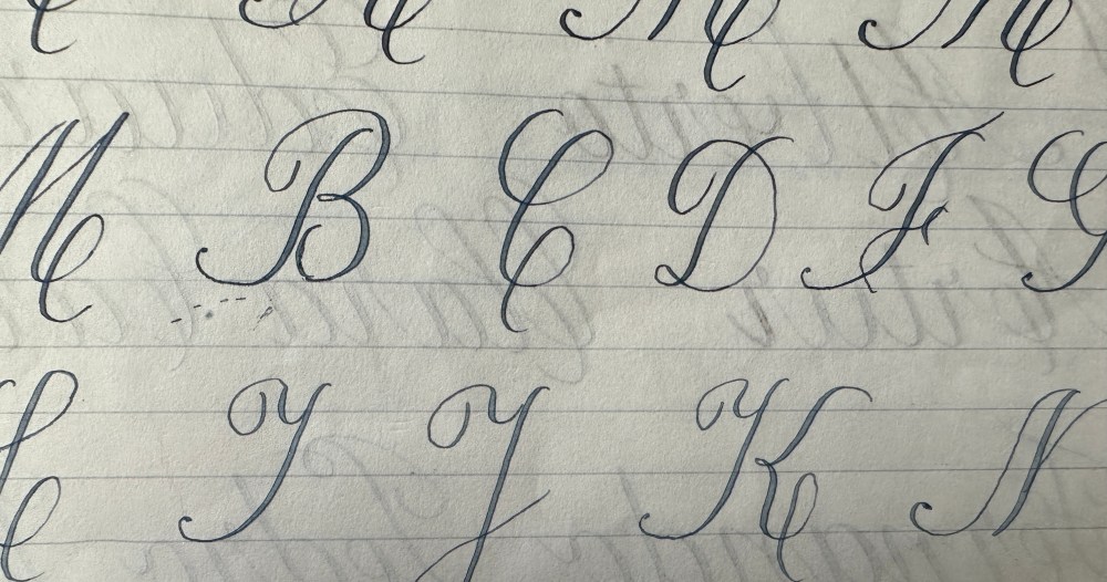
Designers value script and states are reinstating cursive education, yet Gen-Z can’t read it, and brands are straying from it. Chloe Gordon explores.
Jessica Walsh Launches Type of Feeling
The &Walsh team deployed years of experience in brand identity and strategy to craft a collection of typefaces designed to evoke particular moods and sentiments: joy (Jubel), cozy (Conforto), longing (Onsra), and tranquility (Serein), to name a few.
The Art & Science of Typography in 100 Principles
What does it mean to really understand type—to use it with clear intent and purpose? Universal Principles of Typography, a book by Elliot Jay Stocks answers this and so much more. The book’s 100 principles cover everything from the tactical to the compositional, sometimes pausing for the philosophical.
Why is Soccer Jersey Typography So Bad?
Image designed by Christoph Koeberlin
All too often the type used on the backs of jerseys lacks legibility and the same level of thought and care incorporated into other aspects of the jersey’s design. Charlotte Beach talks to sports type designer Christoph Koeberlin to unpack some of the best and worst typography on display in this summer’s tournaments.
Commercial Type Samples Custom & Off-the-Shelf for Rolling Stone
The magazine’s new type palette pays respects to its successors (Dennis Ortiz-Lopez’s condensed slab serifs with high contrast display of the 90s, and Jim Parkinson’s enduring and curvaceous 1981-2018 wordmark) but takes the aesthetic in a new direction. The team’s redesign ethos: “Make it look like Rolling Stone, without directly sampling bygone issues.”
A Typography of Reuse
Everyone here in this Minneapolis neighborhood knows about the letters. “Oh yeah, the letter place.” That would be hunt & gather. Over 28 years, owner Kristi Stratton’s “vintage amusement store” has sold oddities and curiosities, letters included.
Vocal Type and Civilization Expand the Story of Type and Social Justice at MODA
Characters: Type in Action, at the Museum of Design Atlanta (MODA), is a collaboration between Vocal Type and experiential design studio Civilization. Examining the impact of typography on the fight for social justice, the exhibition features typography from Vocal Type founder Tré Seals and The Vocal Civilian, a newspaper designed by Mark Baker-Sanchez.
Types of Love: Designers Pair Fonts for Valentine’s Day
Selecting a typeface pair is not unlike dating. Fonts might go together “on paper,” but in practice, they might be completely wrong for each other. This year, Monotype launched an A.I. font-pairing tool to help designers streamline this process, but for this exercise, we asked human designers to give us their favorite Valentine’s Day duos.
This Year’s Best Picture Nominees as Typefaces
The 2024 Best Picture nominees include a range of films that represent an eclectic array of tones, themes, looks, and textures, much like typefaces. To get in on the Oscars fun, we’ve created a thorough round-up of each of the 10 Best Picture nominees as typefaces.
From Over-Helveticization to Comic CERNs: A Design Anthropologist on “Fontroversy”
Keith Murphy, an Associate Professor of Anthropology at UC Irvine, spends much of his time researching the intersection of design and human culture, specifically typography. He contends that the friction between design and humankind often comes alive in type. Enter the “fontroversy.”
That’s a wrap for 2024 in type. Stay tuned for our 2025 Typography Report, dropping soon!
The post PRINT Year in Review: 2024 in Type appeared first on PRINT Magazine.

