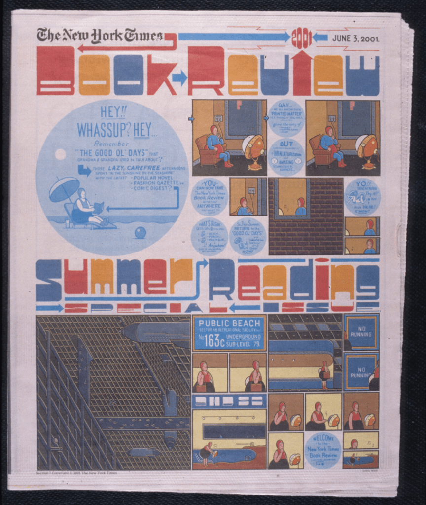
On June 3, 2001, Chris Ware’s design of the special Summer Reading issue of The New York Times Book Review published to a chorus of shock and awe. It had become customary that the illustrator conceive a thematic visual concept that was followed throughout the issue from cover to cover (usually around 10–12 illustrations). I was art director of the section, and the only marching order I gave was to “make it summery.” So, I was stunned a week or two later when I saw Ware’s sketches. It was summery, all right, but it was also the most astounding interpretation of the theme I had ever seen (and I had previously utilized such notable talents as Maira Kalman, Matt Groening, Christoph Niemann and Seymour Chwast). Ware had been given a free hand, which he used to entirely transform the masthead, logo and overall format (after it came out, I was reprimanded and ordered never to allow it again). But I did not care. What was done was so well done. Ware’s visual language is sublime complexity, and despite the rule-breaking, it was loved by all.
Ware is one of the most beloved comics artists of our time, and his recently published ACME Novelty Datebook Volume 3, spanning the years 2002–2023, is a must-have for fans like me who are mesmerized by how he does what he does. Drawn from the sketchbooks of the creator of Jimmy Corrigan, Building Stories and Rusty Brown, ACME offers a rare chance to get to know the artist behind such an incredible body of work.
Ware is one of the most important cartoonists of the past 75 years, a Chevalier of the Ordre des Arts et des Lettres, the first cartoonist to win the Guardian First Book Award and the first American to win Europe’s highest prize for cartooning (the Grand Prix D’Angouleme).
Like R. Crumb’s famously intimate sketchbook series, ACME was not intended to be seen by his fans, but pulling back the curtain is a gift to all who worship at the alter of Ware. I recently had the good fortune to explore some of his thoughts about life, art and the new book.
Over three decades ago I was on the awards committee of The Swann Foundation of Caricature and Cartoon, and Art Spiegelman brought in a newspaper you had published with your early work. The board members were blown away—you were hands-down the winner. How do you feel when you look back at those early attempts at finding your visual language?
Well, you are very kind; thanks for the generous words. Honestly, I can’t look at any of my early stuff—or really too much of my recent stuff, either—without feeling frustrated by my drawing ability. With my early strips all I see are little bits and pieces I was thieving from other artists (nearly all of whom were published in Art Spiegelman and Françoise Mouly’s RAW magazine, including Art himself) in my attempt to mash together some sort of something that I could somehow consider “mine.” In my twenties I went back and forth between improvising directly in ink or crafting images that were as iconographic and geometric as possible, then eventually combining the two in an attempt to capture contradictory feelings and sensations—or some such thing—but found that these experiments ultimately felt like what David Foster Wallace called “metafictional titty pinching.” I finally just gave up and tried to present my stories as clearly as possible with the occasional shift in approach whenever it still felt instinctually appropriate.
I presume you’re only showing what you take pride in showing, but can you detect a clear evolution—or did you zig and zag before becoming Chris Ware?
Even though Frank Lloyd Wright was one of America’s biggest jerks—an arrogant philanderer who designed a logo for himself and buried his initials in the name of one of his best-known designs (Falling Water)—he was also an indisputable genius who regularly reinvented himself and so avoided staleness and sterility. I think about his relentless “doing the opposite of what he’d done before” and I worry I don’t have the fortitude, intellect or self-confidence to follow his example—but I try. I doodled a little strip about this in this last datebook, including Scott Joplin and Beethoven in the list of artists who regularly re-thought themselves up to their final moments. Theirs is a tough model to follow.
I love seeing the ACME “brand” take form. Was this always meant to be your signature, or was it initially a stop along the way?
I titled my regular periodical “The ACME Novelty Library” so I indeed wouldn’t have to put my name on it, since drawing and publishing is really its own act of quiet arrogance. Also, I noticed that in single-page comics the artist’s signature frequently acted as a sort of punctuation mark—or worse, an advertisement—plus, I didn’t want it to contribute to the rhythm of reading, as it interfered with the sense of life I was trying to get at. So “The ACME Novelty” part of this book’s title is now completely vestigial, if not completely insane, since I haven’t done an issue of my comic book in over a decade. However, the thought of titling a book “Chris Ware’s Third Sketchbook” is way worse. (Though really, what’s the difference? I still essentially made a pretentious logo for myself, just like Frank Lloyd Wright did.)
ACME is such a classic comic/novelty title. What does it mean to you?
“Acme” was a fairly common commercial brand name in the 1910s and 1920s, nostalgically invoked by Chuck Jones in his Roadrunner cartoons of the 1940s and 1950s, and all of which I was also trying to play on in the 1990s when I started publishing my own comic book. At that time, underground/independent/experimental comics tended to have one-word “loud” names, and I wanted to make something that was harder to remember and awkward and, especially, uncool. Also, since I was trying to tell stories in each issue that were as emotionally moving and literary as I could muster, by hiding them within this fussy shell I felt sort of freed up to experiment and embarrass myself.
When you designed your rule-breaking cover for The New York Times Book Review, I was struck by your exceptional lettering acumen. How did type and image become your metier?
Comics drawing, aka cartooning, has more in common with typography than with traditional drawing: the drawings in comics are meant to be read, not just looked at. However, most of the drawings in this sketchbook, done from observation or direct memory, fall more into the latter category. Or, in other words, unlike in my comics fiction where I use a ruler and geometric simplification for the sake of artistic clarity and literary transparency, almost all of what is in this book is just plain old drawings and watercolors about life as lived.
Since I hate wasting time but am still startlingly good at it, when I’m on the phone I nearly always draw, and during the pandemic, like everyone, I spent a lot of time on the phone, so sometimes just for fun I would copy 19th-century and early 20th-century comics, typography or whatever compelled me into my sketchbook—the only rule being that I didn’t know why it compelled me. [It’s an] activity [that] goes back to all of the great books you did in the 1980s and 1990s, and to which I still look to find something unusual that captures that strange balance between the “looking at” and “reading of” typography.
Finally, since you asked, I tried to teach myself to handletter by looking at examples of 1920s original commercial art, specifically those done for the Valmor cosmetics company, original scraps of which were sold by the Chicago novelty store Uncle Fun and run by Ted Frankel, who had inherited the company’s entire back catalog. I learned more from looking at those old inked and whited-out boards than I did from all of the old instruction books I tried to puzzle out, which always seemed reluctant to give up their secrets. These Valmor originals, many of which were by African American artist Charles Dawson, also affected the way I ended up drawing comics, which was to work more typographically than drawing-ly, for lack of a better word.
When you see the three volumes of Date Book, do you have any regrets, second thoughts, nostalgia or other emotions?
Of course; life is full of regrets, and confoundingly, while some of my favorite books are facsimile notebooks and sketchbooks (especially the sketchbooks of Robert Crumb, which, along with Art Spiegelman’s encouragement, saved me in art school), I didn’t realize the effect that publishing my own might have. As I say in my introduction, the decision to publish a sketchbook—where a sketchbook should be a place where one feels absolutely free to humiliate and mortify oneself—torpedoes its basic utility. So almost immediately after printing the first volume I started keeping a separate daily comic strip diary into which I diverted all of the private unpublishable stuff. Now I have a thousand unpublishable pages of a private comic strip diary, which I still compulsively keep mostly for my daughter, as it covers her life more than anything.
In the meantime, I still tried to thoughtfully arrange these three sketchbooks (aka “datebooks”), culled down from 13, into something that hopefully still somehow captures the inevitable passage of time and life, as the books begin when I was a teenager learning to draw and end right when my teenage daughter leaves home—yet here I am, still learning how to draw.
What other alterations, if any, do you have in mind for your work?
Well, aside from simply trying to get better, I’m currently working on three graphic novels, as well as the occasional New Yorker cover, and continue to make sculptures and paintings; also, I’m helping to design the exhibitions for a traveling retrospective of my stuff that began in the Pompidou in 2022 and went through other European venues, which will end in Europe next year at the Centre de Cultura Contemporània in Barcelona and then, finally, at the Billy Ireland Museum in Columbus, OH, in 2026.
The post The Daily Heller: Chris Ware’s Favorite Wares appeared first on PRINT Magazine.

