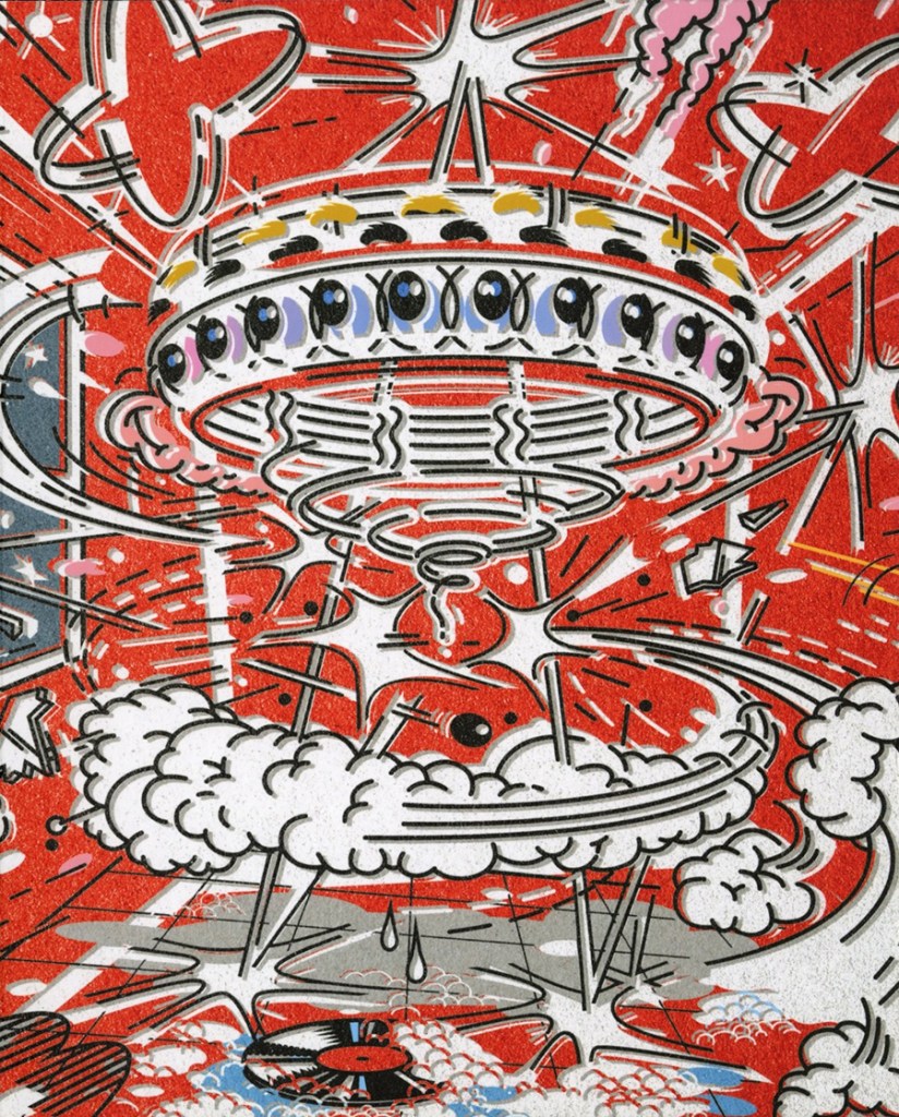
The other day I noticed this announcement on Instagram:
I had forgotten about having contributed to the book, but was happy I had the good sense to agree to a few years back. It is an exciting collection of this key figure from LA’s rock epoch. For those who don’t know, in 1980 he directed many of the first music videos; his editorial illustration appeared in most national magazines; he was a founding partner of various design groups, including Art Attack (1975), Neo Plastics (1980) and Brains (1994); he served as art director at Virgin Records (1992) and Warner Music (2001).
To celebrate his forthcoming publication, below is the text that I wrote for MXWX, alongside an interview with Haggerty.
It was the late 1960s. I had the good fortune to be mixed up with some bad fortune but in the good sense of the word. I was the art director of a few underground newspapers. I had the good sense to take advantage of the times while it was good to be bad. One of the good things about working on the bad underground porn weekly called SCREW, was that I could ask good, indeed great, artists and designers to work with me. By employing good illustration I could have these wonderful artists make me look good. But enough about me. Let’s get to Mick Haggerty.
I badly wanted him to work on SCREW. So, as was my habit, whenever I saw some printed or unprinted work that struck my fancy, I’d write a letter on SCREW letterhead, suggesting (actually begging in a nuanced grovel) that the recipient do a cover or two. Do enough covers in a year and an artist could put a down payment on a inflatable sex doll. Do only one or two and an artist could tell their friends (or not, as the case may be) that they’d done one or two SCREW covers (status?), and take them out for a moderately priced dinner on the fee they received.
At that time in the late 1960s/early 1970s, we had no immediate forms of communication, especially from New York to London, other than Telex (which SCREW could not afford) or Special Delivery (which SCREW could not afford). So regular airmail was the best. A letter to Mick took two weeks to arrive, and depending on how keen he was on answering, it could take a minimum of two weeks for the return post. It was always a gamble. I’d usually give up hope if I didn’t hear anything back for three or four months—sometimes a year. I don’t recall how long it took for Mick to respond. But respond he did. And not just in a letter saying “are you kidding me?” or “I have more self-respect than to work for your rag” or “may you stew in the hell of your own making.” He agreed to do a cover and sent along a sketch, too. I didn’t even look at the sketch before sending back my airmail response: “Do it.” The result is in this very volume.
That is pretty much my memory of our interaction. I feel we met at some point, but no records exist. But I know without doubt that I continued to follow his work. And the piece of his I still adore (which my filmmaker son, now 30, fell in love with too) is Mondrian Mickey. This image of a lopsided DeStjil grid painting pouring primary color paint onto the floor in the form (and color) of a Mickey Mouse melt is the most hilariously genius commentary on the marriage of fine and popular art ever produced in the 20th century. Take that, Mr. Warhol.
When Mick asked me to write this essay, in addition to my own story, I took the opportunity to ask him about his (well, it is his book!). And the first question I had to ask was about Mondrian Mickey.
Seems to me that your most familiar work is the Mondrian melting into Mickey Mouse. What do you believe is your most iconic work?
Yes, Mickey Mondrian is it. I’ve spent my whole life on that wall between those two.
Is there an origin story?
It was done for Takenobu Igarashi at Idea Magazine … at the time I was fascinated by the plasticity of objects, and was making lots of drawings that showed extreme movement and transformation. (Pablo and George get a lot of well-deserved credit for deconstructing form in space, but the comic strip was invented a decade before Cubism, and those artists never get a look in). I of course considered Piet Mondrian the High Priest, the king of black outline and flat color, but the cultural appropriation of his work allowed me to also see him in a more kitschy, style king context. Looking through sketchbooks of that time I made many drawings of his paintings, some with lots of handles on transforming them into furniture, and even as melting swiss cheese. Once you melt and tilt the work, what else would it become?
Perhaps the work resonates with other graphic artists because it gets to the heart of the simple alchemy and reinvention that’s possible in our daily trade manipulating the same old well-worn images. For me it defines the exact spot I spent my life.
Since, I’m now in interview mode, when did you begin to publish?
When I dropped out of college in 1972 I made a cold call on Island Records Office in London, hoping to be given a Bob Marley or even a ska cover. It was a few floors in a converted row house where all the employees sat together around a large white table covered in telephones, and after being invited in, and they had all looked though my portfolio, someone just said, “Give him Rosie?” I was of course happy to get my first job but too embarrassed to tell anyone I knew that I was doing a Fairport Convention “folkie” cover! Many years later I worked with Richard Thompson and he got good laugh out of it.
I recall, and my recollection is proven in this book, a lot of music design. Was music your initial focus?
Music was everything that mattered to me then. When I saw Bob Seidemann’s cover for Blind Faith, the earth shifted on its axis. That art somehow married to the power of music meant perhaps we could change the world. I always felt the best work had its own soundtrack. The Stenberg Brothers, arguably the first and the best [Soviet Russian Constructivist] graphic designers, made work that just screams. I was always drawn to images like that.
What was the illustration scene, world or milieu like when you started out?
I was trained in England as a graphic designer by purists in the Swiss mode like Anthony Froshaug. (He once cried in front of our class after confessing to having mixed Baskerville with Gill Sans on the same page.) I never picked up a pencil without a ruler, and drawing was viewed as a highly suspect activity. I had to travel 6,00 miles to L.A. and lock my door to even dare to attempt it. My impulse was to highly refine my drawings to remove any trace of the fact that I couldn’t draw. When I arrived on the West Coast, the favored style was airbrushed images that made everything look like shiny inflated balloons just begging to be burst.
You draw so damn well. Still, you have many styles. Why? And which approach is your preferred or favorite?
I am always driven by whatever the job at hand seems to require in order to be successful, and I try to confound people’s expectations. I always turned down any job where the client started by saying, “we want something like that drawing you did for …” My first love of course is flat colors inside black lines, reductive, impactful … perfect.
Many of these images were created prior to the computer. Was intricacy a fetish for you?
Most of them are way before digital vector tools, just ink on board, and yes, I broke into a cold sweat after making the perfect line.
The Donald Trump image seems so out of stylistic place. Why?
It seems the perfect style to me. Gilbert Stuart’s famous painting of George Washington, the man who claimed “I couldn’t tell a lie.”
Speaking of guys with orange hair, how did the association with David Bowie come about?
United Artists Records called me in to work on Derek Boshier’s photograph for the cover of Let’s Dance, and it just grew from there. David and I were the same age and grew up just miles from each other. From the start it just felt comfortable; we had a good laugh whenever we got together.
There is everything from cartoon realism to abstract “adventurism” (my quotes) in your work. What triggers which approach?
I love “abstract adventurism” … not sure exactly what it means but sounds like me and I can’t wait to use it!
As my final question, given all you’ve done, is there another aesthetic transformation in the works?
There is only aesthetic transformation, isn’t there?
The post The Daily Heller: Mick Haggerty’s Multiple Personality Illustration appeared first on PRINT Magazine.

