Last week we peeked into the new exhibition at Poster House New York, Fallout: Atoms for War & Peace, with curators Angelina Lippert and Tim Medland. The show covers two dueling forces: atomic energy for peacetime uses, and atomic weaponry that ensures the specter of mutual destruction. Today, we speak to John Kudos of Kudos Design Collaboratory, who designed the exhibition as two conjoined chapters. The colorful side features General Dynamics’ Atoms for Peace poster campaign, originally designed by Erik Nitsche. The darker half explores the nuclear arms buildup, the military industrial complex, and the corresponding poster protest. For those of a certain generation, the exhibition revisits the intense anxiety triggered by constant fear that the Cold War could heat up at any time.
Photography by Samuel Morgan, courtesy of Poster House.
How did you become involved with Fallout to begin with?
Ola Baldych, director of design and exhibits, reached out last September asking if we could take on on exhibition design project on General Dynamics and anti–nuclear power posters with a compressed timeline. Given that we’ve done a few projects for Poster House before and love working with them, I quickly googled “General Dynamics” and blindly replied “Yes, that would be fun.”
Had you known of or seen any of the material prior to this exhibition?
Not really, but my partner Robert de Saint Phalle from KASA Collective is familiar with General Dynamics from previous work.
The design is powerful from whichever door you enter. What was your compositional plan?
We’re familiar with the gallery space from previous exhibition design work. Ola also requested that we reuse a few existing moving wall structures. With these requirements in mind, we mapped the desired foot traffic against the curatorial narrative.
With Fallout, there is a clear opposing duality to the exhibition as outlined by the curators, Angelina Lippert and Tim Medland. We determined that there needs to be a clear indicator when the overarching narrative took a 180-turn, both visually and spatially.
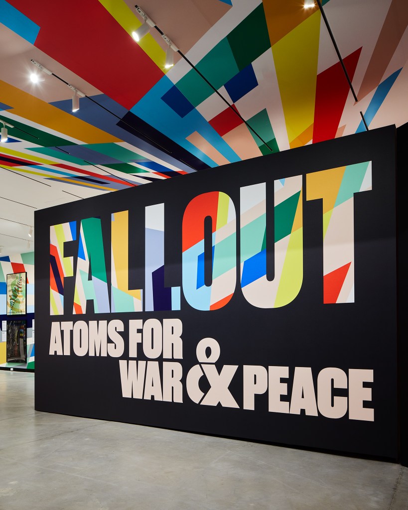
Because nothing about this exhibition is subtle, we decided to adopt the powerful color graphics from Erik Nitsche’s General Dynamics/Atoms for Peace poster (1955). We wanted to create a sense of immersion through colors. Combined with our preference to create a permeable visitor flow, I think the color immersion approach creates this notion of being pulled in from whichever path you take.
For the typography, we picked Druk for the title wall, which Berton Hasebe (the typeface designer) described as a study in extremes. Unapologetically emphatic and forceful, we can’t imagine anything more fitting to typeset the word “FALLOUT” infilled with Nitsche’s oversized color graphics. These color graphics even loom over you on the ceiling, giving you a glimpse of what lies behind.
The large main gallery is divided into two sections, anti-Nuke and Atoms for Peace, with a central zone that suggests middle ground acceptance of nuclear war (i.e., the myth of survival). Was your plan to make this a kind of neutral area?
It is conceptually a neutral area, or a liminal state. We wanted to carve out a physical threshold within the gallery that forces visitors to experience an inflection point in the narrative as they walk through. Robert refers to it as the quantum superposition moment in the gallery, where a particle can exist in multiple states (like being in two places at once, or two narratives at once) until measured, at which point it “chooses” one state.
Within this area, we juxtaposed a quote from Eisenhower against Einstein’s, in the form of a colorful explosion, a schism resulting from the splitting of the atom, releasing color graphics that span distances, time and surfaces. These color fields were hand-painted color-by-number on the longest wall surface available in the gallery and meticulously wallpapered to the ceiling and the floor. The fabrication team at Poster House led by John F. Lynch did a wonderful job
At what point did you discover that adapting Nitsche’s design motifs as a graphic wall and ceiling theme would be so powerful?
We learned from our past exhibition design work, Made in Japan (also for Poster House), that applying large fields of colors and shapes on the walls of an exhibition space can augment the curatorial narrative quite powerfully.
When we started to visualize our 2D ideas for Fallout on an isometric rendering of the gallery, we saw how the simplicity of scaling up Nitsche’s linear and directional design motifs created a very immersive spatial experience. Instead of approaching the exhibition design with an academic and analytical eye, we decided to embrace the jolt, emotional and amplified approach. In the end, we feel this approach is more fitting given the powerful impacts these posters have on their own.
What did you discover while organizing the design that was a surprise to you?
Before working on this exhibition, I have only learned about atomic bomb disasters in history books and films, both documentaries and fiction. I have not lived experiences of the atomic bomb scare, so my textbook knowledge on the topic was mostly associated with its grim impact on the planet and humankind. I was dumbfounded to see so many beautifully designed General Dynamics posters from the 1950s promoting the atom as the net-positive future in so many sectors. Disneyland’s television series “Our Friend the Atom” created in response to Eisenhower’s “Atoms for Peace” speech at the 1953 UN General was completely mind-bending. It made me realize that the topic of this exhibition is two sides of a coin.
During our brainstorming process, we spent a great deal of time settling on the right tone of voice for this subject. It touches on science, politics, social justice and humanity. In the end, we concluded that the exhibition is about the ideal future versus grim reality filled with contradictions. This became the keystone of our design concept, which started with this sketch of an ‘x’ that also forms an ampersand (see below).
How do you feel about the entire show?
We’re very happy with the outcome of our design work; it’s very dimensional and experiential. We also hear that people actually spend quite a bit more time observing the posters and reading the interpretive labels compared to other exhibitions we’ve done.
On the flip side, we are deeply moved by stories we’ve heard from those who have, or close to, lived experiences with atomic disasters. Unfortunately, given the shifting global power right now, I really hope that history doesn’t repeat itself.
The post The Daily Heller: No Nukes, and Yes Nukes, at Poster House appeared first on PRINT Magazine.