Reading is the secret ingredient, says Naomi Usher, who leads the “design process” for all the posters created for the famous off-Broadway Soho Rep theater in New York City. This is her tenth anniversary collaborating with illustrators, playwrights and directors, deftly accomplishing what is often hampered by stakeholders’s egos. Or, to put it another way: “The posters for Soho Rep are weird. Naomi Usher is a weird designer too,” states Luci Gutiérrez, who illustrated and designed the posters for Revolt. She Said. Revolt Again. and While You Were Partying. “For an illustrator, it’s rare to find a space of freedom and play—without restrictions or the need to create pleasing images. The only requirement for the posters is to reflect the spirit of the play,” not the players.
After recently seeing a few of her posters for the first time, I wanted to talk to Usher about her design process—and how she skillfully navigates these sometimes treacherous theatrical waters.
Illustration by Katherine Streeter
Illustration by Montse Bernal
Illustration by Ulla Puggaard
First, a little biography: Where are you located? How long have you been designing these posters?
I own a small design agency in New York City called Studio Usher, which I founded over two decades ago. Before that, I worked as an art director at Allure magazine, a design director at Disney and as a designer and studio manger for a wonderful woman named Yolanda Cuomo. I joined the board of Soho Rep in 2010, and before cycling off in 2015 began designing the company’s posters—work I’ve continued ever since.
Illustration by Luci Gutiérrez
Illustration by by Adam Hayes
You’ve created quite a ream of posters. Do you believe that in the theater world posters fill seats?
In the case of Soho Rep there is a direct relationship between the poster and ticket sales, and it is critical to a show’s success before reviews. Cynthia Flowers, one of the three directors of Soho Rep, and I have evolved the design into a format with the poster printed on one side and additional information about Soho Rep’s current season on the reverse. We mail it to 10,000 homes prior to each show. When the poster arrives and after a show opens, there is another marketing benefit to the printed posters, and ironically it is digital. A selfie, in front of the poster, shared on social channels, becomes a powerful marketing tool to help spread the word in a way that is organic and personal.
Illustration by Riki Blanco
What are the guidelines you give yourself in making an alluring poster?
Read the script. Reread the script.
The poster should trigger an emotional response rather than an intellectual one.
Avoid anything too literal, on the nose or overly representational.
Steer clear of seeking inspiration on social media.
Meet multiple times with the playwright, director and Soho Rep’s artistic leadership to gain deep understanding of the production.
Challenge anything that feels like my own default approach. Instead, strive to adopt the playwright and director’s perspective.
Design by Naomi Usher
Photographs by Jonathan Nesteruk
Which of your posters has had the most success in terms of capturing the essence of the play?
I approach posters with the goal that they resonate even more with the audience after they’ve seen the show. If the poster sparks someone’s curiosity enough to buy a ticket, and then, after experiencing the performance, they look at the poster and think, “Ah, now I get it,” I feel like I’ve succeeded. The artwork has evolved from just an illustration on paper to becoming a part of the live theater experience.
Given that framework, there are two posters I would choose. The first would be the one we created for Jackie Sibblies Drury’s play Fairview, which was awarded the Pulitzer Prize in 2019. Ironically, that’s the poster I feel least comfortable with in terms of design. The direction I received from Jackie and director Sarah Benson was: “It’s about surveillance, and it should be bland, boring and beige—sort of like Nordstrom.” Designing a bland poster should obviously go against everything I aim for, so when the production took off and the poster landed on a book cover, I wrestled with the reality that it had done exactly what it needed to: The key art captured the tone of the first act, and while the poster offered a subtle hint of the play’s profound climax, it revealed nothing, which was essential to the production’s power. And yet, I can’t help but wish—still a bit—that the design had been something else. Something bolder. Something without Optima.
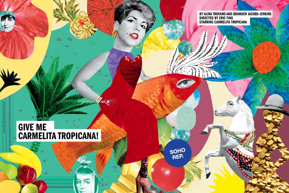
The second would be for the play Give Me Carmelita Tropicana!, written by playwright Branden Jacobs-Jenkins and performance artist Alina Troyano. Though it begins in a sterile, gray lawyer’s office, the play itself is anything but beige and controlled. When Branden, Alina and director Eric Ting arrived for our initial meeting, their inspirations formed a wildly colorful menagerie—cockroaches and mice entangled in love affairs, the 17th-century nun and poet Sor Juana Inés de la Cruz, paper fruit, Wangechi Mutu collages, and a red goldfish that Eric mentioned would be a stand-in for Branden.
Jokingly, Branden brought up Lady Godiva, and after that, I couldn’t shake the image of John Collier’s painting of a naked Lady Godiva riding a horse draped in an embroidered red cloth. That vision became central to our direction for the illustrator on the project, Katherine Streeter. In her first sketch phase, she placed Carmelita at the heart of an image—straddling a red goldfish instead of a white horse. And, well … you’ll have to see the play to understand just how perfect that is.
The scene-stealing goldfish is a wonderful character—hilarious, profound and ever-expanding. However, one thing that is specific to an off-Broadway theater like Soho Rep. is that the playwrights are usually workshopping and rewriting well into previews. So when I look at the poster now, I am left to wonder: Did Branden, Alina and Eric know the goldfish’s centrality all along? Or did the key art process help solidify the vision of the production on stage and in fact that is why the poster captures the essence so well?
I should add that the poster for Soho Rep’s next performance, the play The Great Privation (How to flip ten cents into a dollar), written by Nia Akilah Robinson and directed by Evren Odcikin, is currently in production. The show opens in March at Soho Rep’s brand-new temporary home on 42nd Street. That poster feels like it has caught the essence of the play. We shall see.
Design by Naomi Usher and Tyler Spangler
Theater posters have a long history. Where do you think Studio Usher’s fit into that?
By collaborating closely with directors and playwrights, I think I create posters that are part of the lineage of theater posters that do more than advertise; they are themselves artworks that invite interpretation. Unlike the purely commercial Broadway posters that rely on star power and reviewers’ quotes, Soho Rep’s posters are part of the tradition of treating posters as an extension of the theatrical experience itself.
Design/illustration by Naomi Usher
I continue to be grateful for construction sites, where posters are found. How do you feel about the current wave of street posters?
As I walk around the five boroughs, something I do frequently for inspiration, I often think of the American writer O. Henry’s quote, “New York will be a great place if it’s ever finished,” and while there are times that I tire of the endless scaffolding, I love how construction sites create space for flyposting. The posters are huge and ephemeral—up one day and torn down the next, which helps make the city feel alive. I enjoy them when they are freshly pasted, I enjoy the layered remnants they leave behind, and I’ll admit that I have torn off a corner or two of paper to be able to match a color combination perfectly.
Illustration by by Henry Hargreaves
The post The Daily Heller: Reading and Rereading the Script appeared first on PRINT Magazine.