Field Notes memo books have been a favorite brand among designers since 2008. In addition to the feel-good tactility of writing and sketching on real paper in a handy pocket-sized booklet, the creators, Draplin Design Company and Coudal Partners, update the cover themes on a quarterly schedule. The new spring edition is a gem for those who are Midcentury commercial sign-centric.
“The Field Notes team heard a presentation about the Beverly Sign Co. by professional sign painters Kelsey Dalton McClellan and Andrew McClellan of Heart & Bone,” Jim Coudal told me. “We immediately decided we needed to create a Field Notes edition and a film so we could tell the story. We enlisted their help and also commissioned them to paint a sign at Field Notes HQ.”
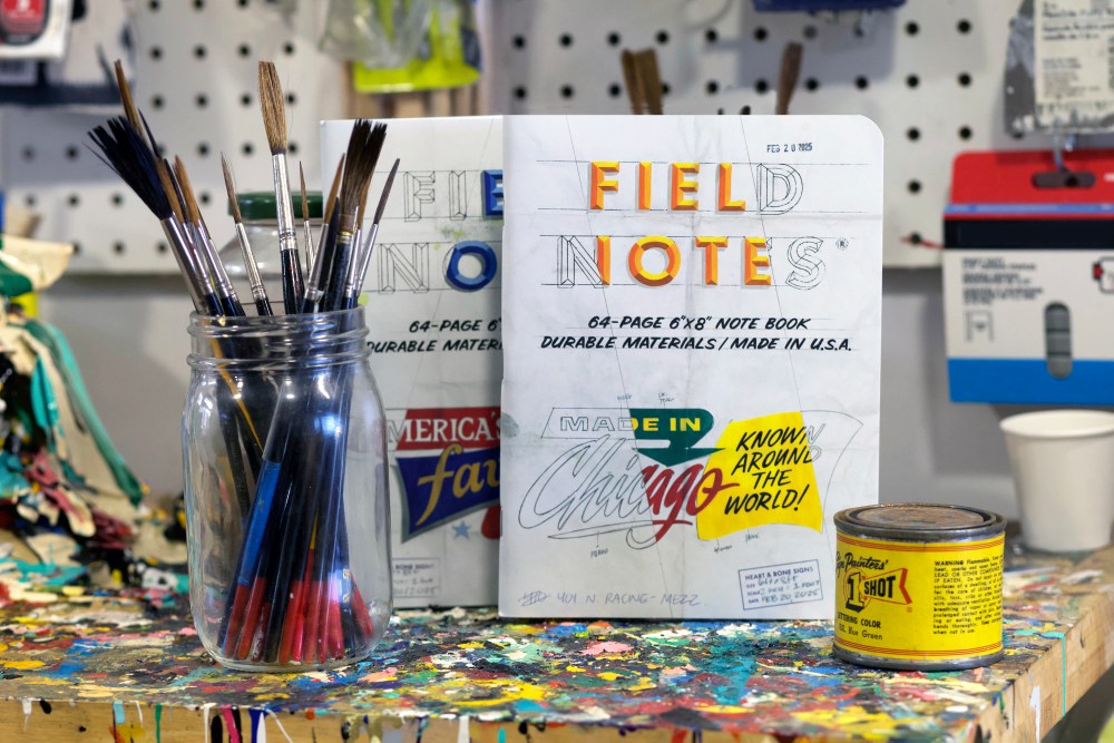
The commercial signage of the ’50s and ’60s reflected the booming economy of the post-WWII era. One of the companies that helped usher in this golden age of sign design was the Beverly Sign Co. The company put Chicago at the center of the Midcentury sign-painting map with its “panelized” compositions, novel typographic treatments and bold colors. The style came to be known as the “Chicago Look,” a design sensibility that influenced signage across the country—and inspired the latest limited-edition notebooks in a brand-new size.
Kelsey Dalton McClellan and Andrew McClellan documented the Chicago Look in a recently published book, The Golden Era of Sign Design: The Rediscovered Drawings of Chicago’s Beverly Sign Co. Culled from the Beverly Sign Co. archives, saved from the trash heap in the 1970s by a young designer at a successor firm, the McCellans’ book is full of preliminary sketches, client proofs and color “swatches” used on site by painters (known as “wall dogs”).
“Beverly Sign’s work is unmistakable, and it helped spawn a renaissance of sign design that lasted until the rise of vinyl and large-format printing,” Coudal says. “The swatches are so interesting and distinctive, and covered in pencil notes from the designers and clients directing the painters to do this or that. We wanted to capture the look of those proofs, and decided that the only way to do it justice was to make it big.”
Field Notes announced that it commissioned the McClellans and collaborator Bob Behounek to create two covers in the style of Beverly Signs’ proofs, each featuring a distinctive diagonal swatch of color and the notes and patina of a working document, printed on Westrock Tango C1S 16 pt. “White” cover stock. The notebooks are 6×8inches—larger than the company’s standard 4¾×7½-inch notebook size—and contain 64 pages of Domtar Lynx Opaque 60#T in white, with a graph grid in “Non-Repro Blue” soy-based Superior ink.
The “Chicago Look” Edition two-pack retails for $14.95 and comes with a 2.25-inch “Wall Dogs Forever” pinback button and a postcard of one of the cover designs as a finished sign, which was painted full size by Heart & Bone.
The post The Daily Heller: Telling Tales About Telltale Signs appeared first on PRINT Magazine.