Water bottles rarely carry meaning beyond their function. Most exist purely to hold liquid, stay cold, and survive daily wear without much thought given to what they represent or how they make you feel. They’re tools that disappear into routines, useful but forgettable, designed for efficiency rather than connection. Few products in this category attempt to add narrative or emotional weight to something as ordinary as staying hydrated throughout the day.
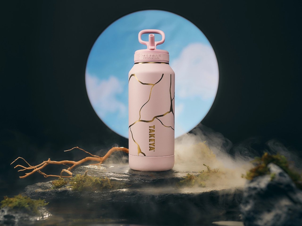
The Takeya Kintsugi Collection draws from the Japanese art of repairing broken ceramics with gold, a practice that treats fractures as features worth highlighting rather than flaws to hide. Instead of concealing damage, Kintsugi transforms cracks into golden seams that tell stories of resilience and renewal. The collection applies this philosophy to water bottles through gold-accented crackle patterns that wrap around the surface, turning each one into a small meditation on strength found through imperfection.
Designer: Takeya
Gold lines branch across the matte finish in patterns that catch light differently depending on angle and movement. The effect feels deliberate rather than decorative, like each bottle carries its own history of breaks and repairs even though they arrive new. The visual reference works because it doesn’t just borrow aesthetics but commits to the underlying philosophy.
Four colorways offer different personalities while maintaining the same gold crackle treatment. Blanc presents soft and minimal. Rose adds warmth through its blush tones. Bleu Marine brings depth and boldness. Noire creates dramatic contrast where gold lines feel most pronounced against the matte black surface. Each color changes how the Kintsugi pattern reads visually, giving the same design language multiple emotional registers depending on what resonates personally.
The bottles hold meaning beyond their appearance through how they’re built to withstand actual use. Triple-wall insulation keeps water cold for thirty-six hours, which matters during long days when refilling isn’t convenient. The silicone bumper protects against drops and impacts that inevitably happen when objects get carried everywhere. These protective features align with the Kintsugi metaphor perfectly, the bottle is designed to endure damage gracefully rather than pretend damage won’t occur.
Using the bottle becomes a small daily ritual that carries more weight than typical hydration. The gold lines serve as visual reminders that imperfection doesn’t diminish value but can enhance it when embraced intentionally. Every scratch or ding the bottle accumulates over time adds to its story rather than detracting from its appearance, which inverts how we typically think about wear and aging in consumer products.
The Kintsugi Collection makes hydration feel less mechanical and more mindful by connecting a simple daily act to a philosophy that’s survived centuries. The bottles function as practical tools while serving as small, portable reminders that strength often comes from what we repair and carry forward rather than what remains pristine and untouched.
The post Water Bottle Inspired by Japanese Kintsugi Celebrates Cracks first appeared on Yanko Design.