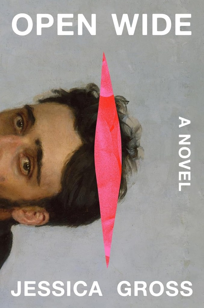
As you might gather from the publisher’s description below, Open Wide is an … unsettling (!) book. I’ve always been fascinated by how cover designers can lean into the darker sides of a narrative without spilling into full-on genre territory—and Eli Mock absolutely nails the vibe on Jessica Gross’ Open Wide.
Below, he tells us more about the cover—and the rest of our favorite finds released or announced in August follow.
Official publisher description:
Olive is desperate to get close to Theo—really, really close. She’s always struggled to connect with people. And now she’s in her 30s, single, and so flustered by relationships that she secretly records her conversations, hoping to decipher social cues and find a way to be less alone.
Then Theo turns up for a shift at the same food pantry where she volunteers. He’s a surgeon fascinated by human organs, a former soccer player, and possibly as weird as Olive. For the first time, someone seems to crave and understand her. Every recording of Theo is a balm, which just makes Olive more afraid of losing him. The only solution seems to be to bind him to her forever. Luckily, the gap between Theo’s front teeth is just wide enough for something—or someone—to slip inside.
Arresting and immersive, Open Wide explores the complexities of intimacy, love and consent, as universal human impulses bleed into the surreal.
What was the brief for this project?
The cover needed to capture the romantic body horror and possessive nature of Olive’s relationship. We wanted something weird, but not too gruesome.
Tell us a bit about the relevance of the central object on the cover.
It’s a portal—Olive’s obsession with Theo leads her to find a gap in his teeth that allows her to unzip his body and climb inside. It’s a little violent, so I drew a rough opening, and if you look closely, filled it with an image of intestines. The jacket is printed with a neon pink that really helps it pop.
The composition is so striking. Where did you source the face?
The painting is Vsevolod Mikhailovich Garshin by Illia Repin and can be found at The Met. Olive mentions it as her favorite painting and that she developed a crush on the subject. It also happens to loosely fit the description of Theo, who is a little uneasy with continuing the relationship (justifiably!) when he learns that Olive has been “unzipping” and climbing inside his body.
Given the title, were there elements you were playing against or seeking to avoid?
One of the directions I was asked to explore included a mouth and teeth. It may have been a bit too on-the-nose.
How did you choose the overall color palette?
I went with neon pink and red as a reference to intestines, or as Olive and Theo call them, “pink pasta.” I like the contrast it creates with the oil painting.
What were you looking to convey with the type treatment and arrangement?
The type was loosely inspired by Theo’s teeth—slightly rounded, bold, with a perfect gap between OPEN and WIDE.
What other comps did you explore before arriving at the final design?
I tried a few directions with exaggerated mouth and teeth. There were also some intestine-heavy concepts. They were all a bit too gruesome.
The post 23 of the Best Book Covers of August 2025 appeared first on PRINT Magazine.

