Few logos can claim a legacy of over a century, but SKF’s wordmark has been a quiet icon of industrial design since 1908—long before corporate branding was even a formalized practice. Originally hand-painted by an employee, the bold, geometric lettering was a strikingly modern expression for its time, setting an example for countless industrial brands that followed. Now, more than a hundred years later, SKF has refined its identity once again, carefully balancing heritage with the demands of a digital-first world.
SKF, the Swedish industrial giant, has unveiled a refined visual identity that reinterprets its 1908 logo for the digital age. Rather than a radical departure, the update is a measured evolution, an acknowledgment of the brand’s legacy while ensuring it remains relevant in an increasingly digital landscape.
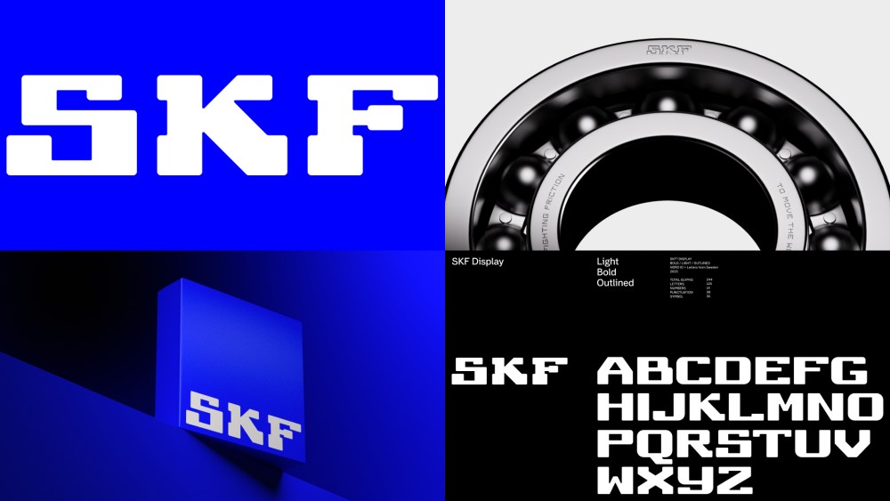
Long recognized as a pioneer in industrial branding, SKF’s original logo, over a century old, set the precedent for commercial design. Now, in collaboration with design agency NORD ID at NORD DDB, the company has rebalanced and fine-tuned its wordmark, preserving its bold, geometric structure while adapting it for contemporary use. The adjustments are subtle but significant, ensuring clarity and consistency across modern applications.
A key component of this refresh is SKF Display, a custom typeface derived directly from the logo’s forms. Created in partnership with Göran Söderström of Letters from Sweden, the typeface extends the brand’s distinctive visual language, reinforcing its heritage while offering greater flexibility in typography. Designed with digital environments in mind, SKF Display embraces movement and adaptability, core principles that align with the company’s engineering expertise in reducing friction.
Beyond typography as the central component, the updated identity incorporates refined color applications, dynamic motion principles, and a renewed focus on visual storytelling. By embracing its history without being bound by it, SKF maintains its status as a brand that moves with the times, both in industry and in design.
The post SKF’s Brand Update Proves That Good Design Endures appeared first on PRINT Magazine.