Disbelief.
Brad Holland died on Thursday March 27 at 2 a.m. after heart surgery. He was 83.
He was my first professional friend, critic and inspiration when at 17 I stumbled into the worlds of satiric art, illustration, magazines and graphic design.
We had a natural bond and tumultuous relationship that I think is endemic to all closely tied, emotionally driven, unforgettable and irreplaceable relationships. We had great adventures, illuminating experiences, deep respect for and loyalty to one another.
Brad (date and photographer unknown). He sent me photos for an article I never had a chance to write.
Brad had heart issues dating back to when we first met in 1967. (“I share aortic valve insufficiency with Abraham Lincoln”, he’d proudly tell me.) He was frank about his problems but he was also invincible, so it seemed. When the day after New Year 2025 we talked by phone, he mentioned that he was having a heart procedure in mid-March. He was more concerned with finishing the paintings for a major exhibition at Nuages Gallery in Milan scheduled for late January. From the sound of his voice, I figured the “procedure” would turn out well.
I forgot to call him before he went in. So, I sent an email last week, casually asking how it went and if he needed anything. I was not worried when he didn’t immediately respond. He was never one to answer right away. He routinely ignored online distractions.
Last Friday, I received an email from Jonathan Twingley, a former SVA MFA Illustration student who had become Brad’s long-time assistant—and then “friend, mentor, brother” (thank heavens for Twingley)—with the subject: PHONE CALL? The message: “Would you be available for a quick phone call? ‘Fraid I’ve got some tough news to share.”
I knew immediately.
In winter 2024–2025 alone, I’ve received too many similar messages. The circle gets smaller and smaller as we get older and older—great stories come with aging, yet many grave losses, too.
Twingley’s voice is eerily similar to Brad’s. He told me Brad had an attack on his stairwell and was rushed to the hospital by ambulance. I simply cannot picture Brad on a gurney in one of those emergency shock-absorber-less boxes. Twingley rushed to the hospital, where he stayed until the end.
Brad’s life has already triggered social media memories and remembrances. His work touched very many people. I devoted an entire chapter and more to him in my 2022 memoir, from which I’ve reprinted a version below as well as links to interviews and some articles by and about Brad’s invaluable and soon to be (in fact, now) painfully missed presence.
On the grief spectrum, I’m not sure what comes next …
Holland’s original artwork/paste-up for The Asylum Press, an indie illustration studio we began with the underground comics artist Yossarian.
My Mentor
In 1968 I acquired a real job and a reluctant mentor.
Brad Holland answered an ad for an illustrator for a magazine I decided to launch on my own. He was not seeking the job as mentor—I was 17, he was 24—but our paths had crossed. Without a design or art education I was in need of his wisdom and experience. Sometimes, I still need it. I could never draw or paint like or as well as him. So, the most important takeaway for me focused on the ethics of making art.
I learned about aesthetics from my Walden School art teacher Neil Shevlin, but ethics was a new one. Holland taught me that an illustrator, cartoonist and even an art director could make a decisive contribution not only to a publication, but to the culture at large (however large or small that culture might be). Holland offered inspiration to me when I anxiously wanted to be some kind of an artist but was indoctrinated into believing that commercial art was a lesser form. Holland convinced me otherwise.
I met Holland by accident, through the ad I placed in the Village Voice for contributors to a small magazine that I was starting with bar mitzvah money set aside for college tuition, which I wasn’t going to need. Borrowed Time was the title, which came from adolescent musings on mortality and impermanence and was a play on Time magazine. I had a classmate—Walden’s resident “mod”—who, when I floated the idea of a magazine, immediately drew a Beardsley-esque cover, which to my eye was just perfect. I had assembled a few poems and stories, thinking that it would be a literary magazine. I had some money to pay for printing. My best friend Leigh Hart’s stepfather was a big shot Varick Street printer. At the Freep [New York Free Press, where I was hired as “art director” straight out of high school], I had a place to set type for free on an IBM MTST mag-tape computer. I was already the seasoned art director of the Free Press for all of three months. The rest would take care of itself. How difficult could it be? Well, it wasn’t as easy as I had imagined. My advertisement pulled a literary/poetry/art ensemble that was inconsistent at best. Holland brought a strong [personal] point of view.
Holland had arrived in New York City from Kansas City, a year before by way of Tulsa, OK, and Freemont, Ohio [via Fort Smith, AR]; he worked as a design supervisor at the “rabbit department” of Hallmark cards in Kansas City and started getting hired for illustration work almost immediately after getting off the Greyhound bus. It was clear to me that he did not have to submit work to my semi-literate literary magazine. And he almost didn’t when he saw what I was planning, especially the cover.
At our first meeting in the basement apartment of Leigh Hart’s step-dad’s townhouse on East 10th Street, Holland arrived with the largest portfolio case I had ever seen. He was tall, skinny and sported a short beard. Like a drawing of a stereotyped rube in the Saturday Evening Post, just off the bus from the West or Midwest, he looked out of place in hippie Greenwich Village, except for the beard. Originally from Arkansas he had worked as a supervisor at Hallmark [with illustrator Wendell Minor] but had come to New York to make a different kind of mark. During the hour we were together he uttered only a few words; his blue searing eyes never once looked directly at me but were fixed intently on his work as I slowly turned over the large inked drawing boards.
“Good stuff,” I told him, holding my awe in check at the sight of his meticulously rendered line drawings featuring surreal fantasies and allegorical scenes. “I like ’em. But can you illustrate literature? Can you stick close to the text?”
Literature, indeed! I had no idea what I was talking on about. Nonetheless, Holland agreed to contribute—and for no fee—so long as he retained complete control over what he did. He was like the architect Howard Roark in the book on individualism that everyone—left, right, center—was reading, The Fountainhead, by Ayn Rand. Of course, I agreed to his demand.
Actually, I was surprised that he returned a week later for the first editorial meeting I called to explain the magazine to the anointed contributors. Holland patiently listened to my pedantic monologue about the blah blah blah “philosophy” of Borrowed Time, and then stuck around until everyone had left, at which point he said, “I’ll help you design this thing.”
“But I already have an art director,” I replied, referring to a high school buddy, Timothy, who pretended to know how to produce layouts.
“He doesn’t know shit about designing a magazine,” Holland replied. “And frankly, you don’t know much about putting a magazine together either, so I’d like to be involved, at least where my drawings are concerned.”
His words pierced my ego like rusty X-acto blades. After that I wasn’t sure I even wanted him around, but he was persistent. He was also correct about my so-called “art director,” who resigned the day after we started pasting up the first pages. Holland took over the job by default and the very first thing he did was to slowly and patiently introduce me to real typography.
That’s when Brad became my teacher. Not in the ways of illustration, but in publication design in general and visual thinking specifically. He had worked for Art Paul at Playboy and Herb Lubalin at Avant Garde; in addition to their fluency with art, each of those art directors were brilliant typographers. I wanted to do that too. Sitting on Brad’s grungy Lower East Side tenement floor day after day for three or more weeks, pasting up pages for Borrowed Time, cutting and gluing various clip-art letters together, making the best use of transfer and press-type, I learned aspects of type use I hadn’t appreciated before—notably achieving expression through letters and the accents, voices and pitches that different faces have. I can’t say that I became good at it, but I became aware of the nuances that make typography personal to the designer.
In fact, he did all the type composition himself. Using the great ad and magazine designer Herb Lubalin as his model and Avant Garde magazine as his prime example (incidentally, he published his first major editorial illustration there in 1968), Holland showed me the expressive nuances achieved by smashing, overlapping and otherwise allowing type to speak. While I resented that he was so much better than me, I knew that what he was imparting was the equivalent of months, possibly years of art school training. I was torn between feeling gratitude and baser emotions.
I admired Holland’s passion and listened spellbound as he told me about his duels with editors and art directors over his principle to never render anyone else’s ideas—editor, author or art director. Rather, his job was always to find a better, more personal solution to an illustration problem. He never illustrated anything verbatim but always reinterpreted a text in metaphorical or allegorical visual terms. Moreover, he stuck to his guns sometimes at the expense of losing a job, which happened from time to time. His actions seemed foolhardy, professionally suicidal. Yet when they paid off—when something without equal was published in a national magazine or on a book jacket or a poster—the result was awesome. I understood that Holland was not only fighting the conventional wisdom that an illustrator was merely the extension of an art director’s or, worse, an editor’s hands, he was trying to radically alter, if not expunge, the conventions of slavishly sentimental illustration and create a more intimately expressive art. He once confided that he would either win or quit—there was no middle ground.
It worked! Within the year that I met him he found sinecure in Playboy, Evergreen Review and even the staid Redbook. He eventually became a star artist for The New York Times Op-Ed page. Drawing inspiration from the legacies of such acerbic graphic commentators artists as the Wiemarians Kathe Kollwitz , Georg Grosz, Henrich Kley, and his revered Francisco Goya, Holland’s stark black-and-white “idea” drawings raised the conceptual bar of an antiquated field that was rooted in Rockwellian representation and Saturday Evening Post sentimentality. But just as he refused to be dictated to by editors and art directors, he was never sanguine about having more than a signal signature style. He told me, “My model was always writers, guys who could write essays, poetry, plays, whatever they choose, and try different approaches. There’s no reason an artist can’t take a similar approach. Use charcoal one day and bright colors the next. Do a series of white-on-white paintings and then do a handful of messy drawings as if you were 5 years old. I mean you can’t get everything into a single picture. Every picture is just a piece of a whole. It’s kind of like the old cliché of the blind guys feeling the elephant. Every day you feel a new part of who you are.” And so, he evolved his methods and manners to suit his needs, often surprising, sometimes shocking those who commissioned him thinking they would get one thing and then wind up with another.
I wished I had Holland’s talent and his courage. Frankly, the frustration of being limited by my own meager abilities was a painful struggle. I couldn’t draw realistically if my life depended on it. Holland could. I couldn’t come up with the visual metaphors that seemed to flow from Holland with ease. Yet at the time I continued to draw my little cartoons, and tried to get them published with some success in various underground newspapers. Getting published was satisfying, but more important to me was earning Holland’s approval for what I was doing. I wanted his validation that my art was good. But he never said so in as many words to my face—at least I never heard him say it—and at age 18 I decided not to draw anymore.
Sounds childish, but I presumed that since I couldn’t compete with Holland, who was not nearly at the top of his game, and since I liked art directing, I’d just stop doing one and focus the other. It was a sound career move. But I also figured that if I stopped drawing, I’d be hurting him, not me. Six months after I had published my last cartoon (for years), I met Holland in the street and he asked, “How come I don’t see your drawings anymore?”
“I decided to stop doing them,” I said with an angry edge to my voice.
“Too bad, some of them were really good,” he said.
Victory?!
I had given Holland power and abused our relationship.
However, a new dynamic did take hold. As an art director I was under his watchful eye, but I was not in direct competition with him. I allowed him to teach me about the history of satiric art and visual commentary—the same history that nourished him for many years. Holland also became a regular contributor to underground papers I designed, The New York Review of Sex, The East Village Other, Screw, and The New York Ace, and I was able to apply some of the lessons I learned from him to my jobs. For instance, I gave license to artists who sought to redefine their briefs so that personal solutions were possible.
By the early 1970s Holland was a fixture at The New York Times OpEd page and made such a mark that he was copied far and wide. The OpEd page was the most important illustration outlet in America, and he contributed illustration that both complemented the articles and stood on their own as integral works of art. In 1974 I became OpEd art director, and working with Holland was a great perk. Over time we became equals, though I still get a bit irritable when I recall how he critiqued what I did. These days we don’t see each other often, but our bonds will never be broken. I have never really known anyone who exerted such a fundamental impact on the way I think about and practice in this field. Without Holland, I doubt if I would be doing what I do today. But without Holland’s fervency and passion for message art I am certain American illustration would not be as conceptually astute, but rather still locked between those old verities of sentiment and romanticism.
Brad’s cover art for the Original Rock n’ Roll show that that I co-organized for ROCK magazine, featuring (clockwise from left) caricatures of Brad, writer Ray Schultz, me and illustrator and old friend Wendell Minor. As was often the case, Brad’s illo was not entirely accurate since the show was devoted to ’50s/‘60s DooWop. But that was Brad!
Selected links to interviews, chats and essays about, by and with Brad Holland:
On Brad Holland’s first monograph in 30 years
CORE 77 interview with Brad on his fight in Congress for intellectual property rights
PRINT IS DEAD interview with Brad on everything
Brad Holland’s Letters to Himself on his use of handlettering
GRAPHIS 235 cover story
Poor Bradford’s Almanac autobiographical essays
VAROOM article on the artistic BiGGNESS of illustration.
Brad’s comics page for the New York Ace c.1971.
Brad’s 11th Street and Ave C neighborhood before gentrification for the East Village Other. c.1970s.
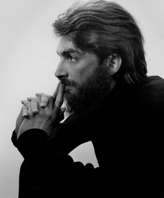
I’ll never forget his searing gaze. Photographer and date unknown. Courtesy Brad Holland.
The post The Daily Heller: Mourning for Brad Holland (Stage One) appeared first on PRINT Magazine.