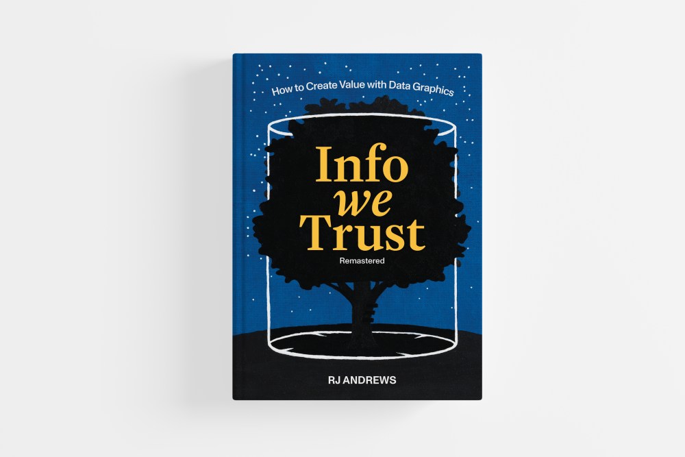
Visionary Press is the concept of data storyteller RJ Andrews, whose latest book, Info We Trust, Remastered, tells tales of the evolution of charts throughout history.
Andrews’ premiere volumes for Visionary Press featured three surprise heroes: Étienne-Jules Marey, who changed not only science, but cinema and art, too; Florence Nightingale, not simply (if such a thing can be called simple) a legendary battlefield nurse, but a keen statistician whose colorful diagrams helped persuade royals and generals to adopt reforms; and Emma Willard, whose maps of history defined chronology for millions of Americans.
On April 17, Andrews will appear as part of the Herb Lubalin Lecture Series to discuss charts “from mere shadows of civilization to potent instruments of persuasion.” The event will be followed by a reception for an associated gallery exhibition that traces the evolution of the book and broadens its lens to celebrate the field of information design as a whole. Works by leading figures such as Shirley Wu, Nadieh Brehmer, Nigel Holmes, Zan Armstrong, Mona Chalabi, Giorgia Lupi, Data Vandals, and Kenneth Field showcase today’s expanding visual vocabulary.
In advance of his latest book, below Andrews and I discuss information versus disinformation (i.e., truth vs. lies).
You titled the book Info We Trust, Remastered. This is an era where the leader of the free world rejects the entire notion of truth. How and where do we find trust in data?
I believe our collective knowledge and ability to help one another navigate the world can always be improved. Today we have more need for this help than ever before.
The book presents a long list of techniques to make information artifacts more trustworthy, but I think you are after something more abstract.
Yes, we are right to be wary, but we ultimately have to work together. We cannot fully know the real world. How could we? Our capacity to understand is limited compared to the vast complexity of reality. We must depend on one another. We cannot grasp it all individually, so we trust in the knowledge of others. Without trust, the house falls down.
What is the goal of this book? Who is your ultimate target?
From the book’s introduction: “What matters is that you are courageously confronting the chaos to improve how people see the world. This is the goal.”
Ambitiously, the project is to elevate the craft of data graphics. To foster more shared understanding. To encourage everyone striving for better ideas about how things are and hold a conviction and hope that further progress is possible.
(Specifically, I wrote the book with two friends in mind. One was an interactive data designer, someone with far more talent than me, who was ignorant of our craft’s deep foundations. The other was a manager at a big tech company who consumed loads of information, but had little appreciation for its construction.)
Infographics are more than trust in information, they’re organizing its transmission to the public. You tell the story through “abstracts of mythology.” Can you explain that concept?
Mythology teaches us how storytelling works and why the sharing of information, through story, is important. The hero’s journey—going out, having a daring adventure, and returning with some treasure for your people—is a fitting model for the data storyteller’s dive into data and production of engaging information.
But other story models, like Ursula Le Guin’s gathering bag model (a community collects gossip and the truth emerges through the evolving relationships of all) or Venkatesh Rao’s boat story (a community embarks on an adventure together) are also compelling.
I’m curious why you used the rough sketch style in the book.
My first batch of illustrations were vector artwork. I showed them to my friend and comics professor Nick Sousanis. Unimpressed, he asked to see my hand-drawn preparatory sketches and encouraged me to use them instead. From there I developed the style of illustration you see.
The roughness of the sketches emphasizes the human craft inherent in data storytelling. Their production, slowly with markers, gave me necessary time away from screens to meditate on the book’s creation. Strategically, they create a unique atmosphere for the volume that differentiates it from previous data-graphic books, in a way that reflects the book’s humanistic spirit, optimistic outlook and timeless perspective.
How do you define your role as a data storyteller, and how far back does this kind of storytelling go?
Information graphics are older than written language. New types of statistical graphics, which we mostly take for granted today, were born from the Enlightenment (and its data).
A choice early example of data storytelling comes from a 1628 application for funding to Isabella of Spain to solve the “longitude problem.” In the letter, Michael Florent van Langren used a dot plot to show the extravagant errors across seven estimates of longitude by various astronomers. Historian Michael Friendly calls it the first statistical graph.
Data storytelling is often defined by its graphic artifacts: charts, maps, diagrams, and so on. But our engagement, the map is stale. It has no life. Does a lonely chart in the woods inform?
It is the lively exchanges these items provoke that make them meaningful. We see the map, a noun, but the verb of seeing matters most. My job as a data storyteller is to create artifacts—experiences—that have a good shot at generating meaning.
You quote Sherlock Holmes saying “Data! Data! Data! I can’t make bricks without clay.” Sounds true enough, but how does it relate to your argument in the book?
Unlike photographs, data stories reveal otherwise invisible phenomena. How else could you see the rise in population or increase in temperature over time?
These magical views are only possible because people in the past decided to encode some aspect of their reality. All data is a shadow of what has flowed before.
You advocate immersing oneself in data or the people who experience what becomes data. How do you go from collection to synthesis to visualization?
Visualization is a thinking tool, a process, that may begin before data collection. We can cartoon what we think things might look like before obtaining necessary data. Doing so helps us document assumptions, wage hypotheses, and think freely about possible designs.
With data in hand, we use visuals to understand it in an iterative process often called exploratory data analysis (EDA). Insights and artifacts form this journey often inspire the polished production of a story worth sharing with others.
Can you explain Visual Encoding?
The modern timeline, where each decade receives the same length of space no matter how busy that time period is, is a rather recent invention. It has helped us manage time across a couple centuries when life seems to be going faster and faster.
Visual encoding translates abstract unseeable values, like time or a country’s GDP, to visual metaphors using familiar channels like position, size and color. For example, we can use a “stack of stuff” metaphor to represent a larger value as a taller rectangle or a more salient color to represent a higher temperature.
You quote Marie Neurath of ISOTYPE fame, that charts have meaning that works for everyone. Is visualization really the way to organize “layers of understanding”?
My favorite data stories begin by forcing you to notice something immediately, usually with some pre-attentive simple comparison like big vs. small. This takeaway is often summarized in the piece’s headline. Then, they go further by showing you the details that add up to the big comparison. For example, seeing the details of pieces that stack to make a tall rectangle.
These details are layers of understanding that you have to choose to read, to engage with. Their presence not only affords opportunities for additional insights, they also encourage greater trust with the summary total.
Much of your book relies on a reading of historical artifacts and precedents. Why is history so important in info that is trustworthy?
It would be strange for a songwriter’s musical knowledge to only span the past decade of hits. In any craft, the historic catalog is essential.
History contains an enormous wealth and diversity of lessons for us to exploit. If a design lesson from an old chart resonates with my own practice today, then I know it has a good shot at being timeless. History also inspires our own work. It tells us that we are part of a rich tradition of visionaries who helped foster better understanding. Its champions, like Florence Nightingale’s decade-long fight for sanitary reform, also remind us that having the right answer is just the beginning. The hard work of graphic advocacy requires us to get those answers in front of the right people, again and again. History encourages us to endure.
Can we reestablish our trust in data and information, especially now that AI and AGI are knocking at our doors?
Trust is never absolutely secured. Trust is fundamentally about the future. It is a reasoned investment in ongoing cooperation.
With AI we have new cooperations to develop, navigate and benefit from. Is it scary? Sure. But it’s exciting too.
In the words of Hobbes (the tiger), “Everything familiar has disappeared! The world looks brand-new! … It’s like having a big white sheet of paper to draw on!” Let’s go exploring.
The post The Daily Heller: Information Trumps Disinformation Every Time appeared first on PRINT Magazine.