Hello hello.
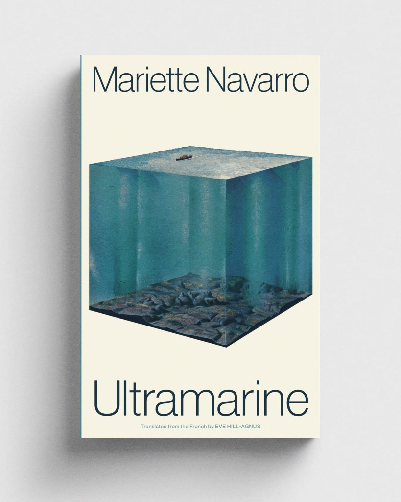
Jolly nice to find my cover for Mariette Navarro’s Ultramarine on Casual Optimist’s Book Covers of Note. Other roundups are available: Literary Hub’s 13 Best Book Covers of March, PRINT’s 20 of the Best Book Covers for March 2025, and Spine’s Book Covers We Love. Am I missing any?
Cover Meeting talks to Sarah Wasley, Production Director and Design Director (aka “the bossy person who sets deadlines”) of Granta Books. Nodding particularly furiously at the bit about the importance of developing a thick skin by working in-house before going freelance, and love that Sarah talks about collecting freelancers like Pokémon.
Cannot wait to get my hands on some of the Penguin Archive, celebrating 90 years of the sphenisciform publisher with new A-format paperback editions of classic texts. Reminiscent of the landmark Great Ideas series, but rather than drawing upon broader book design history, this series references Penguin’s own design heritage. Jim Stoddart talking to The Bookseller back in November:
“The design process has been an extensive fever dream of book covers, old and new. Using typography as the medium to evoke different Penguin eras, we’ve reprised the creativity of many legendary designers involved with creating Penguin’s visual legacy, from the first tentative modernist covers and hand-drawn logos to the highest evocation of type and book design.”
John Self has done a thorough breakdown of the covers on Bluesky. Would love to see them all collected in a big ol’ book alongside the designs they’re referencing – that’d be one hell of a teaching tool.
Actually, talking of hell … the best Penguins are the ones where the logo looks a bit sheepish, like it’s just waddled into shot and isn’t quite sure what to do next, so this one is particularly amazing.
On the Faber blog, Jonny Pelham outlines his process for redesigning three of Samuel Beckett’s most important novels – Molloy, Malone Dies and The Unnamable. Particularly loving the use of Kurt Schwitters.
Elizabeth Goodspeed on why graphic designers can’t stop joking about hating their jobs, how irony became the industry’s dominant tone, and what it might mean to care again.
Cyrillic type samplers designed by Ukrainian graphic artist Oleg Volodymyrovych in 1979, scanned and shared by the lovely P&C.
A new comic book trade association has been formed by the publishers behind The Beano, The Phoenix and 2000AD. Comic Book UK aims to represent the interests of everyone in the British comics industry, to advocate for it as a vital part of the economy, and “make the UK the best place in the world to create, publish and sell comics and graphic novels.”
We visited Newcastle’s Laing Gallery on the weekend and accidentally stumbled upon The Last Ships; an entire room of Chris Killip’s photography documenting the rise and fall of the shipbuilding trade in the North East of England in the 1970s. It is, of course, stunning, but for some reason, it’s barely signposted in any way. What gives?
And if social documentary photography of the North is your cup of tea, Peter Mitchell’s Nothing Last Forever retrospective has arrived at the Photographers’ Gallery.
That is all.
This was originally posted on Meanwhile, a Substack dedicated to inspiration, fascination, and procrastination from the desk of designer Daniel Benneworth-Gray.
Header image by Daniele Levis Pelusi on Unsplash.
The post Meanwhile: Penguin’s Fever Dream appeared first on PRINT Magazine.