How An Architect Maximised Space In This 1960s Apartment
Architecture
This 66-square-metre apartment has been redesigned by CARD architect and co-founder Tahj Rosmarin. Walls painted Dulux Natural White. Accent walls painted Dulux Pre School Half Blues.
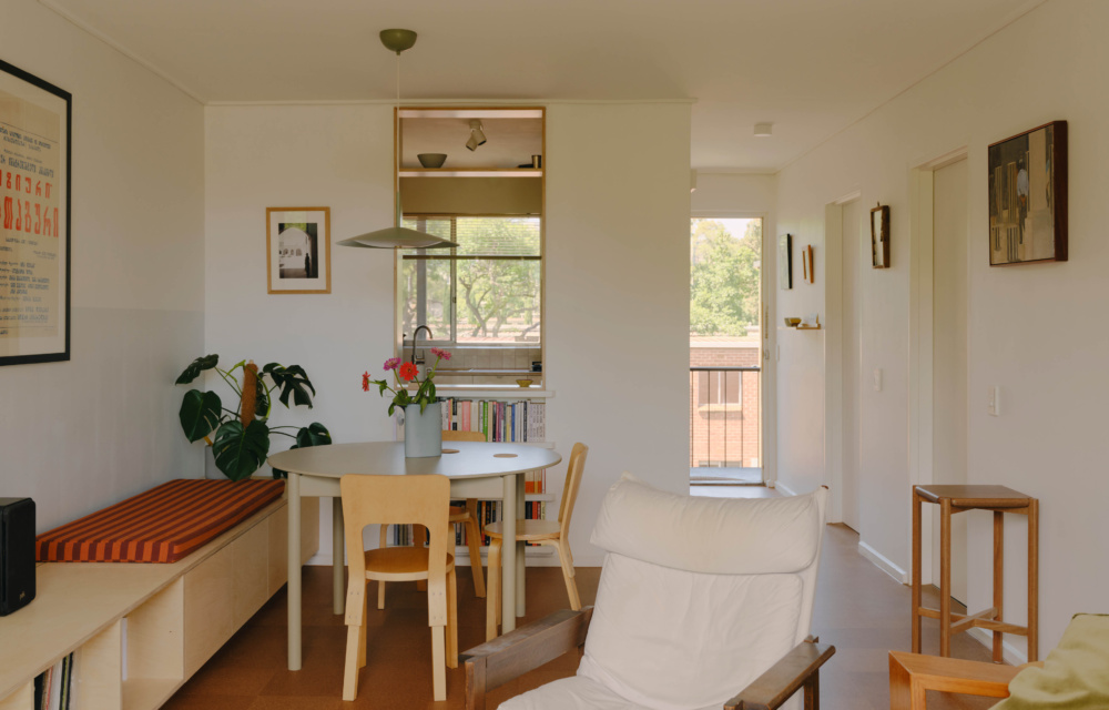
The updated kitchen partition features a tall opening overlooking the living room. Broad Pendant Small in Eucalypt by Coco Flip. Plonk Round Dining Table in Avocado by So Watt.
It offers improved visibility through to the gardens outside, while creating a ‘room within a room’.
Birch Plywood by PLYCO on joinery. Rust Decoply Plywood by PLYCO for kitchen countertop.
The living room opens to a balcony in the treetops. Painting by Gareth Sansom. Sequence Table 01 and Sequence Table 02 by Coco Flip.
A built-in plywood unit provides storage, in addition to creating a banquette seat for the dining nook. Custom cushion from Colombo Sri Lanka.
AJ Table Light by Louis Poulsen from Cult.
Natural Cork by Kustom Floors. Artwork on left by Shanti Shea An.
The Hotham Gardens apartment complex.
ARTEK Chair 66 Alvar Aalto from Anibou.
In the 1960s, the Housing Commission of Victoria worked with a panel of notable mid-century architects to design the Hotham Gardens apartments in North Melbourne.
CARD co-founder Tahj Rosmarin — who recently moved into one of the apartments inside the double-brick building with his partner — says the complex has stood the test of time, largely thanks to its robust structure, ‘solid floor plan’, and considered connection to the surrounding gardens.
‘One of the best parts of the apartment was its natural light. Each room has a window so there is always light coming in,’ the architect says.
‘Being on the top floor of the building also meant it felt very private… like a treehouse. Its balcony is literally in the canopy of a large tree,’ Tahj adds.
But almost six decades since the apartments were first constructed, there was no denying the inner-city home had room for improvement.
‘Certain aspects felt stifling,’ he says. ‘A big one was the layout of the kitchen, which felt pokey and had a strange layout which meant only one person could be in the room at a time.’
A wall between the kitchen and the living room separated the two spaces, with only a low small servery window that didn’t allow for any visual connection. And at just 66 square metres, it was important to maximise every inch of useable space.
‘The idea for the project was to prioritise small furniture interventions and cost-effective upgrades over extensive demolition,’ Tahj says.
This meant thinking about joinery as furniture and infrastructure that could ‘unlock’ increased functionality in each room, with a focus on budget-friendly materials like cork flooring.
In the new and improved kitchen, plywood cabinetry and a red laminate benchtop set the tone for the rest of the playful renovation, as a larger vertical opening was added to the diving wall to create the illusion of ‘a room within a room’ without eating into the floor plan.
Tahj also designed a clever multi-purpose joinery unit that stretches the length of the living room.
‘This long piece of furniture collects precious objects, books, and records and provides long-term storage. But it also creates a dedicated dining nook, removing the need for cluttered furniture or standalone pieces,’ he adds.
The couple were inspired by other enduring compact homes like the Cairo Flats in Melbourne and Le Corbusier’s studio apartment to include subtle colour blocked accents; painting half the walls a soft blue shade.
And while all the integrated storage might have been born out of necessity, displaying all their favourite objects in this way is what gave the little apartment so much character!