We’re doing a bit of catch-up here! A few weeks ago, on LinkedIn, Vocal Type‘s Tré Seals shared his type design work for Prudential, and though the news is not exactly, well, new, we couldn’t pass it up. The 150-year-old financial company had turned to Seals to design a bespoke typeface for Blueprints to Black Wealth, an initiative focused on economic inclusion: financial education, resources, and empowerment for Black Americans.
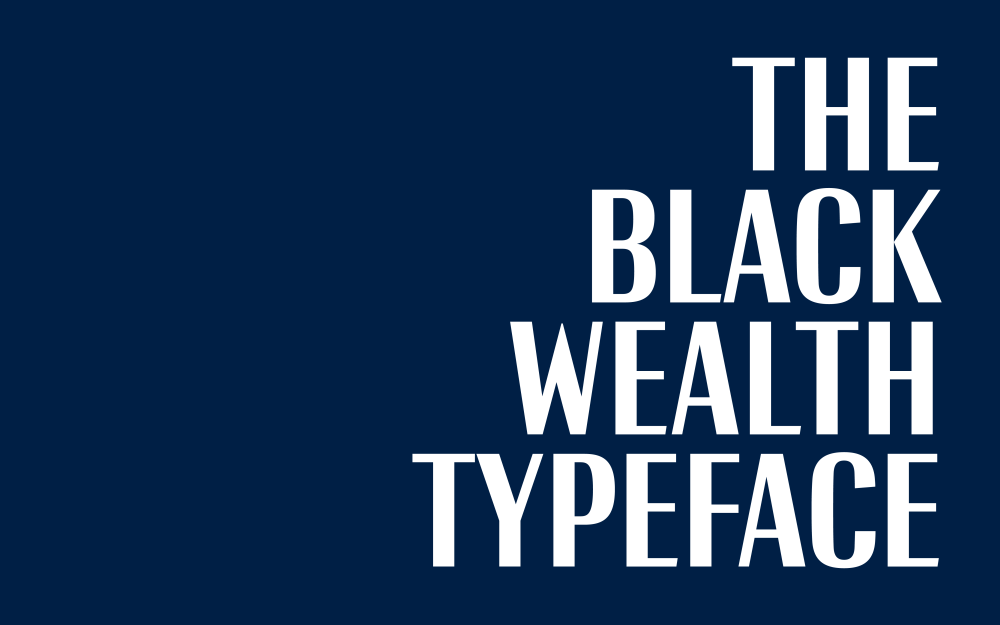
Black Wealth, the typeface, tells a compelling visual story. It’s upright and material, yet elegant. But as with all of Seals’ work, it is worth a closer look. Seemingly small details, like the divet on the capital G, carry forward meaningful and resonant historical sources.
I approached Seals with a few questions about the development of Black Wealth, and he kindly indulged me with a window into his typically thoughtful process.
The Black Wealth typeface as a visual object resonates so closely with Prudential’s Blueprint initiative: standing tall, building on a foundation, growing wealth, legacy. Where did the inspiration start for you? Was it another typeface? A historical artifact? Or was it more of an intuitive visual direction?
The foundation was built on VTC Martin‘s proportions. I decided to use this as a starting point since it was used in an early version of the campaign to test target audiences. This meant they wouldn’t have to reconfigure any of the layouts too much. We based the shapes of the round characters on the tops and bottoms of Prudential’s typeface, Pru Modern, which would eventually be paired with the Black Wealth typeface.
The real conceptual breakthrough came from a poem commissioned for the campaign by Blaq Ice. I stitched together two passages forming the phrase “Standing tall with grit and grace,” which became my North Star. This made me realize that grit is more visible than grace. When it comes to how the Black community is often seen or portrayed, in my opinion, the grit is often what’s most visible – we’re most visible in the grit of sports, the gritty stories portrayed in our music, and the grit required to protest. But how often are we seen or portrayed as graceful? As fragile? As complex humans?
At first, my goal was to display both grit and grace in a single typeface. But as the poem became more refined and the photography started coming in, my goal became about highlighting our grace, fragility, and our humanity, since our grit is visible in so many other places and spaces.
The result was a high-contrast sans serif, representing grace, with condensed proportions so that it felt tall. We also referenced various cultural touchstones, including The Green Book, the 2011 rebrand of Ebony magazine, and book covers from Toni Morrison and James Baldwin.
The real conceptual breakthrough came from a poem commissioned for the campaign by Blaq Ice. I stitched together two passages forming the phrase “Standing tall with grit and grace,” which became my North Star.
Tré Seals
The way you’ve rendered the capital G is very interesting— there’s a sharp divet where the bowl meets the stem. Why the G? And what was your thought process for this detail?
The design of the capital ‘G’ was taken directly from the 1947 issue of The Green Book, a travel guide for African American motorists during the Jim Crow era. Founded by Victor Hugo Green, an African American postal worker, The Green Book helped Black travelers navigate safely by listing businesses and services that would serve them. It became “the bible of black travel during Jim Crow” and represented resilience and community resourcefulness in the face of systematic discrimination. This historical reference felt particularly meaningful for a project about Black wealth and empowerment.
The Negro Motorist Green Book: 1947: A Classified Motorist’s & Tourist’s Guide Covering the United States, 1947 by Victor H. Green, The New York Public Library (public domain)
Are there any other easter eggs in your design?
I’m not sure I’d call them easter eggs, but when designing the uppercase ‘M’ and ‘W’, we looked at a lot of Harlem Renaissance typography, specifically from Aaron Douglas and Winold Reiss. Other than that, we referenced Freight Neo by Joshua Darden as the first recorded Black type designer.
Left: Harlem: a forum of Negro life, vol. 1, no. 1, cover, from 1928, illustrated by Aaron Douglas; Right: Harlem, Mecca of the new Negro, from 1925, illustrated by Winold Reiss; both from the collection of The New York Public Library (public domain)
In our current moment, when our historical record is quite literally being whitewashed, the work of Tré Seals showcases how design can help keep history alive.
For more, check out the “Building Black Wealth” campaign video series in collaboration with Look Listen Studios (in the first, below, Seals talks about the development of the Black Wealth typeface).
The post Tré Seals Leans into Grit and Grace for Prudential’s Black Wealth Typeface appeared first on PRINT Magazine.