Hello hello.
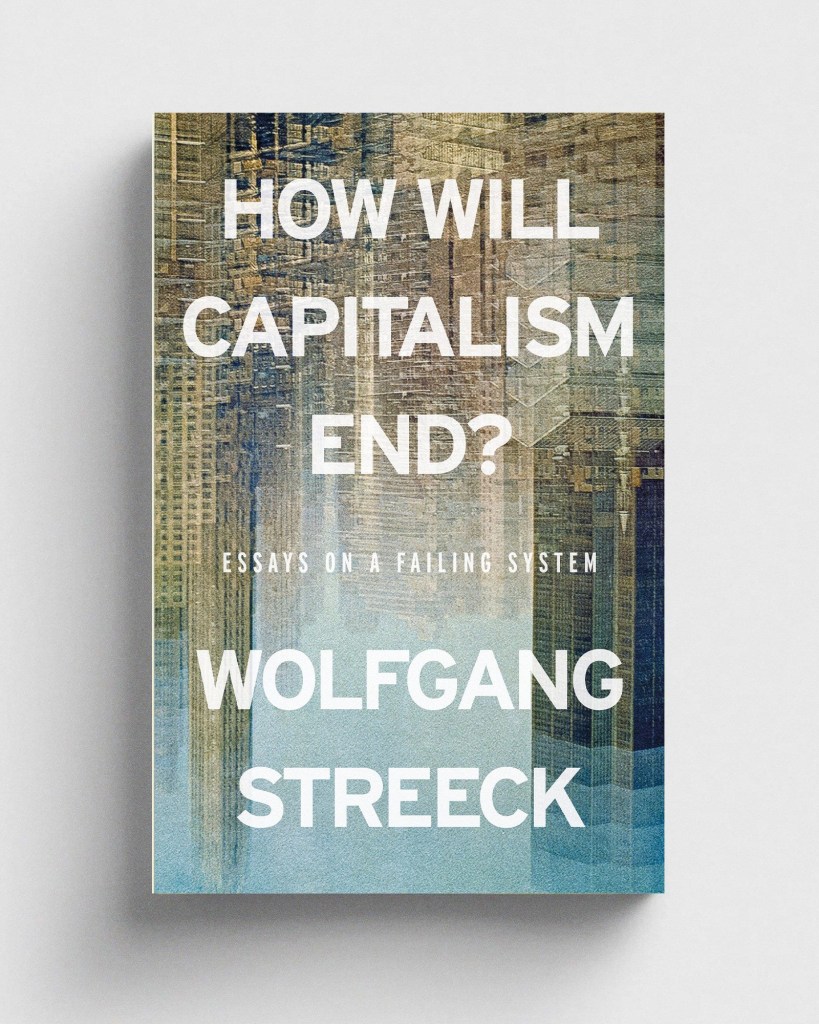
Design for a new edition of Wolfgang Streeck’s How Will Capitalism End?, published by the wonderful folks at Verso. More of this sort of rectangly wordy picture vibe can be found at danielgray.com.
Always pleasing when a job comes along and you realise you have absolutely the perfect research material on your bookshelf that has just been waiting for its moment in the sun. This week I’ve been absolutely battering Alistair Hall’s excellent London Street Signs for a thing and subsequently drawing upon the sign-inspired type from Keith Bate’s foundry K-Type.
Other cities are available … to mark the launch of Field Notes’ spring edition, “The Chicago Look,” a film looking at the work of Beverly Sign Co. Oh, and there’s a book, The Golden Era of Sign Design: The Rediscovered Sketches of Beverly Sign Co.
This passage from Kurt Vonnegut’s 1997 novel Timequake, recently bloosked by John Self, feels exceedingly relevant to the current state of creative affairs:
“People capable of liking some paintings or prints or whatever can rarely do so without knowing something about the artist. Again, the situation is social rather than scientific. Any work of art is half of a conversation between two human beings, and it helps a lot to know who is talking at you. Does he or she have a reputation for seriousness, for religiosity, for suffering, for concupiscence, for rebellion, for sincerity, for jokes? There are virtually no respected paintings made by persons about whom we know zilch. We can even surmise quite a bit about the lives of whoever did the paintings in the caverns underneath Lascaux, France. I dare to suggest that no picture can attract serious attention without a particular sort of human being attached to it in the viewer’s mind. If you are unwilling to claim credit for your pictures, and to say why you hoped others might find them worth examining, there goes the ball game. Pictures are famous for their humanness, and not for their pictureness.”
OOO – a collaborative design exhibition between Tom Etherington and Jon Gray, opens next month at the Old School Gallery in Alnmouth. Can’t wait to see what they’ve conjured up.
A new exhibition in New York explores the work of prestige publisher The Folio Society and celebrates 78 years of visual storytelling through the art of book illustration.
Mike McQuade has a new website for his art and illustration, and good lord, it’s full of so much loveliness. Particularly envious of his ability to name artworks. Somehow, this is always beyond me.
Lots of fantastic work in the Casual Optimist’s latest book covers of note roundup. Looks like type with dots is having a moment.
Buying up South African art since 2004, apparently, Nando’s has one of the largest private art collections in the world and potentially the largest on public display. Huh.
Had a jolly nice time doing this Classic Paperbacks puzzle from Princeton Architectural Press. That’s right, the way I relax when not putting book covers together is … putting book covers together. Ooh, and there’s a cookbook one too …
That is all.
This was originally posted on Meanwhile, a Substack dedicated to inspiration, fascination, and procrastination from the desk of designer Daniel Benneworth-Gray.
Illustration from The Human Soul, 1913 by Hippolyte Baraduc; Boston Public Library / Public Domain Archive.
The post Meanwhile: Humanness not Pictureness appeared first on PRINT Magazine.