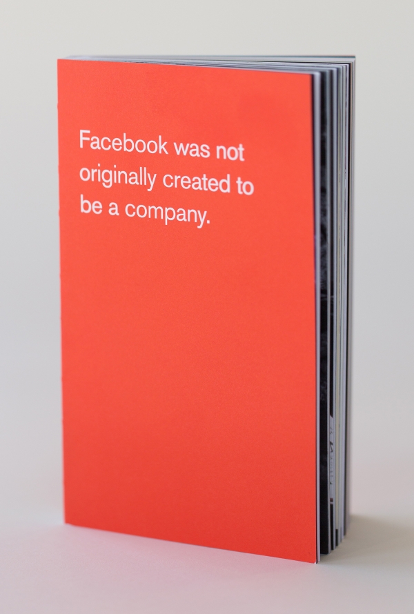
Facebook, it goes without saying, is among the most domineering digital media brands in the world. But it was not intended to become the addictive powerhouse it is today. In fact, Facebook was not originally created to be a company.
In early 2012, tucked into Facebook’s Menlo Park headquarters, you could find an anomalous revolutionary cell called the Analog Research Laboratory, founded by a devout silkscreen printer and old-school graphic designer, Ben Barry. He printed by hand and taught screenprint skills and poster printing to Facebook employees who ventured into his ink-stained playground.
Amid the work that emerged from the lab, there was a modest little book developed in the manner of Marshall McLuhan and Quentin Fiore’s The Medium in the Massage, which, through word and image, explained Facebook’s philosophy—or so its creators believed.
It was a gift meant for internal use only. New employees also received a copy—and I was given one as well. It has been 13 years since it was released, and Facebook has radically and speedily transformed in that time—as have the company’s massive intended and unintended consequences. I recently happened to find my copy after all these years, and felt elation at having rediscovered a rare, telling artifact. I was considering what to write about it when I received a random email from Barry, its co-creator and creative director. Not one to thumb my nose at coincidence as cosmic sign, I replied to Barry and asked him to speak more about the Lab, his departure and the book, Facebook was not originally created to be a company.
You ran a hands-on printing workshop at Facebook. How did such vintage technology meet digital? Was it love at first byte?
It was never my actual job, but I did help co-found the Facebook Analog Research Laboratory with Everett Katigbak. At the time, we were both designers on the communication design team at Facebook. Our jobs involved designing everything at Facebook that wasn’t the product. What that practically meant was designing conferences and events, user education websites, the Facebook blog, marketing illustrations, videos, the office architecture, etc. Everett had a letterpress printing background, and I had a screenprinting background. The Analog Lab grew out of our shared passion for printing, and Facebook’s “hacker” culture. It wasn’t anything we were hired or asked to do, and instead grew organically through our efforts over time.
I did teach many screenprinting workshops for employees. This started after we began making and putting up posters all over the office, and people began coming to us with ideas of other posters they thought we should make. My response was “why don’t you make it? I’ll show you how.” This invitation allowed us to educate, crowdsource ideas, and scale the distribution. One way that these printed artifacts “meet digital” was by being shared through images and videos on social media.
I fell in love with screenprinting during college, specifically at my first internship with The Decoder Ring. Paul Fucik (arts-rec.com) is the one who really taught me how to print.
I recently told the stories of my screenprinting education, founding the Analog Lab, and teaching print workshops in this podcast interview.
Why did you close the shop?
I don’t actually know what led to the decision to close the Analog Lab. I left Facebook Jan. 2, 2014, and I think the lab closed in 2023 or 2024. Scott Boms took over running the lab after Everett and I left, and was there until the lab’s closure.
What was the ethos at Facebook at that time?
Facebook’s mission was always to make the world more open and connected. To give everyone who wants it a voice. Essentially, to democratize access to publishing.
Internally, it had what we called a “hacker” culture. By that, we meant a culture that valued rapidly prototyping ideas and was tolerant of failure. To quickly learn and iterate from real feedback.
You did a lot of your printing in your shop. What are some of the pieces that stand out?
I’m proud of all the work I did there, but I think the simple red type posters were some of the most successful and iconic. These captured, elevated and celebrated internal slogans like “Move Fast & Break Things”* or relevant external slogans like “Done is Better than Perfect.” As organizations grow they begin to institutionalize certain behaviors. We were trying to use art and design to institutionalize ideas like questioning authority and feeling empowered to take risks. To give people permission to behave in certain ways. Ultimately, this was probably an unwinnable battle, but I think we helped stave off the infection for a while.
The poster to commemorate Obama’s visit to Facebook was also a fun one, in part because of the story behind making it.
*The meaning of “Move Fast & Break Things” has been sadly (but understandably) misunderstood externally. It never meant being sloppy, or having low standards, or intentionally breaking things. It meant that the company culture was willing to tolerate some failure in the pursuit of speed. Failing quickly meant learning quickly meant succeeding quickly.
Can you explain why this booklet was produced? Were you helping to define a growing media company?
I think the seed of the idea for the book first came about when Everett and I were helping to design the renovation of the Sun Microsystems campus into what would become Facebook’s long-term home. It felt so huge and corporate to us at the time. Up to that point Facebook had done a remarkable job of retaining its scrappy hacker startup culture. I recall discussing with Everett that after we moved, newly hired employees would have a completely different experience and expectation when starting at the company.
There were so many important company cultural moments that had happened prior to that, which had contributed to making Facebook the company it was. Those stories were scattered across various employees’ posts on the product, the internal Wiki, or just in certain people’s heads. I wanted to take as many of those fragmented pieces as I could and package them into something that could be handed to new employees. Something where we could say, “hey, just read this, and you’ll have a better idea of who we are, what we care about, and most importantly, why.” Part history lesson and part value statement. Again, this was part of the same strategy I had to try and stave off (for as long as possible) corporate mindlessness.
I pitched the idea to a sympathetic friend on the marketing team who helped me secure a printing budget and the help of a talented copywriter (J Smith). J was loaned to us from an ad agency the marketing team was working with on some other initiative at the time. I also pulled in my friend Tim Belonax to help design the book. I had recruited Tim to work at Facebook a year or two earlier (we had done Project M together in 2007). I knew all the people to talk to for stories and content, so I acted as the editor/art director. The three of us designed the entire book over the course of a couple weeks with no oversight. Once we had a pretty solid draft, I showed it to Zuck to get his input and blessing (there were only very minor changes he requested), and then we just printed it. In hindsight, perhaps it was a bit naive, but I still feel incredibly proud of it.
We gave them out by putting them on every employee’s desk the morning of the Facebook IPO. They were also given out to new employees on their first day for several years, I think. There were multiple printings, and at least one version with some updated and additional pages after I had left.
The design and format of the book was heavily inspired by Marshall McLuhan’s The Medium is the Massage. The similarity to Chairman Mao’s “Little Red Book” was totally unintentional, and born out of my ignorance. The book’s cover was red, because it was from the Analog Research Lab, and we had already been producing the red type posters for several years. It felt intuitive to just stick with that. The red for those posters was chosen somewhat arbitrarily, only to be a counterpoint to the blue of the corporate visual identity. I like to think maybe the universe just has a sense of humor.
I recall it being very well received internally, and externally it has also seemed to resonate. Every year or so it seems to be discovered anew and has a brief moment on social media. I think its success is largely because it feels authentic in a way few companies rarely have the courage to communicate.
Why did you eventually leave your position there?
The short answer is frustration with internal politics and the direction Facebook’s external marketing was taking.
I also talked about this decision in more detail in this interview.
The post The Daily Heller: And the Word Was Facebook appeared first on PRINT Magazine.