PRINT Awards Professional Honorees in Illustration, Handlettering, Type, Graphic Novels, Citizen Design, and Design for Social Impact
The winning work in these categories extended the limits of line, shape, and expanded our concepts of design as a beacon of change. Our 2025 PRINT jury brought varied experiences and professional pedigrees to review entries in these diverse design categories. In Illustration, Handlettering, and Type, Paul Peart-Smith, Edel Rodriguez, and Alice Li lent their voice and vision. Marisa Sanchez-Dunning, Silas Munro, and Eleazar Ruiz considered designs for social impact. Projects submitted to our Citizen Design category were carefully considered by Jennifer Rittner, Amos Paul Kennedy, Jr., and Janell Nelson.
Learn more about this boundary-pushing, award-winning work below.
Illustration
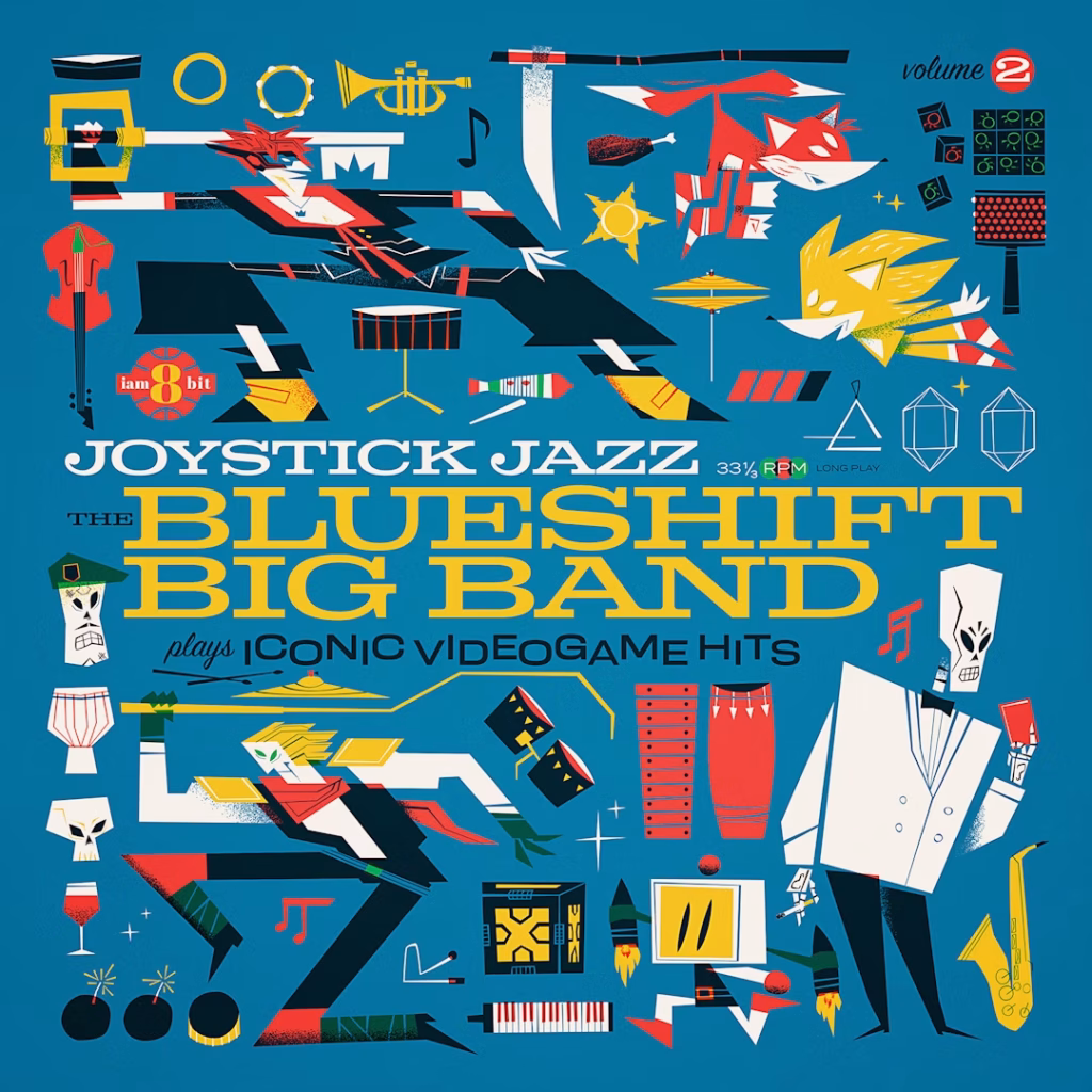
First Place – Joystick Jazz vol.2
HandMade Monsters – Mark Borgions
This vinyl record cover art represents the big band interpretations of classic video game tunes. The album’s music is by the Blueshift Big Band. The release is produced by the production company iam8bit in Los Angeles.
This volume is the second release in a series where the artwork depicts characters and props from the included franchises, balanced with musical instruments, all subscribing to the style of the music. The art is produced straight to digital with a limited color scheme (yellow, red, green, cyan), all 100% flat color and their blending, with minor shadow grain. The artwork includes front and back cover, front and back inner sleeve, and labels for this single record release.
Second Place – Ferny’s House
Stout Collective – Max Hauler
Stout Collective teamed up with Blue Label Packaging Co. to create a custom series of can designs showcasing their new digital printing system. Centered around the concept of “Fern,” the team developed four fictional beverage brands: an alcoholic RTD, a wine, a regional beer, and a trendy beer — each with its own unique identity and aesthetic.
The standout among them, “Ferny’s House,” is the trendy beer label, imagined as the creation of Gabrielle Ferny — a horticulturist-turned-brewer known for staying ahead of the curve. Her beers are bright, easy-drinking, and made with ultra-fresh hops. The label design is packed with playful detail: a lush garden filled with tiny alien creatures, inspired by Where’s Waldo, each engaged in its own quirky activity, offering a new surprise every time you look.
Third Place – Joystick Jazz vol.3
HandMade Monsters – Mark Borgions
This vinyl cover art represents an album of big band interpretations of classic video game tunes. In this volume — the third in a series — all the music is from Mario Bros games.
Like its first place-winning counterpart, the album’s artwork depicts characters and props from the franchise, balanced with musical instruments, all subscribing to the style of the music.
Design for Social Impact
First Place – GREATNESS: Diverse Designers of Architecture
Beyond the Built Environment – Jason Murphy
GREATNESS: Diverse Designers of Architecture is a groundbreaking publication by Pascale Sablan that redefines what excellence looks like in the architectural profession. More than just a book, it is a manifesto for equity and representation, featuring essays, case studies, and profiles of 47 architects and designers from diverse backgrounds. These professionals are not only shaping the built environment in bold and innovative ways but are also addressing urgent social issues through their work, from housing injustice to environmental sustainability.
Designed to mirror the values it champions, GREATNESS is vibrant, accessible, and intentionally inclusive — from its golden-foil title and dynamic layouts to a production team composed entirely of women and people of color. As part of a broader movement that includes over 50 SAY IT LOUD exhibitions and the Great Diverse Designers Library, this book is both a celebration and a call to action. It invites the industry to recognize the indispensable contributions of diverse voices and challenges us all to build a more just and inclusive future through design.
Second Place – Mammogram Awareness Posters
MBB – Rob Mitchell
A mammogram is one of the most important preventative screening measures a woman can take. Unfortunately, it is rarely marketed in a way that captures attention or in a way that truly conveys the ease and simplicity of having it done. For breast cancer awareness month, MBB set out to encourage all the women in the agency to schedule their screenings.
Utilizing a bold color palette and celebrating the advancements in earlier detection due to 3-D technology, the team put posters around the agency with fun and engaging headlines designed to garner both interest and action.
Third Place – ADL Impact: Ensuring Community Safety
Group SJR – Rick Slusher
The Anti-Defamation League (ADL), a nonprofit committed to fighting antisemitism and all forms of hate, partnered with a creative team to develop a new content series that brings its mission to life through real-world stories. Designed to showcase ADL’s ongoing impact through education, advocacy, and community partnerships, the series presents authentic narratives of change and resilience.
Titled Impact Stories, the series blends video interviews with hand-drawn illustrations to convey the emotional depth of individuals confronting bias, bigotry, and discrimination. Watercolor splashes layered beneath the animated linework add a sense of urgency and humanity to each story. The first installment spotlights ADL’s Center on Extremism and its role in tracking down those responsible for antisemitic “swatting” attacks. Through the perspective of a targeted Rabbi, the story reveals both the danger of these hate-fueled acts and ADL’s critical work in pursuing justice.
Citizen Design
First Place – CHARACTERS: Type In Action
Throughout history, typography has played a pivotal role in the ongoing pursuit of freedom—sometimes leading the charge, other times operating quietly in the background. CHARACTERS is an exhibition that explores this dynamic through typefaces from the Vocal Type catalog, each inspired by Black history and serving as a lens to examine how typography has been used both to oppress and to liberate.
The Atlanta installation of CHARACTERS, hosted by the Museum of Design Atlanta (MODA), reframes typography as an active witness to and agent of change. Set in a city deeply entwined with civil rights history, the exhibition delves into Atlanta’s local narratives—from student-led protests to grassroots journalism—using letterforms to spotlight stories of resistance and expression. By integrating hand-crafted materials and interactive elements, the show invites visitors to see typography not as neutral design, but as a powerful cultural and political force.
Second Place – ANKA
Doga Bircan LLC – Doga Bircan
ANKA is a play-focused organization that provides emergency support for children displaced by disasters and crises. Named after the phoenix, it symbolizes resilience and rebirth, offering children a way to rebuild their sense of safety and identity through play. With thoughtfully designed play sets and strategic planning, ANKA aims to be the first organization to integrate play into disaster relief efforts, helping kids not only recover but rediscover the joy of being a child.
Designed for rapid deployment and adaptability, ANKA’s play systems are fast, flexible, and easy to integrate into disaster preparedness plans led by local agencies and governments. Its first play set, “Draw&Build,” includes paper pieces and crayons that allow children to color, draw, and build creations, encouraging emotional expression and storytelling. Compact and portable, the packaging transforms into a carry bag, complete with a name tag for personalization and a caregiver guide with emergency contacts. Mirroring the play sets, ANKA’s brand identity is warm, playful, and rooted in a childlike illustration style that reinforces its mission: to restore joy, trust, and community for children, wherever crisis may strike.
Third Place – The Vocal Civilian
The Vocal Civilian newspaper extends the CHARACTERS exhibition beyond the gallery, transforming typography into a shareable, physical medium. Created by Vocal Type and Built by Civilization, the paper explores voice, power, and representation. Its masthead features VTC Garibaldi, inspired by the anti-Fascist paper Il Combattente, linking the project to a legacy of resistance through type.
Custom dispensers and modular design allow the newspaper to reach wider audiences, including schools and small institutions. A standout article distinguishes between citizens and civilians, questioning who has the privilege to be vocal. Through both content and form, The Vocal Civilian positions typography as a living tool for social change.
Graphic Novels
First Place – Coca-Cola Southwest Beverages Safety Comic Book
*Trace Element – Katie Kitchens
Coca-Cola Southwest Beverages, one of the largest Coca-Cola bottlers in the world, employs thousands of workers across numerous facilities in the Southwestern United States and maintains a deep commitment to workplace safety. To help reinforce their 14 Life Saving Rules, the company partnered with a creative team to develop engaging, memorable communications. In the first phase, a series of comic-book-style posters were designed and displayed in employee hallways to bring each safety rule to life.
Expanding on that initiative, the team developed a follow-up in the form of a “nap-mare” comic book, turning the safety rules into a narrative where zombie-like workers place safety in jeopardy. The storyline added humor and urgency while reinforcing key behaviors. The printed comics were distributed to all employees and incorporated into Coca-Cola Southwest Beverages’ onboarding packets, making safety education both impactful and accessible.
Second Place – A.C. 2020
Mirko Ilić originally created this series to express the anxiety and uncertainty caused by the COVID-19 pandemic. Over time, within the same series, he also began to address other anxieties and visual observations. Each visual essay consists of self-contained single-page stories created in greyish-blue tones to reflect the subject.
Handlettering
First Place – Arabic Lettering Posters
Arabic Lettering Workshop – Wael Morcos
These three posters promote the Arabic Lettering Workshops, an ongoing series that explores the expressive range of Arabic script through shifting thematic lenses. Each poster features the same title—”Arabic Lettering Workshop”—rendered in a graphic style that reflects the spirit of the specific session, functioning as both advertisement and conceptual extension.
Workshop #18 focuses on typographic deconstruction, using geometric and graphical elements as core components. Workshop #19 takes visual cues from Saloua Raouda Choucair’s stacked wooden sculptures, translating their form into lettered composition. Workshop #20 highlights playfulness and the creative basics, celebrating experimentation and the joy of making.
Second Place – Three Wide Brewing Co.
Caliber Creative – Brandon Murphy
The Three Wide Brewing Co. logo was designed to capture the bold, dynamic personality of the brand through custom hand lettering. The lettering features sharp, angular shapes that evoke a sense of irregularity and individuality, perfectly reflecting the brewery’s motto, “all characters welcome.” The unique, exaggerated letterforms give the logo a modern yet playful feel, making it both eye-catching and memorable.
The custom typography ensures that the brand stands out in a competitive craft beer market while also emphasizing the brewery’s commitment to celebrating diversity and creativity. This lettering is not only a reflection of the brewery’s ethos but also a playful variety of logo lockups that allows for the brand to live on any canvas— whether that be on glasses, merchandise, outside signage, or a responsive website.
Third Place – Cicada: Dual Emergence 2024
Dreyer – Marguerite Dreyer
In the summer of 2024, two distinct populations of periodical cicadas—Brood XIII and Brood XIX—emerged simultaneously in a rare natural event known as a dual emergence, which occurs only once every 221 years. To commemorate this extraordinary phenomenon and promote environmental awareness, a series of limited-edition letterpress posters was created. These prints aim to highlight the ecological significance of the event while encouraging reflection on the interconnectedness of natural cycles and environmental stewardship.
The posters were designed in the style of 1960s and ’70s San Francisco rock concert posters, drawing inspiration from Art Nouveau for both composition and typography. Custom lettering, adapted from historical references, was paired with Jonathan Hoefler’s Champion Gothic Featherweight and unified by a recurring titling ampersand. Blue and green color fields represent the two cicada broods. Printed on a Vandercook press, each of the 32 prints—an edition number derived from the sum of Broods 13 and 19—is unique. The posters have been accepted into juried exhibitions and will be featured in the AHFE 2024 Conference Proceedings as part of a published book chapter.
Type Design
First Place – Growtown
Growtown, a cannabis brand known for its connoisseur-grade products, enlisted Frontier for a comprehensive rebrand, spanning strategy, naming, product architecture, and visual identity. The new brand celebrates the spirit of experimentation behind each product, embracing the idea of cannabis creators as modern-day mad scientists.
Key elements of the identity include a custom hand-lettered wordmark and a suite of illustrations in a matching style. The brand uses the metaphor of a town to organize its product lines into distinct “districts,” such as Central Station for beginners and the Emporium for more specialized offerings. Each illustration captures the vibrancy and curiosity that define Growtown’s approach.
Second Place – Sharp Serif Text & Display
Sharp Type – Lucas Sharp
Sharp Serif is a contemporary serif typeface rooted in the classical traditions of 15th-century Italian and French Renaissance typography. Designed by Lucas Sharp as his second serif textface, it blends historical reverence with modern accessibility. Sharp Serif OmniLatin includes a comprehensive Latin character set that supports a wide range of underrepresented languages, alongside Greek and Cyrillic scripts, each drawn in tandem to ensure cohesion across the Pan-European character set.
The display counterpart, Sharp Serif Display, takes a bold approach to optical sizing by merging the utilitarian forms of stencil typography with refined, high-contrast serif aesthetics. While stencils originated from practical needs—like fast lettering on irregular surfaces—their distinct shapes have earned a lasting place in the visual language of type. In a market saturated with sans serifs, Sharp Serif stands out as a thoughtful return to the expressive potential of the serif genre, offering a design that informs rather than sells.
Third Place – Rosalie
Sharp Type – My-Lan Thuong
This refined display serif is the result of years of meticulous development, balancing aesthetic precision with a deeply intentional character set. Inspired by a medieval mural in Guérande, France, the typeface explores striking polarities—merging historical references with contemporary sensibilities, sharp angles with soft curves, and calligraphic elegance with structural clarity.
Over six years, the design evolved into a distinctive typeface marked by high contrast, expressive swashes, and unconventional proportions. Motivated by a commitment to linguistic inclusivity, the designer collaborated with regional experts to build an extensive Latin character set. The result supports over 800 languages, including hundreds of African and Indigenous North American languages, expanding typographic access across diverse global communities.
We’re celebrating the PRINT Awards Honorees all week! Next up: Professional In-House, Self-Promos, Invitations, Website & App Design, Social Media & Content Design, Motion Graphics & Video, Environmental Design, Data Visualization & Information Design, Outdoor & Billboards, and Posters.
Learn more about the PRINT Awards Honorees in Brand Identity & Identity Systems, Brand Campaigns, Branding Collaborations, Logo Design, and Packaging Design.
Visit the PRINT Awards Gallery to see all the work from this year’s competition.
The post Our 2025 PRINT Awards Honorees Push the Boundaries of Letterforms, Linework, and Design for Change appeared first on PRINT Magazine.