I thought I had received an email from a ghost. The sender was David King, who I naturally mistook for … David King—the UK graphic designer, magazine and book editor, and collector/scholar who died in 2016 at 73. (As The New York Times noted at the time, he had amassed “a trove of Soviet political art” that was donated to the Tate.) I was ruefully unaware of the actual sender, the other UK-born, San Francisco-based graphic designer, David (Dave) King, who had designed the enduring emblem for the punk band Crass in 1977. I was also woefully ignorant of the image and King’s work for bands and social activism at large.
This Dave King was amused and forgiving. In fact, he requested that I write a foreword for his book David King Stencils: Past, Present and Crass, published by Gingko Press, which included the mark, variations thereof and other powerful street and political art icons. I was a bit unnerved: The David King I knew was well-known for his anti-aparthied and anti-fascist posters in England, while the Dave King I did not know created anti-war, anti-rascist and anti-capitalist marks and posters in the United States, including a brilliant Mickey Mouse–as-hammer-and-sickle.
I was just finishing my own book The Swastika and Other Hate Symbols, and Dave King’s stencil imagery fit precisely into what I was already writing about—visual inoculation against the white extremist virus.
I gladly accepted his invitation. He graciously accepted my ignorance of him, Crass and punk history in general. He requested that I focus on the power of the symbol, “perhaps downplay the band itself, to the extent that it’s possible to separate the band from its symbol; “include reference to other content of the book in terms of design approach and use of the stencil medium,” which was fortuitous, since I had just finished a book on stencil type. Although he made clear that “in my mind the book is a lot about the stencil technique itself as well as the subject matter. … The technique greatly affects how a piece is designed. We’ve included the stencils themselves and shown them before they’re used and after, covered in spray paint. There is a lush tactility to the layered paint that is its own appealing aesthetic. At least to me! The Crass symbol is the hook but not the whole story.” So I wrote a foreword that made me proud.
Months later in 2019, I received the printed book in the mail. I also learned that Dave King had died at 71. We never got the chance to meet in person.
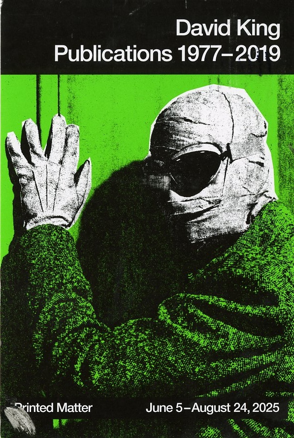
At the beginning of June I received an announcement that the legendary Printed Matter artists’ book and periodical store was opening an exhibition of King’s publications, club flyers, advertisements and original stencils used during the course of his career. These days my gallery hopping is limited, but this slice of design history was a must-see. I am grateful King gave me an opportunity to have a small part in commenting on his legacy.
The following essay about King and the Crass emblem includes excerpts from an interview we did together and the foreword I wrote:
The logo for the punk band Crass (1977–1984), designed by Dave King … is explosive and memorable. He equates his design with the ubiquitous Campaign for Nuclear Disarmament (CND) logo, best known as the “peace sign,” inspired by Bertrand Russell and designed in the UK by Gerald Holtom in 1958. The peace sign echoes an early Christian-era mark called the crow’s foot, and it became the primary ban-the-bomb protest symbol in the early 1960s. (Another origin story posits that the CND symbol is the combination of two semaphore signs for ‘N’ and ‘D,’ implying the crow’s foot was a coincidence.)
“The symbol later evolved into the emblem for the emergent anti–Vietnam War peace movement and has retained its vitality for over 60 years. The Crass logo has a similar trajectory. It is a peace symbol for punks,” King told me. “In fact I discovered years later that the peace symbol nestles within the Crass one,” he added. In 1977 King designed the original symbol for an agitprop pamphlet railing against the British church and state titled “Christ’s Reality Asylum.” Fifty copies were printed on a Gestetner copier. The type and logo were spray-painted on a gray cardboard cover using hand-cut stencils. “The design was specifically wrought to be stenciled,” he explained, “what lends it resonance I think is having a double-headed snake and the strong, negating diagonal at the heart.”
Later the same year the pamphlet’s author, Penny Rimbaud, co-founded Crass and applied the mark as the band’s symbol. “It fit neatly and dramatically on the bass drum,” King said. His design deliberately takes chances with double-edged symbolic elements. An alternative version of the mythic ouroboros, a snake eating its own tail, is rendered as two legs of a sun-cross, intertwined with a symmetrical Celtic or Christian cross also commonly found in ultra-right-wing emblems. In the war of ideological signs and symbols, this can be a confusing signal—but the result, like a vaccination, uses some of the disease to create immunity. This is why King’s logo, like the peace sign, has achieved the transcendent status he very much wanted. King designed the Crass logo to attack the very images it co-opts. The band advocated anti-fascist, anti-capitalist, anti-establishment, anarchic action, and King’s work in general, through prodigious stenciling and spray-painting, “is an antidote to the symbolic bombardment from the middle and far right.”
The Printed Matter exhibition (on view until Aug. 24) is a well-deserved testament to a significant figure in art and design history—and it is not to be missed.
The post The Daily Heller: The Other David King appeared first on PRINT Magazine.