Logos are visual representations of a brand that help establish recognition in the target market and among its audience. Since logos are designed for a specific target audience, their designs evolve. For instance, today’s logos are minimalist, while ‘90s logo designs were often bold and cluttered, reflecting the aesthetics of that era.
It is interesting to examine the logos from the 1990s era, as they reveal a unique combination of color and typeface choices that were crucial design elements of the time. These logos also serve as inspiration for those seeking a retro-style logo design through a logo design service or AI logo generator.
Here are 20 memorable logos from the ‘90s for your inspiration
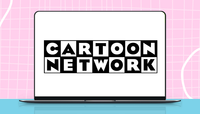
1. Cartoon Network
The Cartoon Network is an iconic logo from the ‘90s era. An attractive feature of the logo is that it is composed of squares for each letter of the brand name. The letters are alternatively in black and white blocks, which gives the logo a playful nature.
Today, the logo has been simplified to just ‘CN’.
2. Nickelodeon
The Nickelodeon logo featured a bright orange splat behind white, which conveys cheerfulness and energy. The brand name was positioned in the center, accompanied by a custom sans-serif typeface in white, which gave the logo a unique look.
3. MTV
MTV’s iconic logo featured a bold “M” letter with a graffiti-style “TV” on the side. The logo was one of the ‘90s symbols that played a crucial role in capturing the attention of young audiences. There is a predominant M size that represents the ‘Music Television.’’
4. Microsoft Windows
The Microsoft Windows logo is among the most iconic logos of the 1990s era. All the typical features of the logo are present in this design. There are multiple colors, with larger window elements. The four quadrants, in red, green, blue, and yellow, along with pixelated effects and a flowing black background. It became a lasting symbol of the digital revolution.
5. Apple
The ’90s logo design of the tech giant Apple featured a rainbow color palette and a minimal silhouette. This iconic logo has undergone significant changes since then, and it is now a simple black-colored logo.
6. Friends
Friends was among the most popular sitcoms of the 90s era. Its logo features six colorful dots between each letter, representing the distinctive personalities of each of the six friends in the show. The handwritten font reflects the casual and informal attitude of the friends.
7. Barbie
The Barbie logo in the 1990s featured a bold, cursive font in hot pink. Its hot pink color reflects the femininity and innocence of the children who play with these dolls. The bold custom font of the brand name in cursive script draws attention. Another chief feature of the logo is that the brand name has an upward slant, which makes it unique.
8. Burger King
The Burger King logo is an iconic burger-shaped 1990s logo. The logo was designed to resemble a sandwich—with the brand name ‘Burger King’ placed between two buns. Its unique creation was intended to resemble a giant-sized burger. The emblem features vibrant red and dark yellow colors.
9. Walkman
The Sony Walkman logo was famous for its ‘W’ shape in black, which represented the brand name. Beneath this icon was the brand name in joined letters, which reflected the love and connection people have with music.
10. PlayStation
The PlayStation logo is a quintessential representation of the 1990s era. Its logo features bold colors, with the red ‘P’ letter standing tall and the twisting ‘S’ in yellow, blue, and green. A 3D effect can also be noticed, which was a favorite of the decade. The logo was more than just a gaming symbol, as it successfully captured the excitement of the decade for this new technology-driven entertainment.
11. Saved by the Bell
This sitcom’s circular logo used bright, mismatched typefaces to reflect teen culture.
The playful use of colors and oversized letters hinted at its youth-focused content.
Saved by the Bell was an American teen sitcom that followed six teenagers as they spent their lives in the Pacific Palisades area. The sitcom’s logo is circular, reflecting its lighthearted and fun nature.
It consisted of handwritten typefaces with large letters of different shapes, indicating that the sitcom was intended for children. Its use of bright colors also reflected the fun nature of the sitcom.
12. Sweet Tarts
The Sweet Tarts logo is a wordmark featuring the brand name in pink and blue colors. Its chief feature is that the letter T in the middle is in both colors. This refers to the sweet and tart flavors of the tarts.
There is a descriptor ‘’tangy candy’’ at the top right corner of the logo in lowercase letters. But the letter N is in uppercase to indicate playfulness, as the target audience is children.
13. Baby Bottle Pop
The Baby Bottle Pop logo is for a candy maker brand. The wordmark is in neon colors, featuring a baby bottle cap at the top right corner. Then, there are chalk-like lines that form the boundaries of the logo space, giving the impression that a child draws them.
14. Toys R Us
The Toys R Us logo from the 1990s features multiple colours, reflecting the playfulness typically associated with children and toys. The company logo targets young people. A chief attraction of the logo was the backward ‘R’ letter, which showcased the playful nature of children.
15. Hot Wheels
The Hot Wheels logo features a generous use of red and yellow-orange colors, which are associated with flames. The company previously had a plain lettering logo in white. Later, in the 1990s, the emblem adopted a custom font. The logo design is a flat design with a thin black outline.
16. Teenage Mutant Ninja Turtles
The Teenage Mutant Ninja Turtles is an American media franchise known for its four anthropomorphic turtle brothers as comic book heroes. Its logo features large green letters that resemble the turtles and the characters.
17. Seinfeld
The Seinfeld logo is in a serif font that appears slightly italicized. The brand name in red shines brightly against the oval-shaped yellow background. This dramatic combination of red and yellow reflects the quirky and comedic nature of the show. The yellow oval shape in the background highlights the show’s storyteller Jerry Seinfeld.
18. The Fresh Prince of Bel-Air
The Fresh Prince of Bel-Air is an American sitcom. Its logo features the brand name in display font, inspired by graffiti art. The show revolves around a teenager from West Philadelphia who moves in with his wealthy uncle. The graffiti element in the logo represents the teenager, while the serif fonts are for the rich family members.
19. Bubble Tape
The Wrigley’s candy logo features a handwritten, comic-style, bubbly typeface. There is the extended letter e at the end of the word. That reflects the tape-like bubble gum. The logo features multiple colors, reflecting the excitement of the target audience of preteen children.
20. Crush Pop
The Crush logo features a playful use of colors that reflects the spirit of the 90s. As a soda drink, the yellow, white, and red colors give the logo a refreshing appearance. The exaggerated shapes help catch the attention.
These are some of the memorable logo designs from the 1990s. Based on these designs, the bright and neon color combination was a hallmark of the era. These colors were eye-catching and generated a sense of excitement. Bold typography and a graffiti style, featuring round and abstract shapes, were the hallmarks of the 90s.
If you need a retro logo design, Designhill, the leading creative marketplace, can help. You can launch a logo design contest and get dozens of unique design ideas from the designers on the site. Alternatively, you can work with a talented designer from this marketplace to get a customized logo for your brand. You can also explore its logo generator to create multiple logo ideas.
Wrapping Up
The ‘90s were a vibrant era for logo design, filled with experiment and personality. Many of these logos continue to inspire logo designers and brands today. If you’re planning a retro-themed brand or want to evoke nostalgia, these iconic logos are perfect reference points.

