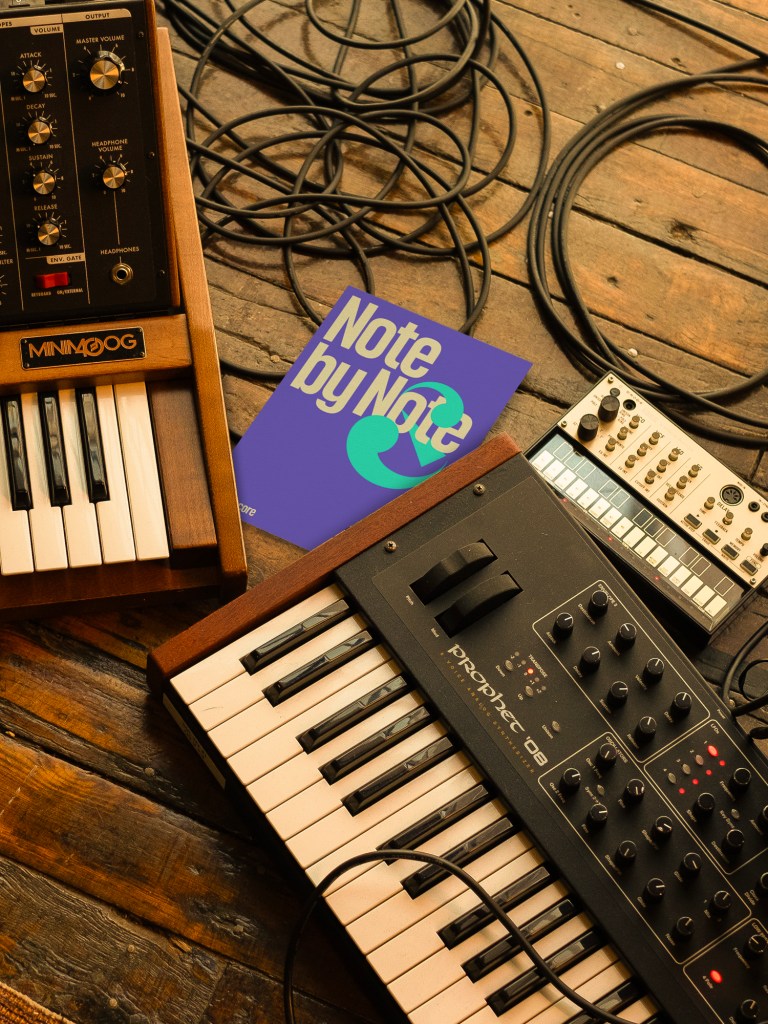
In the vast and often noisy world of music tech, Muse Group has quietly been building something remarkable. With over 400 million users across beloved tools like Ultimate Guitar, MuseScore, Audacity, and MuseClass, they’ve become a global leader — without a brand most people could name. That changed with the help of COLLINS, the design and strategy firm known for making the invisible not only visible, but unforgettable. Together, they took on a bold challenge: to unify Muse’s fragmented portfolio into a single, emotionally resonant identity, and, more importantly, to close what Muse called “the gap” between creative ambition and confident expression.
The result is a reimagining of Muse as a Creative Fluency Company — a brand not just about software, but about unlocking artistic flow. With a new purpose (“Inspire the artist. Unleash their sound.”), a visual language that pulses like soundwaves, and a system that stretches across every product touchpoint, Muse is now poised to empower the next generation of creators. I spoke with Nick Ace, chief creative officer at COLLINS, about the thinking behind the work, the design decisions that shaped it, and how branding can play a deeper, more human role in the creative process.
… we wanted to capture something more fundamental: the feeling of musical creation in itself.
(Conversation lightly edited for length and clarity.)
Muse aimed to bridge “the gap” between ambition and expressive ability, an idea many creatives can relate to. How did your team engage with that tension during the design process?
Ah, tension!
“The gap,” as defined by Muse Group, is that frustrating space between ambition and the ability to express it. This gap suggests why 90% of guitarists abandon their instruments within a year. Muse Group recognized its role was not just a software provider, but as a bridge spanning this critical divide.
We worked with Muse Group to articulate and focus their real purpose: What we ended up calling Creative Fluency. Muse is dedicated to helping anyone achieve a state where playing and creating music becomes second nature. This reimagination of their brand needed to communicate this ambition while unifying a diverse product ecosystem under a coherent identity that could grow with their expanding platform.
The reframing of Muse as a “Creative Fluency Company” feels more behavioral than categorical. What inspired this shift from tool-based branding to a more psychological, almost pedagogical position?
Muse has had no trouble getting people to try their tools—they’re inviting and intuitive. In most cases, it takes about ten minutes to grasp the basics. Our aim was to inspire people to keep learning and expand beyond just knowing how to use their tools into understanding them as second nature. We want technical barriers and structures to dissolve into musical flow states.
Creative Fluency isn’t something you can simply communicate to customers; it requires shared organizational understanding so that everyone working on Muse Group’s products and marketing recognizes this is the real end goal.
Suprematism, musical notation, and sonic vibration are abstract yet emotionally potent sources. How did you translate those references into a coherent and accessible visual language without alienating everyday musicians?
We love Kazimir Malevich. In his Suprematism manifesto, Malevich declared: “Under Suprematism I understand the primacy of pure feeling in creative art. To the Suprematist, the visual phenomena of the objective world are, in themselves, meaningless; the significant thing is feeling, as such, quite apart from the environment in which it is called forth.”
That’s where we began.
His philosophy aligned perfectly with Muse Group’s ambition and the purpose behind Creative Fluency. Just as Suprematism sought to transcend literal representation in favor of pure emotional expression, we wanted to capture something more fundamental: the feeling of musical creation in itself. A big ambition, but there it is.
Why think small?
The way we see it, mirroring common genre aesthetics and familiar tropes is alienating. It tells people exactly what to feel rather than inspiring them to find their own, new understanding.. While others emphasize complicated engineering or complex tool precision, Muse Group’s identity takes a different approach. Instead of showcasing technical specifications or ridiculously complicated interfaces, we center the story around the raw experience of musical creation. Rather than depicting the many tools, we visualize the outcomes—resonance, harmony, and breakthroughs that happen when technical barriers dissolve.
Muse Group is not just a “software company.” It is a vital creative partner in making music. And that emotional resonance is a key part of it.
To that end, we’ve applied Suprematist principles in our thinking:
Geometric Abstraction: Logo and visual elements employ simple geometric forms suggesting movement and harmony without literally depicting musical instruments, notation or interfaces.
Dynamic Compositions: Element interactions reflect Suprematist spatial relationships and visual tension.
Color as Emotion: The palette prioritizes emotional resonance over representational accuracy, using color to suggest creative states.
Reduction to Essence: Like Malevich’s reduction of art to fundamental shapes and colors, we distilled the brand to essential elements—seeking a more direct experience of learning and playing.
Floating Elements: Visual components exist in, say, a “non-gravitational’ space. We love Suprematist compositions where forms exist in abstract visual relationships.
From legacy tools like Audacity to newer platforms like MuseClass, Muse’s portfolio spans generations of creators. How did you design a unified identity that could speak both to seasoned users and first-time learners without diluting the brand’s emotional power?
We worked to serve dual purposes: unifying diverse products under one recognizable Muse system while allowing each app to speak to its distinct audiences.
Rather than applying grim, rigid visual templates across all products, we developed a foundational language that adapts itself, depending on context. The cornerstone was Muse Display, our custom typeface family that we designed. The typeface features four distinct styles, with each style sharing structural DNA—the same proportions, spacing logic, and underlying geometry—but presenting different personalities through carefully crafted details. “Sonata,” designed for MuseScore, incorporates rounded, elegant curves reminiscent of musical notation, while “Shred,” inspired by Ultimate Guitar, features sharp, angular terminals reflecting the intensity of a guitar solo. In partnership with our gifted friends at Contrast Foundry, we made this all work.
We complemented this typographic flexibility with product-specific color palettes that maintain visual relationships while establishing unique emotional territories. Each product’s colors harmonize with the broader Muse spectrum, but speak to their particular audience.
The system isn’t just visual, but also architectural and experiential. Can you speak to the challenges of embedding this new identity into Muse’s digital ecosystem while preserving fluidity and coherence across platforms?
Look, good clients get good work. So credit goes to Yury Vetrov, Vitaly Rynsky, Valentin Ladyagin, Lena Kireeva, Jack Sutton, Sophie Browness, and the broader Muse Group team. They have been remarkable to work with. Yury had the foresight to recognize this wouldn’t be a simple, by-the-book, guideline share-out. Before formalizing all the new identity elements, he established regular collaboration with their product and marketing teams.
The sheer scale of implementation presented unique challenges. Muse serves 400 million customers who rely on their products daily. Introducing new design languages required deep respect for existing users and careful consideration to avoid confusion. Every design decision had to be explored and tested internally for usability, accessibility and coherence across the entire portfolio. Beyond these fundamental requirements, alignment came down to our collective judgment and shared aesthetic vision. Well, and the hope to make a difference.
While we were providing proof-of-concept digital design, Yury ensured that the teams executing the system were testing for best, real-time usability.
While some elements here may appear complex, they are, in fact, simplified and unified in their engineering. Muse Group is continuing to bring all of this to life, expanding the new identity across existing and new products and products in development.
And, so far, so good. People seem to really like it. Especially the assets we paired with music created by the remarkable Rohan Rege of our crew.
And speaking of our crew, work like this is not possible without the absolute best, pulling their absolute hardest. We are beyond blessed here at COLLINS to call some of the most imaginative, sharp, and ambitious people we know our friends and colleagues.
We just hope Malevich would have liked it, too.
Team COLLINS for Muse Group: Rebeka Arce, Indgila Samad Ali, Nicole Cousins, Beth Johnson, Mariah Bush, Cas Malo, Madeleine Carrucan, Tomas Markevicius, John Choi, Taylor Zahrt, Nick Ace, Taamrat Amaize, Michael Di Leo, Gianluca Alla, Alex Athanasiou
Muse Group team: Yury Vetrov, Vitaly Rynsky, Valentin Ladyagin, Lena Kireeva, Jack Sutton, Sophie Browness
Muse Group product & creative teams; Contrast Foundry; photography & videography by Jared Ryder, styling by Liz Borger; music & sound by Rohan Rege
The post Muse Group’s New Identity by COLLINS Hits a High Note appeared first on PRINT Magazine.

