Swatch is about to drop something that’s got the watch world buzzing, and it’s about time. The Mission to Earthphase Moonshine Gold is landing during the full moon on August 9, 2025, and this thing looks way more thoughtful than your average cartoon collaboration. They’re taking the original gray Earthphase model and giving it the full premium treatment with navy bioceramic and actual precious metal accents. The $400 price tag might make you wince at first, but once you see what’s packed into this 42mm case, it starts making sense. This is going to be a one-day-only boutique release, which means Swatch wants to create some real scarcity without completely locking people out. What gets me excited is how they’re using Snoopy as the main character in an actual story that plays out across the dial complications, not just slapping his face on a watch and calling it a day.
The Dial Is Pure Visual Storytelling
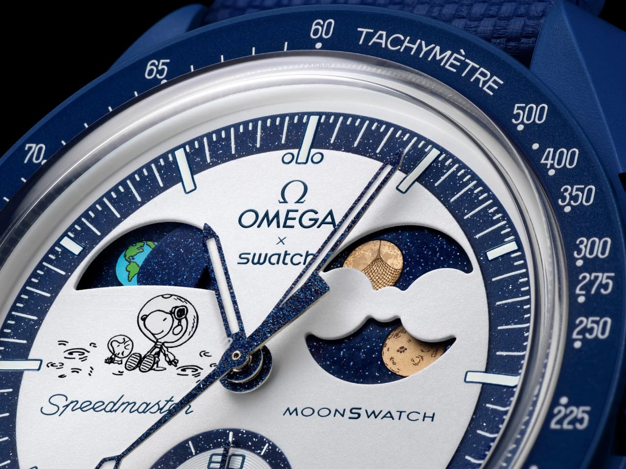
The dial design is way more sophisticated than I initially thought. The white opaline base creates this perfect canvas that lets every other element breathe and pop. You’ve got the earth phase at 10 o’clock where Snoopy and Woodstock are sitting on what looks like the lunar surface, complete with little crater marks and lunar dust details scattered around them. The illustration style stays true to Charles Schulz’s original Peanuts artwork – simple black line drawings that feel timeless rather than trying to be modern or edgy.
The earth phase window itself shows a beautifully detailed Earth with green continents and blue oceans that actually rotate as the complication cycles through. Above it, that navy aventurine background with tiny sparkles creates this deep space effect that makes the Earth really stand out. The moonphase at 2 o’clock gets the Moonshine Gold treatment on both moon discs, and the gold has this warm, almost honey-like tone that catches light beautifully against the dark navy background. Those crater details on the gold moons are incredibly fine – you can make out individual impact marks that give them realistic texture.
What’s brilliant about the layout is how the complications don’t fight each other for attention. The Snoopy illustration sits in the lower left quadrant, balanced by the moonphase on the upper right. The earth phase creates this visual triangle that guides your eye around the dial naturally. The navy minute track with its sparkling finish ties everything together, creating this cohesive space theme without being heavy-handed about it.
The hands deserve special mention too. They’re blued steel with that classic Speedmaster shape, but the navy treatment makes them blend perfectly with the overall color scheme. The chronograph seconds hand has this subtle sparkle finish that matches the minute track, creating visual continuity across all the moving elements.
The Hidden UV Magic Changes Everything
The UV-reactive elements completely transform this watch’s personality. In normal light, you get this clean, sophisticated space theme with Snoopy as a subtle character element. Hit it with UV light and suddenly “I BEAT EVERYBODY” appears in that classic comic book speech bubble style, with additional Snoopy details that weren’t visible before. This is the kind of Easter egg that makes you smile every time you discover it again.
The UV effect shows up in bright blue against the white dial, creating this playful contrast that feels like finding a secret message. It’s positioned perfectly so it doesn’t interfere with time reading but adds this whole extra layer of personality when you’re under blacklights or certain LED lighting. The fact that they included this feature shows Swatch really understands their audience – people who appreciate both technical complications and playful design elements.
The Navy Bioceramic Case Is a Game Changer
The navy bioceramic case completely changes the watch’s presence compared to the original gray Earthphase. This darker color gives it more visual weight and makes it feel more premium. The bioceramic material has this subtle texture that’s not perfectly smooth but has this organic, almost ceramic-like finish that feels substantial under light.
The case proportions look spot-on at 42mm – substantial without being overwhelming. The integrated pushers maintain that classic Speedmaster silhouette that MoonSwatch fans expect. The crown and pushers match the case perfectly, creating this monochromatic look that lets the dial do all the talking. The bezel with its white tachymeter markings creates perfect contrast against the navy case, making the numbers easily readable while maintaining the overall color scheme.
The case construction uses that familiar MoonSwatch profile but the navy treatment makes it feel like a completely different watch. The lug design flows naturally into the case, and the overall finishing has this matte quality that avoids fingerprints and scratches better than glossy alternatives would.
The Strap Texture Tells Its Own Story
The navy VELCRO strap reveals details that most coverage missed. The texture has this woven pattern that’s actually quite sophisticated – it’s not just flat rubber but has this textile-like weave that gives it visual interest. The VELCRO closure system uses matching navy throughout, so there’s no color clash or cheap-looking contrast stitching.
The strap thickness looks substantial without being bulky. The way it curves naturally doesn’t create that awkward gap that some rubber straps have. The white Omega x Swatch logo on the strap is cleanly applied and sized appropriately – not too big or flashy but clearly visible. The overall proportions work really well with the 42mm case, creating a balanced look that doesn’t make the watch appear top-heavy.
What’s smart about this strap choice is how it reinforces the space theme while being practical. NASA has used VELCRO extensively in space missions since the 1960s, making it historically appropriate for a space-themed chronograph. You can adjust the fit throughout the day as your wrist changes, and it won’t scratch desk surfaces or catch on clothing like metal buckles sometimes do.
The Caseback Continues the Story
The caseback design ties the whole theme together perfectly. Earth gets rendered in those classic Peanuts colors – bright blue and green – surrounded by “I BEAT EVERYBODY” in that same playful font. The text placement around the perimeter includes all the technical specs and mission details, but they’re arranged in a way that doesn’t compete with the central Earth graphic.
The navy bioceramic caseback material matches the case perfectly, and the engraved text has good depth and clarity. This kind of attention to the caseback shows Swatch thinking about the complete ownership experience, not just what people see when the watch is on your wrist. The Earth illustration uses the same bright colors that appear in the earth phase complication, creating visual continuity between front and back.
Technical Details That Actually Matter
The lume performance creates this two-tier lighting system that’s both functional and fun. The hour markers and hands glow in that classic green Super-LumiNova, while the UV-reactive elements create this cool blue glow under blacklight. The contrast between the green time-reading lume and the blue decorative UV elements adds personality without compromising legibility.
The dial printing quality shows impressive attention to detail. The “Speedmaster” script maintains that classic font style, while “MOONSWATCH” uses a more modern typeface that bridges the gap between Omega heritage and Swatch innovation. All the text stays crisp and properly aligned, which isn’t always a given with collaborative pieces like this.
The complications themselves show impressive finishing work. The earth phase disc has realistic continental shapes and ocean colors, while the moonphase discs feature those detailed crater patterns in the Moonshine Gold coating. The aventurine backgrounds in both complications have consistent sparkle distribution that creates depth without being distracting. The way the gold catches light creates this warm contrast against the cool navy backgrounds.
The chronograph subdials maintain perfect legibility thanks to the high contrast navy-on-white color scheme. The running seconds at 9 o’clock, 30-minute counter at 3 o’clock, and 1/10th second counter at 6 o’clock all stay easily readable. The tachymeter scale around the bezel gets printed in white, matching the dial and creating a clean, unified look.
Why This Design Actually Works
What makes this watch special is how all these design elements work together to tell a cohesive story. The navy and white color scheme creates this clean, space-age aesthetic. The Snoopy elements feel integrated rather than added on. The precious metal treatment elevates the whole piece without making it feel gaudy. And those hidden UV elements add personality without compromising the sophisticated base design.
This is how you do a character collaboration right – by making the character part of the story rather than just decoration. Snoopy and Woodstock become lunar explorers watching Earth from their moon base, which ties perfectly into the earth phase complication. The “I BEAT EVERYBODY” message adds Snoopy’s competitive personality without being too in-your-face about it.
The result is a watch that works on multiple levels – as a technical piece with dual astronomical complications, as a design object with thoughtful color coordination and finishing, and as a collectible that celebrates both space exploration and beloved pop culture characters. That’s a tough balance to strike, and Swatch absolutely nailed it with this release.
The post When Snoopy Gets the Gold Treatment: The MoonSwatch Mission to Earthphase Moonshine Edition first appeared on Yanko Design.