There’s no denying it: we are squarely in the the Golden Age of branding in professional women’s sports. With the women’s sports industry booming louder and louder with each passing day, it stands to reason that the quality of the branding of franchises, teams, and leagues would also be on the rise, along with the personal brands of the athletes themselves.
At the start of the current NWSL season, Seattle Reign FC unveiled a new brand identity to keep pace with the women’s sports branding pack, along with a new brand platform for the franchise, “Witness the Reign.”
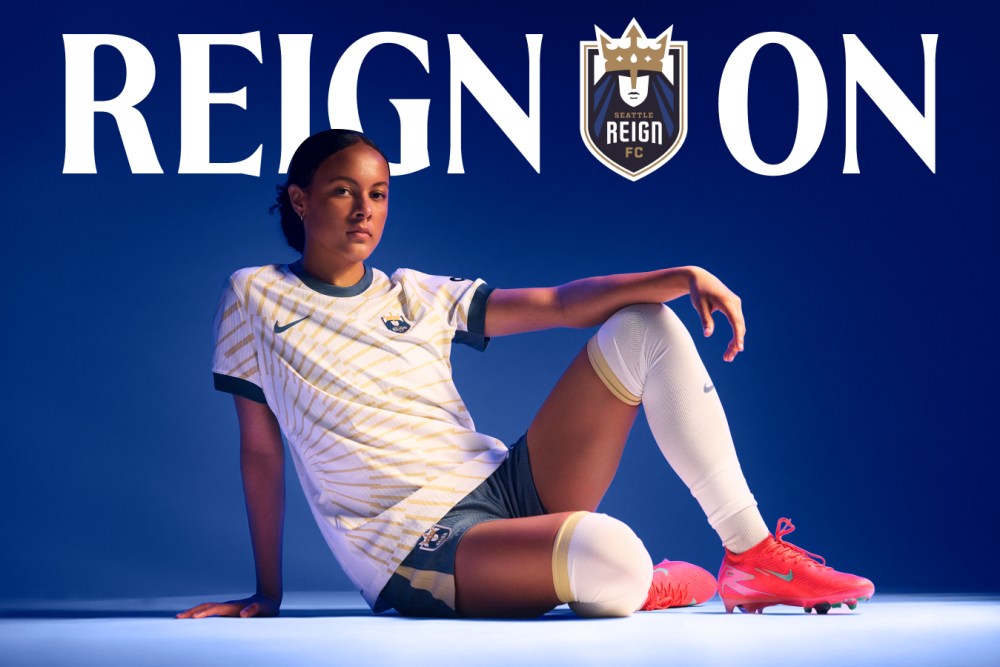
After a stint of turmoil for the franchise including stadium relocation, a different name, and new ownership, Seattle Reign FC had undergone something of an identity crisis. Brand consultancy Redscout was tapped to right the ship, ushering in the next chapter for the team while staying true to its original core fanbase. With this in mind, Redscout zeroed in on the Queen— an existing brand icon they returned to prominence within the club’s new crest.
By expanding upon the Queen’s symbolism and presence within Seattle Reign’s brand story, she became the core of the rest of the system. The Queen’s posture was infused into every other aspect of the brand, from the typography and color palette to the photography and graphic frames that harken to the visual language of royal insignias.
Redscout also played a part in designing the Reign’s secondary kit, the Rise Kit, which showcases the city’s monuments in colors and textures that mirror the Pacific Northwest sun rising over the Cascades.
Seattle Reign’s new brand system becomes yet another sleek, thoughtful, and fully realized presence within the women’s professional sports space, that is no less than what its players and fans deserve.
The post Redscout Gives Seattle Reign FC a Sleek and Regal Rebrand appeared first on PRINT Magazine.