Remember pagers? Those little black boxes that buzzed with mysterious urgency, making hearts race with anticipation. The PIPPO pager concept brings back that lost art of meaningful digital communication, proving that sometimes the most innovative designs come from reimagining what we’ve left behind.
This isn’t just another retro gadget wrapped in nostalgic packaging. PIPPO represents a thoughtful fusion of analog tactility and digital customization, designed to make every message feel genuinely special rather than disposable.
Designers: Dain Kim, Chaewon Lee, Jiyoo Park, Hyeok Jae Jeong, Hyung Jun Park (COMMA)
The project’s philosophy centers on “Born, Beyond, Better”: connecting past, present, and future through emotionally resonant design. The creators understand something we’ve forgotten in our rush toward instant everything: the pleasure of anticipation, the “small tremor” of sending a message, the specialness of waiting for a reply.
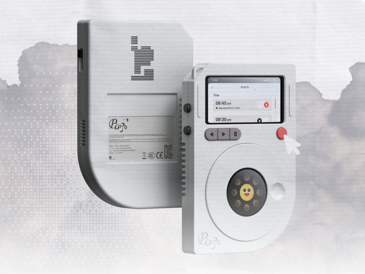
PIPPO’s compact form factor immediately evokes classic pagers and rotary phones. The device features a prominent circular dial, small monochrome display, and minimal button layout. Everything about the design feels deliberately analog, from the matte finish to the playful pixel-art logo.
The interaction model is beautifully intentional. Push up the side power slide to wake the device. Press a button to activate messaging mode. Then comes the magic: rotate the dial 360 degrees to select emojis and compose your message.
The dial springs back when released, providing that satisfying mechanical feedback missing from touchscreens. This isn’t about efficiency but about making each communication feel considered and meaningful. The process forces you to slow down, think, and craft something worth sending.
Where PIPPO gets particularly clever is in its digital-analog fusion. Users can customize themes through NFC and a companion app, choosing between Cyber, Retro, or Vintage aesthetics. Each theme changes the interface, emoji sets, and overall personality of the device.
Day and night modes adapt the display for comfort and battery life. The typography system blends pixel fonts (representing the past), serif fonts (the present), and display fonts (the future), visually reinforcing the device’s mission to bridge generations.
PIPPO targets Generation Z and digital natives who’ve never experienced the anticipation of analog communication. By making messaging tactile and deliberate, it offers a sustainable alternative to the endless scroll of disposable digital interactions.
The device encourages mindful communication where every message matters. Instead of firing off dozens of forgettable texts, PIPPO users craft fewer, more meaningful exchanges. The anticipation becomes part of the pleasure rather than an inconvenience to eliminate.
This concept represents something bigger than just another communication device. It’s a celebration of slow tech, emotional connection, and the idea that the best technology sometimes asks us to pause rather than rush. Sometimes the most revolutionary designs are those that remind us what we’ve lost in our pursuit of speed and efficiency. PIPPO proves that meaningful innovation can come from slowing down and making every interaction count.
The post PIPPO Pager Concept Fuses Retro Tactility With Digital Emotion first appeared on Yanko Design.