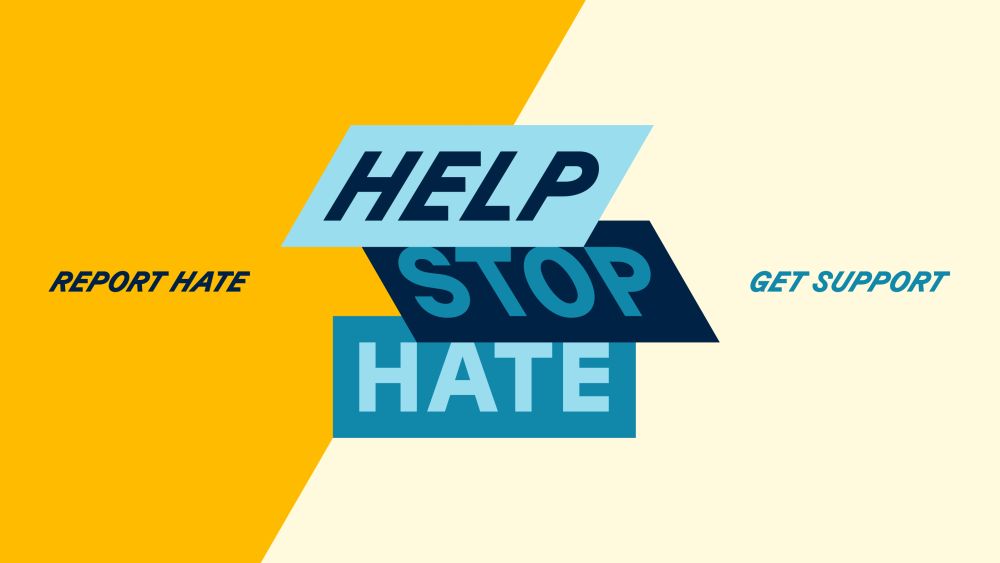
In the case of the Illinois “Help Stop Hate” program, these words are pictures, pictures are signs, and signs are totems that encourage the public to “Report Hate … Get Support.”
In the midst of the federal government’s systematic dismembering of emergency public services, Illinois is one of only three states with a dedicated hate-incident response agency. Nick Adam and his Chicago-based design firm Span, working with University of Illinois Chicago’s (UIC) Institute for Healthcare Delivery Design, were asked to create a design program that would instill public trust in government care. The project was commissioned with the goal of providing care to people and communities experiencing acts of hate.
As Adam notes in our interview, the first step was to reframe the adversarial- and legalistic-sounding pilot program title, Illinois v. Hate, “which cast the state as hero and the public as bystander,” as Help Stop Hate. These three words read not as a threat but a promise. As Adam explains:
“Help centers care. Stop signals urgency without aggression. Hate is named plainly, without euphemism.”
The visual language borrows from civic signage: diagonals, grounded colors, modular layouts—forms people already trust in moments of urgency. I spoke with Adam about the simple design language that welcomes people during this disruptive and uncertain period in melting-pot history.
Tell us more about the commission and its goal.
The Illinois Department of Human Rights (IDHR) had built a service and helpline to support people experiencing acts of hate—one that’s anonymous, confidential and completely separate from law enforcement. That way, people could report without fear of retaliation or unwanted legal entanglements. So the infrastructure was there, but awareness was almost zero, and trust was even lower.
Span was brought in to make it visible, make it trusted, and make it clear that hate is not tolerated in Illinois. Working with the service design team at UIC’s Institute for Healthcare Delivery Design (IHDD), we reimagined how the public would see, understand and use the service. That meant developing everything: a new name, a visual identity system, motion language, and messaging that could survive translation into seven languages without losing its meaning, urgency or compassion.
Help Stop Hate was designed as a public platform with immediate impact—by, with and for the communities most affected by hate. That meant working directly with the Illinois Commission on Discrimination and Hate Crimes, a fully appointed body of 21 leaders from legal advocacy, education, LGBTQ+, disability rights, refugee support, law enforcement and faith-based organizing. Their lived expertise shaped every layer of the campaign—from tone and translation to where and how it showed up. That collaboration ensured we weren’t just speaking out against hate; we were building a trusted system to report it and respond to it.
We replaced the name “Illinois v. Hate” with “Help Stop Hate”—three words that reframed reporting not as retaliation, but as care in action. This wasn’t just a rebrand; it was the design of civic infrastructure, built to deliver both practical support and a public statement that hate is wrong.
How did the public respond to the message?
In the first week after launch, the helpline saw five times more reports than it had in the previous six months combined. This is an increase of 12,000%, week over week.
Community advocates told us that the system’s clarity was what made people act. The diagonals, the motion, the type choices—they weren’t decorative. They were urgent cues. “HELP” leans forward. “STOP” braces back like the brakes have been hit. “HATE” stands still, like a wall you can’t ignore. Even from a moving car or a passing glance, you get the point.
Are the audiences sympathetic to the issues, or are they waiting to be convinced?
It’s both. Some people already see the value. Others only realize it’s relevant when something happens in their own community. We designed the system to work for both. No euphemisms, no coded language—just plainspoken instructions and a path forward.
How many iterations did you go through before acceptance?
We moved quickly, developing hundreds of name options and dozens of design directions, because we weren’t chasing style—we were engineering a tool. The visual identity was tested against edge cases most brands never consider: low-resolution gas pump screens, vertical digital ads inside bodegas, 40-foot billboards, three-inch window clings on businesses windows.
That visibility was intentional. Anti-hate efforts can’t only live in safe or expected spaces—they need to show up where harm happens. This is design not as decoration, but as declaration: a system that can carry the weight of urgency, empathy and trust without collapsing under the realities of the real world.
Are you satisfied with the results?
I think the real measure of success isn’t just a spike in week-one numbers—it’s whether the system stays relevant and trusted as the landscape changes. Lately, we’ve seen an influx of communities and townships wanting to be part of the service—hosting events, distributing materials, and expanding the reach. These gatherings are growing, often standing-room only, and more people are now choosing to report acts of hate in person. That adaptability is what turns a campaign into lasting public infrastructure.
How do you feel words are working in our overly visual (and generative) environment?
In a world saturated with images, many generated in seconds, it was our use of words that broke through. In anti-hate work, showing people is risky: If someone doesn’t see themselves in the faces presented, they often assume the message isn’t for them. This campaign had to speak to the entire public while centering Illinois’ protected classes under the Human Rights Act, which include race, religion, disability, sexual orientation, gender, age, military status and more. To avoid exclusion, we used imagery sparingly and, when we did, it focused on universal gestures of care and comfort—embraces anyone could see themselves in, rather than personal or physical traits.
What more would you like to accomplish with the campaign?
The first goal was trust and awareness. The next is muscle memory, making the act of reporting hate instinctive. That means continuing to meet people where they already are: multi-purpose rooms, community centers, county fairs, faith gatherings and digital spaces.
With the State of Illinois, we transformed words and promises into policy and actions. The next chapter is about keeping it present, visible and trusted, long after the launch moment has passed.
The post The Daily Heller: Words Are Not Just Words appeared first on PRINT Magazine.