Few brands are as deeply woven into the rituals of home life as Yankee Candle. For more than fifty years, Yankee Candle’s apothecary jars have flickered in kitchens, bedrooms, and living rooms across America—burning not only wax and fragrance, but nostalgia itself. Still, even heritage icons must adapt to shifting consumer tastes.
Yankee Candle and its parent company, Newell Brands, partnered with New York agency Beardwood&Co. to reimagine the brand’s design language and packaging in a way that honors its legacy while elevating it for a more design-conscious future. The move was more about recalibration than reinvention—preserving the beloved while modernizing what had grown stagnant.
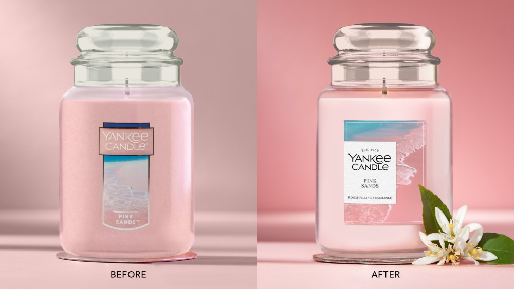
At the heart of the refresh is a careful balance between heritage and modernity. The brand’s most enduring equities—the iconic logotype and unmistakable apothecary jar silhouette—remain untouched, anchoring Yankee Candle’s identity in familiarity and trust. Around those pillars, Beardwood introduced a more elevated visual world: welcoming, joyful artwork that ties fragrance names to emotional storytelling, sensorial imagery that puts scent at the forefront, and design details that make each product something to display proudly.
The resulting system is a renewed brand world that feels both timeless and contemporary—one that strengthens Yankee Candle’s emotional resonance with longtime fans while inviting a new generation of fragrance lovers into the glow.
The post Beardwood&Co. Reimagines a Classic American Brand appeared first on PRINT Magazine.