Paul Renner’s beloved and iconic geometric sans serif has been retooled and reimagined for another 100 years, featuring global language support, optimization for digital communication, and typographic goodies for style and readability. Futura®100 was officially released on September 15, designed by the award-winning foundry, TypeTogether.
I recently sat down with TypeTogether’s founders, José Scaglione and Veronika Burian, to talk about the two-year project to expand Futura.
Futura®100 is the archetype of Renner’s original interpretation, updated for current expectations, emotional gravitas, and worldwide use.
TypeTogether
When Scaglione and Burian met in the graduate type design program at Reading University in 2000, they bonded over their love of editorial text. Little did they know that they’d eventually combine forces when the itch to go independent struck. At a time when most indie foundries were concentrating on display, Scaglione and Burian were fascinated with text for editorial, specifically, what happens to type when printed in a newspaper.
TypeTogether’s mission is one of collaboration with a global lens. Their first project together unfolded across continents, working with some not-so-ideal technology (collaboration in type design, at least the long-distance variety, wasn’t yet a thing in the mid-aughts). Twenty years later, they still work together from afar—Scaglione lives in Buenos Aires, and Burian, originally from Prague, divides her time between Germany and Spain. The core foundry team has grown to 20, but it scales its operation with local experts and designers across the globe. The two think of TypeTogether more as a platform and a community than a company, something they embody as educators, designers, and industry leaders who advocate for progress and access in type design.
Out of this collaborative thread came a relationship with Futura’s trademark owner, Bauer Types, setting the stage for the two-year Futura expansion. That Futura100 offers language support for 90% of the world is impressive, but even more noteworthy is the crack team of local designers and experts required for each of the 23 scripts (12 released in 2025, with the remaining in 2026).
At the time Scaglione and Burian were at Reading, it was common practice to have scripts emulate Latin. “But that was the wrong approach,” Scaglione says. “To design other scripts, you must recover the cultural identity in a historical way.” TypeTogether takes this matter of cultural respect very seriously. When working with world language scripts, sometimes the recovery of the writing system is in flux and in debate among local experts, says Scaglione. This global coverage has enabled the TypeTogether team to do a variety of projects, among them a study on handwriting education in over 40 countries.
In the Futura project, these relationships were paramount. “It’s always a bit tricky at the beginning,” says Burian. “By getting to know the orthography and the relationships between the forms, you can start to understand how far you can actually go.”
Futura is an icon of design, used across the globe already, so why remake it? “It’s the mother of all geometrics,” says Burian. But Renner didn’t set out to create a geometric typeface. He was going back to basics, shapes, the essentials. Futura is its own convention. However, to update it, Burian and Scaglione had to channel Renner’s process of simplification.
Burian and Scaglione explained that while researching the original specimens and drawings, they identified a few areas to improve the then-current digitization of Futura. One of them was the accuracy to Paul Renner’s original vision and expanding on the weight possibilities of the original. Bringing Futura into the 21st century involved designing it as a two-axis variable form, says Scaglione. “This opened the door to a ton of typographic niceties that weren’t available in the original, like small caps, ordinal alphabet, intelligent fractions, you name it.” And that was just the Latin version.
For Futura100’s global scripts, the team had to think outside the typographic and geometric templates. Often, they were exploring the edges of design and readability, says Burian. “Especially in places like India, it wasn’t just about recreating something historical, but a chance to create something new.” The designers pulled source material from book covers, posters, and other lettering, says Burian. “No script could depend on a single person,” says Scaglione. “It was important to have several layers of validation.”
In the current release are scripts in Latin, Pan African, Georgian, Armenian, Cyrillic, Hebrew, Arabic, and Southeast Asia, which include Lao, Thai, Myanmar, and Burmese. Planned for 2026: CJK (simplified Chinese, Japanese, and Korean) is incredibly complex and challenging, particularly Japanese. Nine Indic scripts are also in development for next year.
The weight of redesigning Futura never escaped Burian and Scaglione—they knew that the world would scrutinize their work from top to bottom. Like Renner’s original creation, Futura100 is at its heart a functional tool and not a purely aesthetic exploration. It’s iconic in every sense, says Scaglione. Students around the globe know and use Futura, “but now they can use it in their language,” says Scaglione. The original Futura is recognizable in myriad corporate branding, but Futura100 can now scale beautifully across an entire brand ecosystem.
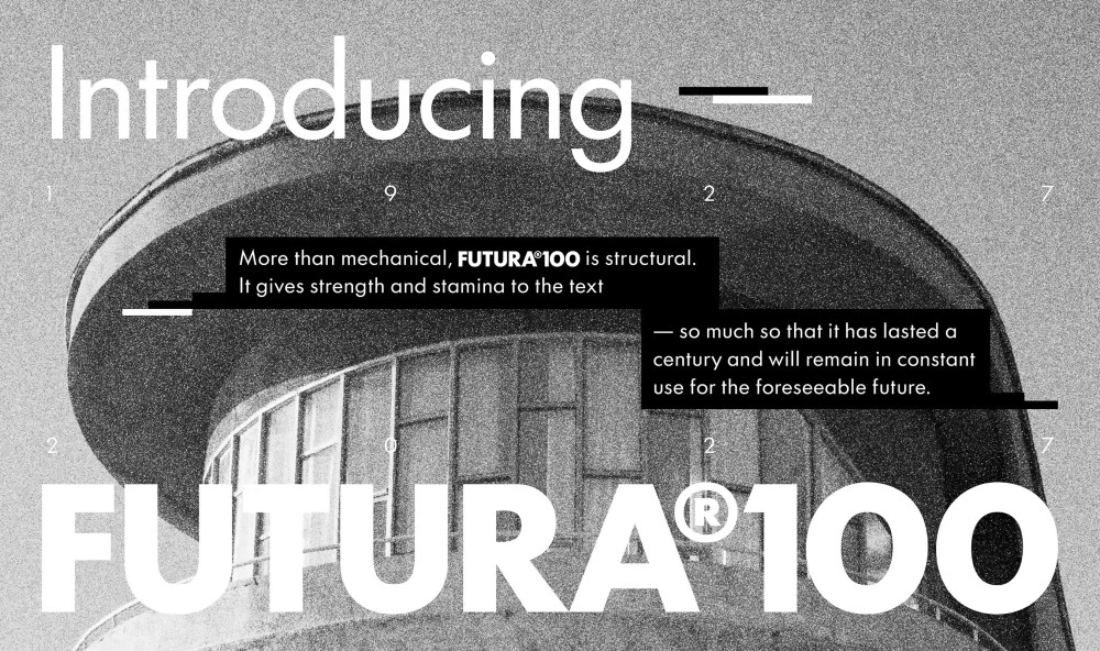
Celebrating the release of Futura100, the TypeTogether website puts it best: What was new and disruptive for its time has now become a hinge upon which type design turns and graphic design rests. More than mechanical, Futura®100 is structural. It gives such strength and stamina to the text that it has lasted a century and, with this iteration, will remain in constant use by more designers worldwide for the foreseeable future.
To learn more about the release of Futura100, visit TypeTogether online.
The post Futura’s Global Expansion by TypeTogether Fit for Another 100 Years appeared first on PRINT Magazine.