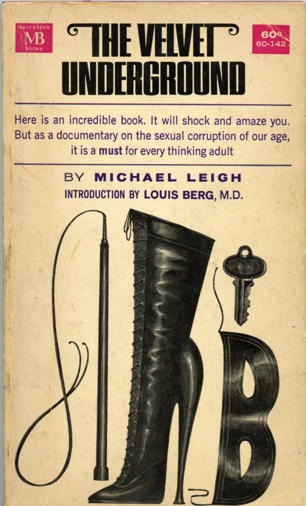
In 1964, when I was 14, I bought a copy of The Velvet Underground by Michael Leigh, a writer, photographer and teacher. This book, meant for readers older than me, was a key to an unknown, underground world. What attracted me was the cover by Paul Bacon. I didn’t know about graphic design and I obviously had never heard of Paul Bacon. But something about the clean presentation of the type and orderly placement of the provocative visual elements was alluring. The title also grabbed my attention (though it would be a few years before I learned of the rock group with Lou Reed, Sterling Morrison, Nico and John Cale, which drew its name from the book). The blurb on the cover was also enticing: “Here is an incredible book. It will shock and amaze you. But as a documentary on the sexual corruption of our age, it is a must for every thinking adult.” I wasn’t at all close to understanding, but those words cinched the purchase. (Being able to carry the book so that people would be shocked by what I was reading also motivated my burgeoning teen rebelliousness.)
It is an example of how visual imagery and design can influence perception. But when I found out what S&M meant, I was aghast. Seeing it again after so many years still continues to have impact. Bacon, known for the so-called “Big Book look,” was constrained by the paperback format but was certainly able to make a profoundly memorable piece.
The post The Daily Heller: S&M in ’60s Culture appeared first on PRINT Magazine.