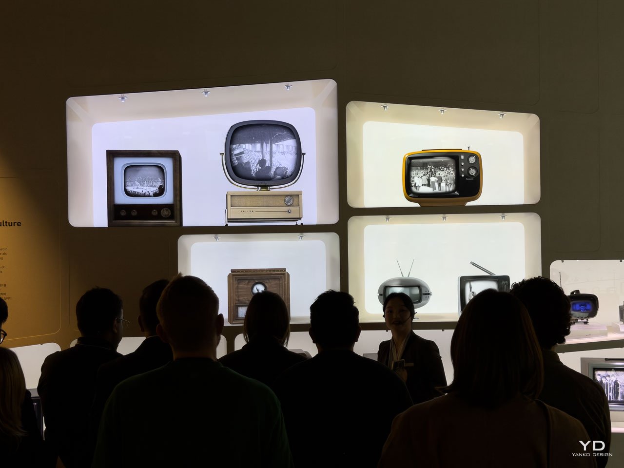
Walking through Samsung’s Innovation Museum in Seoul, I stopped at this timeline wall that tracks television design from 1925 to 2018. And honestly, the proportions made me laugh. Look at a 1950s TV: tiny screen, massive wooden cabinet. Then jump to 2018: wall-sized screen, cabinet that basically doesn’t exist. The entire relationship inverted over ninety years.
What you’re actually watching is designers fighting physics, losing for decades, then suddenly winning so hard they had to figure out what to do with all that freedom. The story is written in wood grain, black plastic, chrome bezels, and eventually almost nothing at all.
When TVs Were Furniture
Those Wild 1950s Proportions
Here’s the thing about early TVs: they showed up as furniture first, technology second. Those 1940s and 50s sets had wooden cabinets that matched your dining room furniture because that’s literally what they were. Pieces of furniture that happened to have a cathode ray tube inside. The screen was maybe a quarter of the total object. The rest? Cabinet. Because back then, the cabinet was the design.
And this wasn’t just decorative. CRT technology needed insane depth for the electron gun shooting at the screen from behind. You wanted a 12-inch screen? Cool, budget 18 inches of depth for the cabinet. Designers had two options: make it look like furniture, or fight physics and lose spectacularly. They went with furniture.
The 1950 black-and-white sets in the museum look completely alien now. Tiny circular screens peeking out of these massive wooden boxes on turned legs, like someone stuck a TV into a colonial armoire. Control knobs the size of door handles on the right side. The screen wasn’t even the main event. You were buying a cabinet that let you peer into a little window.
Color Showed Up and Brought Heat Problems
Color broadcasting really took hold between 1966 and 1970, though 1968 is when it hit critical mass. And suddenly designers weren’t just managing depth anymore, they were managing heat. Color CRTs ran way hotter than black-and-white. The transistor breakthrough in ’66 helped, but you still needed serious ventilation engineered into these cabinets without making them look like they had vents everywhere.
That’s when black plastic took over. Wood cabinets disappeared fast, replaced by injection-molded polymers in dark colors. This looked “modern” and “tech-forward,” but really? Black plastic didn’t show heat stains. Didn’t crack from heating up and cooling down constantly. And it sent a clear message: TVs were technology now, not furniture pretending to be dressers.
The switch happened incredibly fast. By the late 70s, wood-cabinet TVs looked dated, like something your grandparents owned. Black plastic was everywhere, and the proportions started going wider, more horizontal. Everyone knew cable and video were coming, and those cinematic aspect ratios needed different shapes.
Design Shift Complete: TVs stopped trying to be furniture and started announcing themselves as technology. Presence through tech identity replaced presence through cabinetry.
Thirty Years in CRT Prison
Depth Was Everything
For three full decades, TV design was basically just “how do we deal with this cathode ray tube depth problem?” Physics didn’t care what designers wanted. The screens had to curve outward. The cabinets had to stick way out into your living room. You could go wider, sure, but you paid for it with even more weight and depth. You could try making flatter CRTs, but you could only flatten the edges a bit.
This era gave us the “traditional TV” look we all remember. Thick black bezels everywhere. That curved glass face. Speakers mounted on the front flanking the screen because there was literally nowhere else to put them. Control panels that moved from the sides to the front when remotes became standard. And always, always, that massive back end sticking out, forcing you to buy furniture specifically designed to hold it.
Projection TVs: Building a Bigger Prison
Projection TVs tried to escape starting in 1983, but they really hit mass adoption in the late 1980s through the 90s. The pitch was larger screens without the weight penalty. But here’s the problem: they just traded one depth issue for an even worse one. Those systems needed even more internal volume for the projection setup. Those 50-inch rear-projection sets from the 90s weighed 200 pounds and used internal mirrors to throw images onto the screen. They were incredible and ridiculous at the same time. Like, instead of breaking out of the prison, they just built a bigger one.
The Flat CRT Trick
The early 90s brought flat-screen CRTs with huge marketing hype, peaking around the mid-to-late 90s. “The curve is gone! Look, it’s flat!” But check out the museum examples and you’ll see the trick immediately: they flattened the glass front while keeping the same depth behind it. The electron gun was still back there firing at the screen. The vacuum tube still demanded its space and weight. They basically convinced the screen’s face to go flat, but the cathode ray tube body stayed stubbornly three-dimensional, still requiring that massive depth and adding even more weight.
This wasn’t a breakthrough, it was optimization within the same constraints. TVs got slightly thinner but way heavier because that flat glass needed more structural support. The look changed (flat faces felt more premium, more modern) but your living room footprint? Barely different.
Thirty-Year Pattern: Every attempt to escape CRT depth constraints just found new ways to work around the same physics problem. Designers were still prisoners.
When Flat Panels Detonated Everything
2001: The Year Depth Stopped Mattering
2001 didn’t just bring flat-panel displays to stores. It completely destroyed the design language that had been built over 76 years of CRT dominance. Suddenly depth wasn’t your destiny anymore. A 42-inch screen could hang on a wall like a framed picture. The Cabinet Era just… ended. Overnight.
And designers went kind of crazy with the possibilities. Early flat panels had these thick glossy bezels in chrome and silver, totally celebrating how new they were. Screens sat on sculptural stands that looked more like modern art than furniture. Some manufacturers added ambient lighting behind the panels. Others tried transparent stands to make screens look like they were floating. After decades stuck managing the CRT prison, designers had more freedom than they knew what to do with, and you could tell.
But the market optimized toward minimalism pretty fast. By the late 2000s, the bezel race was on: who could make the frame narrowest, the profile thinnest, the presence least noticeable. The whole design language shifted from “look at this amazing technology!” to “look at nothing but the picture.” Black became mandatory again, but for totally different reasons this time. Black bezels disappeared visually. Black cabinets receded into backgrounds. The goal was screen purity.
The Thinness Wars
When LED backlighting (using LEDs to light the LCD panel from behind) replaced fluorescent tubes in 2009, manufacturers could suddenly make panels under an inch thick. Samsung and others started measuring TVs in millimeters, showing profiles next to phones and coins for scale. They were advertising displays thinner than your smartphone.
This was design for spec sheets, not for actual living. A 55-inch TV at 7mm thick still needed a stand, still took up wall space, still dominated the room. But thinness signaled premium in ways that pixel count and refresh rate just couldn’t. It was tangible luxury: that feeling of holding something impossibly light that looks fragile but isn’t.
Curved Screens: The Last Gasp
Those curved TV experiments from 2013-2015? Last gasp of form-first design. Manufacturers claimed they created immersive viewing experiences, but curves were really just about standing out in a flattening market. They looked spectacular on showroom floors and kinda awkward in actual living rooms, where most people weren’t sitting in that optimal center position the curves were engineered for. The market rejected them fast. Not because they performed badly, but because they announced themselves too loudly.
Liberation Complete: The constraint-free flat panel era let designers experiment wildly, then the market optimized straight toward invisibility. The new design language was disappearing entirely.
When Screens Learned to Disappear
The Invisibility Paradox
By the mid-2010s, TV design hit this weird paradox. Screens were getting bigger and thinner, but the actual design goal became making them less visible. Samsung launched the Frame TV in 2017, literally disguising itself as wall art when powered off, letting you display artwork instead of a black screen. OLED panels (with self-illuminated pixels instead of backlights) let screens turn individual pixels completely off for perfect blacks, and they could blend into dark walls so well you almost can’t see them. Samsung’s QLED models used quantum dot technology for better color while staying ultra-thin.
This is honestly the most sophisticated design thinking in television history. It’s not minimalism just for the aesthetic. It’s considered absence. The screen becomes infrastructure. Present when you need it, invisible when you don’t. Stands got simpler, sometimes just a single center pedestal that makes the panel look like it’s floating. Some manufacturers ditched stands entirely, just assuming you’d wall-mount.
The materials shifted again: ultra-thin metal frames, sometimes in premium finishes, sometimes in matte black that absorbs light. No more plastic clunkiness. These are precision-machined objects. Industrial jewelry at living room scale.
When Screens Got Smart
That 2018 milestone on Samsung’s timeline (Smart Display with Bixby) marks another turning point, one that’s still playing out. These displays don’t just show content anymore. They listen, respond, anticipate. The design language is starting to accommodate this new agency. Ambient displays show info when you walk up to them. Voice interfaces don’t need any visible controls. Art Mode features (like on the 2017 Frame TV) turn your television into decoration even when you’re not watching anything, displaying curated artwork or your own photos.
This is TV as ambient interface, not passive screen. And it’s reshaping what matters in design. Brightness matters differently when displays need to work in bright rooms as decorative art. Color accuracy matters more when screens are showing photography and paintings. Thinness matters less than how well it integrates with your room lighting, furniture, and acoustics.
The Modern Mandate: Presence was everything in the 1950s. Now designers want screens to disappear until the moment you need them.
What This Whole Century Reveals
The Same Pattern, Every Time
Every major tech breakthrough in TV followed the exact same design evolution:
Phase 1 – Living With Constraints: Designers work within brutal limitations. Form serves function because function won’t let you do anything else. CRT depth, heat management, weight: these ran the show.
Phase 2 – Breaking Free: New tech eliminates a major constraint. Designers go wild experimenting. Possibilities explode everywhere. Some ideas work, most don’t. (See: curved screens, 3D TVs, transparent stands.)
Phase 3 – Settling Into Invisibility: The market optimizes toward restraint. The goal stops being “look at what we can do” and becomes “integrate seamlessly into life.” Design gets less visible even as displays get more capable.
We’re in Phase 3 of flat panel evolution right now, and maybe Phase 1 of whatever comes next: flexible displays, transparent OLED, holographic projection, or something that’s not even in Samsung’s museum yet because someone’s still inventing it.
Design Lessons Beyond TVs
What makes TV design evolution so useful to study isn’t the specific materials or measurements. It’s watching how designers respond to constraints changing over time. Depth was mandatory? Make it furniture. Depth became optional? Make it disappear. Screens need to justify taking up space? Give them ambient utility.
This pattern shows up way beyond displays. Every product category goes through these phases as tech matures. Smartphones already did. Laptops are doing it now. Wearables are just starting. Today’s constraint becomes tomorrow’s liberation becomes the refined standard the day after that.
Where This Line Goes Next
Samsung’s timeline stops in 2018, but the story keeps going. MicroLED promises thinner panels with better brightness. Rollable displays let screens literally disappear into furniture. AI integration will make displays context-aware, auto-adjusting to room lighting, viewing angles, content type.
The next evolution won’t be about thinner or bigger. Those races are basically done. It’ll be about screens getting smarter about when to show up and when to fade back. About surfaces that are sometimes screens and sometimes not. About displays that understand spatial context well enough to become true ambient interfaces instead of constantly demanding your attention.
TV design from 1925 to now traces this line from furniture object to ambient infrastructure. That line’s still moving. And honestly? The most interesting part is that we’re still figuring out where it goes.
The post When TVs Were Furniture and Screens Were Tiny: 90 Years of Getting It Backwards first appeared on Yanko Design.