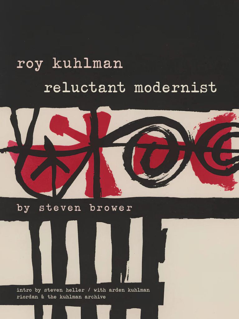
As a book jacket and cover designer, Roy Kuhlman was an original. He designed almost exclusively for the edgy indie Grove Press, defining its list of literary, critical, philosophical and politically radical nonfiction titles. (That is, until he took on freelance clients that caused a rift between him and publisher Barney Rossett.) His style is Midcentury Modern. Although he would object to being locked into the classification, when you see the scores of designs that he produced, collected in the new book Roy Kuhlman: The Reluctant Modernist (Fantagraphics) by Steven Brower (with an introduction by me), the designation is unmistakable.
Midcentury Modernism is a loosely defined umbrella category of design that represents an inventive period in which many artforms were involved. Borne of the unprecedented experiments that promoted the revolutionary modernity of the early 20th century (from the aughts to the late ’30s), Midcentury Modern graphic design (roughly late ’40s to early ’70s) is notable for translating such aesthetic constructs as expressionism, minimalism and abstraction—which signaled modernity in painting, graphics, sculpture, furniture, fashion and architecture—into a vernacular of functional, commercial graphic design, advertising, typography and illustration. Kuhlman’s inspired work was an embodiment of Midcentury form and style, what I have called “narrative abstraction.”
Many of his abstractions tested the reader’s perception. His lexicon of kinetic, morphing shapes was usually rendered in flat colors with painterly and collage randomness. They could stand on their own. But usually, to make them functional, he used simple sans serif or elegant classic serif typefaces; fitting the abstract nature of his manner, he’d frequently draw or paint hand-scrawled titles and subsidiary texts. Much of his work employed two or three colors, as opposed to four-color process—and he was more than adept with limitations.
As art director and principal designer for Grove Press (before moving on to do work for Mobil, Hertz, IBM, etc.), he developed, as I wrote in his obituary for The New York Times, a “minimalist graphic vocabulary entirely his own. He avoided literal representation, because he said he couldn’t really draw well. Instead his random color patterns and amorphous shapes seemed totally independent from the texts they were illustrating. In fact, rarely did he actually read the manuscripts before designing the covers, and yet every image was as provocative, eye-catching and poster-like as book covers and jackets had to be to draw attention on the shelves.”
In The Reluctant Modernist, Brower, formerly a publishing art director/designer who befriended Kuhlman, in conjunction with Kuhlman’s daughter, Arden Kuhlman Roidan (who administers her father’s archive), compiles an enviable collection of over 200 covers, jackets, advertisements and typography that has ensured Kuhlman his pedestal in the pantheon of graphic design.
(This precis was adapted from my introduction to The Reluctant Modernist.)
The post The Daily Heller: Roy Kuhlman’s Narrative Abstraction appeared first on PRINT Magazine.