I love the idea of someone thinking they’re subscribing to a regular magazine and, inexplicably, getting a 3-ring binder in the mail.
Sunra Thompson, McSweeney’s Art Director
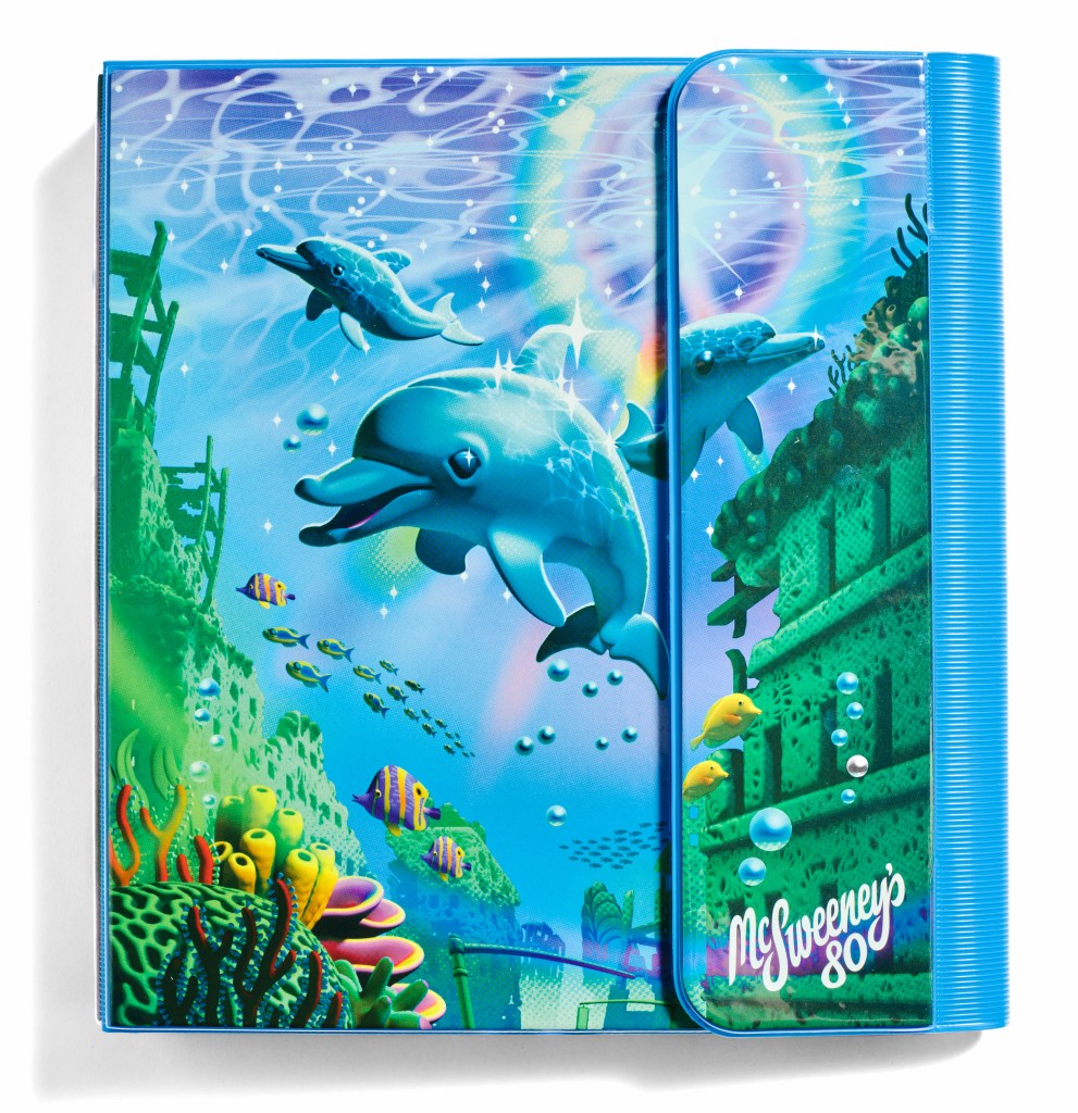
When a new McSweeney’s Quarterly is released, you’d better drop whatever it is you’re doing and check it out. Their latest, McSweeney’s 80, is no exception. McSweeney’s Quarterly 80 is a “1980s rainbow-hued, coral-reef-clad, dolphin-inhabited, drowned-world three-ring oversized-school-binder-inspired volume” that even Lisa Frank herself would appreciate. The binder includes seven individual book art objects from a multitude of artists, including an accordion-shaped catalog of twelve different flowers by Pulitzer Prize finalist Yiyun Li, a story in the form of an end-of-the-world Scantron questionnaire by Pip Adam, and a handful of thoughtfully conceived and deeply nostalgic grade school accessories.
McSweeney’s Art Director Sunra Thompson and editor of the Quarterly Rita Bullwinkel reflect on the process of bringing McSweeney’s 80 to life below.
What was the genesis of McSweeney’s Quarterly 80? Where did the general concept come from, and how was that idea then developed and expounded upon to include the various book art objects in the edition?
Sunra Thompson: McSweeney’s 80 actually grew out of a misunderstanding. I’d been thinking about making an issue of McSweeney’s in the form of a Filofax— one of those old personal organizers bound in a ring binder that included an appointment calendar, booklet for contacts, diary, slots for cards, etc. I presented the idea to the editors, and someone thought I was describing a Trapper Keeper. There was so much excitement for the Trapper Keeper during that presentation that we immediately switched gears and I started collecting old Trapper Keepers.
There were a couple objects that seemed essential to have in the binder. We really wanted at least a folder with pockets, with something inside the folder. We really wanted a spiral-bound notebook. I really wanted some sort of plastic stencil, but I didn’t really know how that would work. And then we spent a lot of time brainstorming stuff that you might find in a binder like this: diaries, calendars, pencil pouches, stickers, rulers, baseball cards, etc.
Rita Bullwinkel: When I came on as editor of the Quarterly last year, Sunra had already made several prototypes of this brilliant design. I had the privilege of getting to put heads together with him to think more about what types of objects that one finds in a school binder that inherently lend themself to narrative. We had a long discussion about the great visual vocabulary in Scantron tests, which directly led to commissioning Pip Adam to create the stunning Scantron story in the issue.
Chris Ames, a writer I very much admire, independently submitted a story in the form of a crossword not knowing we had a Trapper Keeper issue in the pipeline, and that was an obvious, perfect, wonderful fit. At one point I developed a writing prompt that I called “Times Table Stories” (blank form and sample below) where I thought we might get writers to exploit the narrative elements of multiplication, and perhaps we could print them inside the interior flap of the folder, where multiplication tables sometimes live. None of the writers we sent the prompt to were thrilled with the constraint.
As with all creative projects, there were some thrilling, some surprising, and some easily found elements, and then some elements I pursued for a great while that ultimately weren’t a fit.
I know it takes a village to put together a project like this at McSweeney’s. What was the collaboration process like to bring this to life?
ST: Internally, we spent a lot of time spitballing ideas for objects that could go in the issue. We got suggestions from most of the staff, I think. Rita suggested commissioning a story in the form of a Scantron, which made it into the issue and is one of the highlights. A handful of ideas, like a story in the form of a calendar and a sticker sheet, were attempted but didn’t quite come together.
We talked about a school binder being a place for sketching out ideas, for personal work you might not intend to share, so the idea for a sketchbook seemed natural for this project. I reached out to Adrian Tomine, and, to my astonishment, he was open to collecting some of his work in a sketchbook.
We were very lucky to work with artists who are up for turning some of these everyday objects into art.
Two objects that I was personally very excited about, the plastic stencil and the folder, came together purely because the artists figured out something interesting to do with them. The stencil was designed and conceived by Tamara Shopsin. I don’t think I gave her much to go on. I asked her if she’d be interested in making a stencil that had some sort of narrative quality, and she wound up making something brilliant. John Pham, too, conceived of the whole comic-in-a-folder idea totally on his own. I asked him if he could make something with a folder, and he produced something that I think is essential to the issue. We were very lucky to work with artists who are up for turning some of these everyday objects into art.
RB: This issue contains the work of 19 authors and 7 visual artists— an incredible, verdant and potent crowd if there ever was one! Another highlight for me was getting to commission Pulitzer Prize finalist Yiyun Li, a master gardener, to compose into her relationship to twelve different flowers, which was beautifully illustrated by Wesley Allsbrook as a stand-alone catalog that clips into the three rings of the issue. It’s a heavy laminated accordion fold that, when you unfurl it, feels like resource material, or a map. I love the durability of it, and the gesture of something so indelible as Li’s prose being made into a quick-at-hand reference art-object.
What’s the ideal experience you hope readers and viewers of the McSweeney’s Quarterly 80 have when engaging with it?
ST: I hope subscribers and readers are surprised and even a little confused when they get the issue! I love the idea of someone thinking they’re subscribing to a regular magazine and, inexplicably, getting a 3-ring binder in the mail.
For those that choose to spend time with this book-object, there are so many narrative and design surprises to uncover. It’s a total treasure trove.
RB: I totally agree with Sunra! There is something really thrilling that happens when your mind has to take an extra beat to process what you are looking at, and I love the idea of a reader first encountering the issue, and not immediately being able to ascertain that what they are looking at is narrative. For those that choose to spend time with this book-object, there are so many narrative and design surprises to uncover. It’s a total treasure trove.
Is there a component or element of the McSweeney’s Quarterly 80 that’s your favorite or brings you the most joy?
ST: I’m really proud of everything that wound up in the issue— the 3-ring binder itself, by Jordan Speer, is astonishingly beautiful. Working with Adrian Tomine was a dream come true, and I love how his sketchbook turned out. John Pham’s folder-comic is unbelievable. I think the plastic stencil, by Tamara Shopsin, might be my favorite component— I hope readers find it as surprising and brilliant as I do.
RB: Every single story included in this issue has changed me. It was a thrill to get to work with writers whose work I have admired for decades alongside writers like Ava Tomasula y Garcia who sent stories in through our open call for submissions and were totally new to me.
The post ‘McSweeney’s Quarterly 80’ is Spun From Maximalist Grade School Nostalgia appeared first on PRINT Magazine.