In a cultural moment when museum legacies are being reexamined, sometimes even rewritten, the Branch Museum of Design in Richmond, Virginia, has chosen evolution over erasure. Its new visual identity, crafted by MullenLowe Design Studio (MLDS), reframes what a design museum can be. By transforming architect John Russell Pope’s 1919 Tudor blueprints into a living design system, the Branch has created an identity that feels like a manifesto.
The Branch, Virginia’s only design museum, has long been a guardian of architectural history. But under Executive Director Kristen Cavallo and Director of Marketing Katie Hoak — both with deep roots in the advertising world — the museum is redefining itself for a broader cultural stage. They see The Branch not as a hushed institution but as a living brand, one that should be “unmissable and unmistakable.” That conviction tasked MLDS, recently ranked the #3 Most Awarded Design Agency in North America by D&AD, with building an identity rooted in the building’s past yet aimed squarely towards the future.
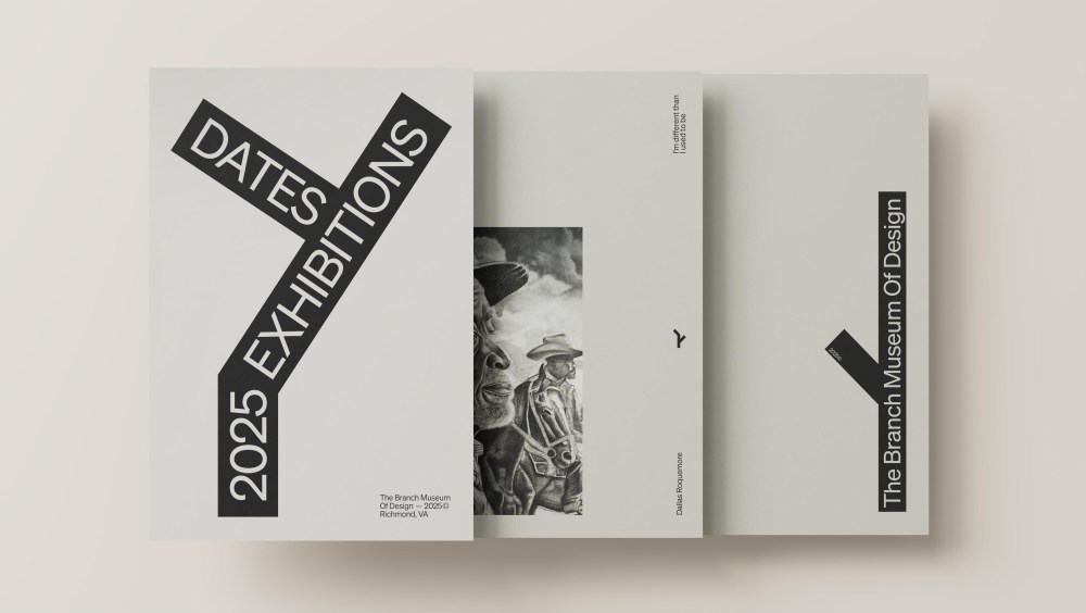
The logo, a sculptural “B” formed from three Tudor gables, captures that duality perfectly. When flipped, it becomes a house, reminding visitors that The Branch is both home and host to design. The off-center placement subtly encourages the viewer to shift their perspective, an elegant visual metaphor for the museum’s new tagline: Where Perspectives Shift. “We wanted to tell a single, connected story — one that ties together this building, this city, and this museum,” said Hoak. “Design, for us, is about meaning, not ornament. Every choice should reflect who we are and why we exist”.
The result is a museum identity you can both hear and see: structure rendered into story, form turned into feeling.
In collaboration with Brazilian studio Evil Twin, MLDS created The Branch’s first sonic brand: a composition that translates the repetition of architectural elements into musical fractals. The arches, grids, and gables of Pope’s design become sound. “All architecture is math. All music is math,” explained João Paz, head of design at MLDS. “It’s as if The Branch itself composed this track.” The result is a museum identity you can both hear and see: structure rendered into story, form turned into feeling.
It’s rare to see a design project this self-aware. Most rebrands flatten history for clarity or reach for generic minimalism in pursuit of modernity. The Branch does the opposite. As Cavallo put it, “When MLDS brought forward Pope’s 1919 architecture to our 2025 identity, we knew we had something special. They captured the entire conceptual leap — from physical form to brand form.” This is design as continuity, a refusal to abandon the DNA that made the museum distinctive in the first place.
That philosophy resonates in the museum’s new positioning. Where once The Branch centered on architecture, it now celebrates design in all its dimensions: fashion, motorcycles, photography, protest art, music. “We moved from celebrating architecture alone to exploring design in every form,” said the museum team in a Q&A. “Our new identity reflects that change, while expressing our belief that design can shift the way people see the world.”
Major institutions, such as the Philadelphia Art Museum and corporate giants like Amazon and Cracker Barrel, have unveiled simplified rebrands this year, often met with mixed reactions. The Branch’s move feels refreshing. It’s not an aesthetic sanitization; it’s a philosophical stance that communicates that design doesn’t erase complexity — it honors it. The updated brand acknowledges that heritage and innovation can coexist, that a century-old mansion can speak fluently in today’s visual language.
Richmond has long punched above its weight. Home to VCUarts, one of the top public art schools in the U.S., and a thriving advertising, street art, and tattoo scene. By embracing design as a force that touches every part of life, The Branch reflects this cultural intelligence by positioning itself as both a mirror and a megaphone for that energy.
There’s also something quietly radical in how The Branch views its role. Museums, as Cavallo noted, are under pressure with some facing censorship, and others losing trust. The Branch’s answer is engagement. “Museums matter when they respond to culture rather than retreat from it,” the team stated. “We aren’t here to dictate taste but to create conditions for curiosity — to remind people that everything around them was designed by someone with intent.”
For designers, the project is a case study in integrity, with a design identity that is intellectual and emotional, theoretical and tactile. Colin Knight, a Richmond-based artist, summed it up best: “A strong visual stance signals seriousness — it tells us you understand the language of design, not just its display.” Amidst the brand noise, The Branch Museum of Design has found a quieter, more resonant tone: one built from its own walls, its own city, and its own unwavering belief that design still has the power to change how we see the world.
The post MullenLowe Rebrands Branch Museum of Design As a Living Blueprint appeared first on PRINT Magazine.