PRINT Magazine’s former editor and longtime contributor, Zachary Petit, has curated our book cover features since 2023. I will do my best to fill his mighty, aesthetically tuned shoes as I catch up with brilliant book cover designs from September, October, and November. What a fall it’s been!
We’re starting with a title that’s a bit of a departure for us: Horror. But the genre feels incredibly appropriate given that the world is a real-life horror show.
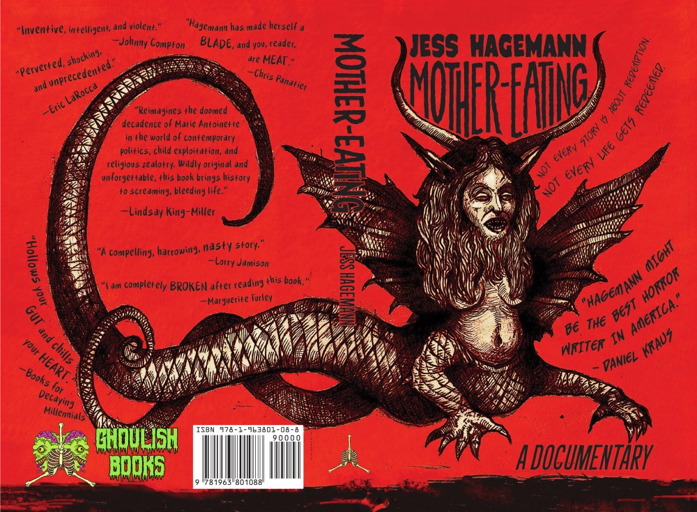
Jess Hagemann’s Mother-Eating places the child-bride scapegoat of “let them eat cake” fame, Marie Antoinette, in a cult built around the lore of Simon Magus (a contemporary of Jesus who, supposedly, could levitate), set in 1980s Austin, Texas. The Austin-based horror writer wove a documentary-style narrative that begins after the heroine has met her tragic fate and is told through other members of the cult. Hagemann tempers torture-room gore with provocative questions, asking: Who among us has the right to tell their story? And, Humans do brutal things to other humans. If we can’t stomach fictional brutality, how can we truly see and acknowledge the horrors of our own era?
The cover’s illustrator, James Sutton, and Zach Chapman (type designer) nailed the vibe. They tell us more below. (Q&A lightly edited for length and clarity.)
James, I understand the inspiration for the illustration came from an artifact from Jess’s research on Marie Antoinette. The original is quite horrific on its own! What details were essential to include in your reinterpretation of the harpie for both contemporary audiences and the horror genre?
JH – As you mentioned, the image is based on a rather strange caricature of Marie-Antoinette from the late 18th century. Jess wanted to keep the image fairly similar to the original engraving, so I didn’t change the design much. Still, I felt it was the case to take it away from its classical engraving style, making it a little rougher, maybe a bit more expressive, while keeping some of the precise lines that I hope pull the design of the past into the present in a pleasing way. Some elements, like extending the horns and having the tail curving around [the spine], were more framing devices for the title and the book synopsis than anything else.
Your illustration style has both a dark/sinister and a Medieval-illuminated manuscript quality. How did the documentary style narrative change how you approached the cover illustration?
JH – I hadn’t read the book before making the illustration. So I just had a brief description of the story, which was enough to go on for how I felt the design should feel. Sinister, weird, a little bit punkish. A lot of my inspiration comes from the kind of illuminated manuscripts you mentioned and the cover art from old VHS horror movies I remember from growing up in the ’80s and ’90s. I thought that pulling those two things together would feel oddly right for this particular story!
Zach, how did you approach the text design?
ZC – James’s illustration of a serpentine chimera is incredible. The way it curls in from over the back cover and spine to peek onto the front makes an atypical layout for a cover, which made setting the type a challenge. I’m a comic book letterer, and I often try to letter comics as if the illustrator has drawn the SFX themselves. The type has to fit in with the art, as if it were always meant to be there. With comics, you can bend, break, and snap type (readability isn’t necessary). I tried to bring that aesthetic to Mother-Eating, while retaining readability, since that’s key for the front of a book cover. So this is why the byline and title are pressed and stretched in between the chimera’s horns, and the blurbs are fluttering out from the wings.
Is there an expectation for horror covers in terms of type?
ZC – Unfortunately, the current state of mainstream cover design and type does not set expectations of genre, especially with horror. There should be, and historically, there certainly has been. Going back to comics, in the ’50s, you could pick up a comic and, without seeing the illustration, tell the genre based on just the typography. Horror had scratchy, wavy, hand-lettered type. In the ’80s, there were big gothic custom fonts created for paperback horror covers. You don’t often see either of these approaches on genre book covers now, just the same handful of fonts. So that’s definitely something I try to bring into any cover I letter or logo I create.
Front cover (left); On the right is the original inspiration: Harpie monstre amphibie vivant. Caricature contre Marie-Antoinette. Estampe à l’eau forte. Paris, Musée Carnavalet (public domain)
The rest of our favorite titles released in September, October, and November follow.
Cover design by Linda Huang
Cover design by Sara Wood
Cover design by Stephanie Ross
Cover design by Kate Dehler
Cover design by Jaya Miceli
Cover illustration by Evangeline Gallagher; type design by Ella Laytham
Cover design by Tyler Cromie
Cover design by Na Kim
Cover design by Kimberly Glyder
Cover design by Thomas Colligan
Cover design by Arsh Raziuddin
Cover design by Stephen Brayda
Cover design by Frances DiGiovanni / Rodrigo Corral Studio
Cover design by Mumtaz Mustafa and Paul Miele-Herndon;
Interior: Zebra with Two Chairs and Funky Fur, 2013 by Mickelene Thomas; courtesy of Mariner Books
Cover design by Kyle. G. Hunter
Cover design by Emily Mahon
Cover design by Arsh Raziuddin
Cover design by Vivian Lopez Rowe
Cover design by Grace Han; (jacket image: Duncan 1890/Getty Images)
Cover design by David Litman; cover art by Andrew Kuo
Cover design by Jaya Miceli
Cover design by Ploy Siripant
The post 23 of the Best Book Covers for Fall 2025 appeared first on PRINT Magazine.