You would think that a white called Cloud Dancer — described as billowy, serene, and light enough to soothe a “frenetic society” — would float gracefully into the zeitgeist. Instead, it plummeted like a deflated balloon at a party no one agreed to host. In the span of days, the internet has debated its symbolism, its privilege, its tone, and why it looks suspiciously like the color your landlord insists on repainting your apartment, no matter what you request. In a moment when the world feels technicolor in its chaos, Pantone’s gentle whisper of calm is being met with a resounding, collective side-eye. If Pantone hoped to give us calm, they inadvertently gave us conversation and spectacular memes instead.
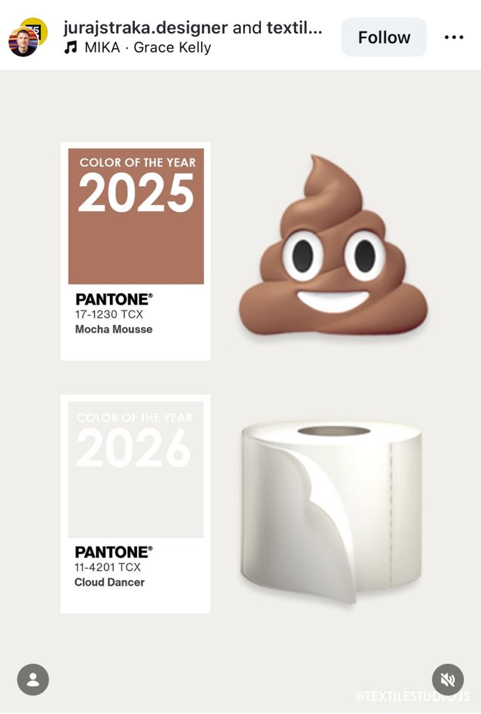
Every December, Pantone hands us a mood. Or at least, that’s the intent. The Color of the Year arrives not only as a pigment but as a cultural barometer, a collective Rorschach test for what we think, feel, fear, and hope for in the year ahead. This time, the reading is white. Or rather, PANTONE 11-4201 Cloud Dancer, an “ethereal,” “billowy,” “vaporized” white introduced as 2026’s Color of the Year because it “quiet[s] the mind,” symbolizes a “fresh start,” and promises to “peel away layers of outmoded thinking” in a world desperate for peace.
Pantone frames Cloud Dancer as a whispered respite — a soft, aerated exhale in a decade defined by overstimulation. I believe Pantone is correct in diagnosing our exhaustion. But they have misread the room in prescribing white as the cure. As soon as Cloud Dancer drifted into public view, the reaction was swift: Why white? Why now? Why this gesture toward simplicity when so little about our present reality feels simple? People aren’t upset about the color. They’re upset about the symbolism.
Pantone argues that Cloud Dancer represents our “desire for a fresh start,” a conscious shift toward rest, reflection, and unity, positioning it as a calming force in a “frenetic society rediscovering the value of measured consideration.” This is an honorable aspiration — and a necessary one. We are overwhelmed. We are craving clarity. And yes, we are overdue for collective decompression. The world is loud enough to rattle bones. A quiet color, in theory, makes sense. But here is the paradox: we are living in a time when neutrality is read as avoidance and simplicity as erasure. Cloud Dancer arrives not into a peaceful void but into a cultural moment charged with political polarization, climate grief, economic instability, global conflict, burnout, and distrust.
Pantone calls it “a conscious statement of simplification” and a hue offering “a promise of clarity.” But for many, simplicity feels like a luxury we can’t collectively afford. White, in this climate, becomes more than a hue. It becomes an invitation, whether intended or not, to step away from the complexities that urgently require our attention.
A color becomes controversial when its message clashes with lived experience.
Pantone describes Cloud Dancer as a “lofty white” centered on “peace,” “calm,” and “contentment,” but to people juggling economic precarity, fighting for rights, navigating online toxicity, or absorbing daily global crises, tonal purity can feel less like serenity and more like disregard. The frustration isn’t aesthetic, it’s psychological. Calm feels like complacency.
Pantone asks us to turn inward, step away from demands, embrace stillness, and recognize that “true strength lies not just in doing, but also in being.” Yet many communities still fight to be seen, heard, and protected. For them, rest is not a shared cultural experience; it’s a privilege unevenly distributed. Meanwhile, the symbolism of white is never neutral in public discourse. Even the idea of white as a blank slate reflects one cultural lens — a Western, minimalist framing of purity and renewal. Pantone calls Cloud Dancer “devoid of artifice,” a “natural white.”
Whiteness, symbolically, is never devoid of cultural weight. And beyond that, people want a color that acknowledges collective transformation, not an escape from it. Pantone speaks of reimagining our future and experimenting beyond boundaries, opening the door to imagination and innovation. Yet Cloud Dancer, though elegant, does not visually embody experimentation or boundary-breaking. It embodies retreat.
The deeper I sit with Cloud Dancer, the clearer it becomes that this isn’t a courageous or even particularly insightful choice; rather, it’s a privileged one. A tone-deaf gesture dressed in the language of calm. Pantone speaks of Cloud Dancer as a hue suited for those seeking serenity, spaciousness, and “true strength” in simply being. But stillness is not accessible to everyone, and framing it as a universal aspiration ignores who can afford to pause and who cannot. For many, a white so airy it “vaporizes” into nothing isn’t a balm, it’s an erasure of the urgency, inequity, and instability shaping daily life. In this context, the very softness Pantone celebrates reads as fragility, or worse, detachment.
This disconnect becomes even more pronounced when you consider the commercial machine quietly humming beneath the announcement. Pantone positions the Color of the Year as a reflection of the cultural moment, but the reveal comes bundled with a slate of highly produced partnerships — a Motorola phone finished in Cloud Dancer’s refined white adorned with Swarovski® crystals, Post-it Notes built around a “Neutrality Collection,” a Command™ Brand hardware line, a Play-Doh edition, Joybird furniture, even a curated global hospitality experience from Mandarin Oriental.
These collaborations require months, sometimes a full year, of development. Product design cycles, manufacturing, packaging, marketing rollouts, and global distribution — none of which happen on a whim. Which raises the question: Is Cloud Dancer truly the color that captures the emotional tenor of 2026? Or is it the color that was logistically convenient for 2025?
When a color meant to symbolize a future “fresh start” must be predetermined far in advance to align with corporate timelines, the initiative begins to feel less like cultural forecasting and more like retroactive justification — a snapshot of sentiment from a moment already gone. If the world has transformed dramatically in the past twelve months, how can a color chosen long before those shifts honestly claim to represent what is coming next? Cloud Dancer may aspire to offer clarity, but it instead exposes the limits of the Color of the Year as a predictive tool. It is not a mirror of the future. It is a time capsule assembled months before the present arrived. And in a world changing this quickly, perhaps the most telling thing about Cloud Dancer isn’t what it reveals, but what it fails to see.
The post Pantone’s White Elephant in the Room appeared first on PRINT Magazine.