A place is not simply a location on a map. There’s dynamism at the heart of creative communities that hone their craft in a particular location.
This friction between designer and place can be a challenge to use your voice and an invitation to help create a new visual language. This shared visual code doesn’t eliminate divergence; it simply sharpens the jumping-off point for breaking the rules. It’s a flow state of shared affinity, energy, and proximity that fuels excellent work. It’s this idea that formed the seed for Hundred Points, a graphic design exhibition at the University of Texas’ Visual Arts Center.
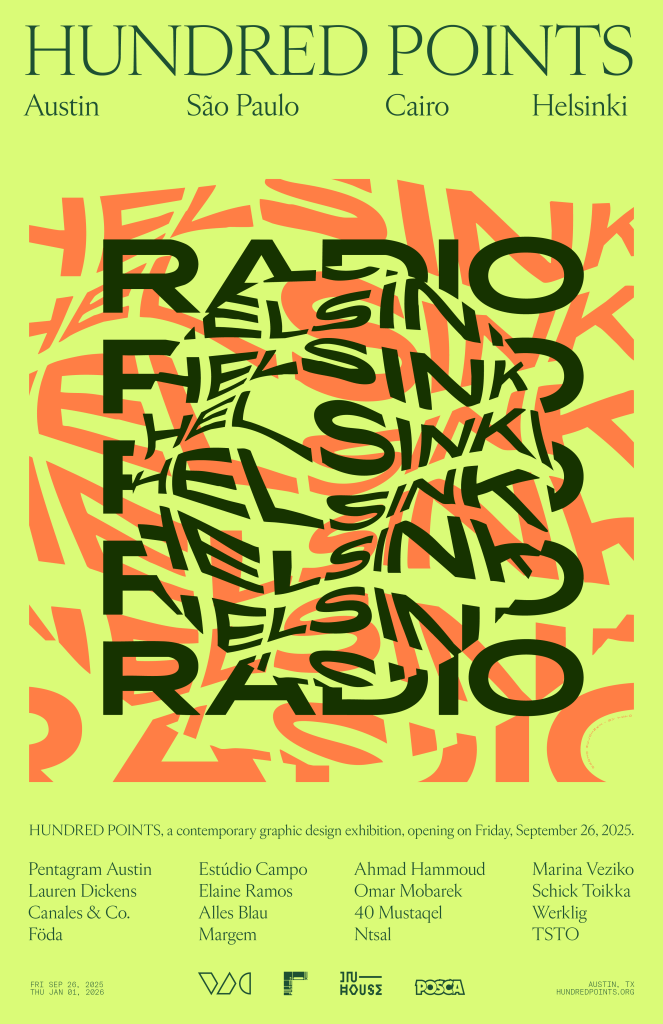
The show features 46 projects from16 studios working in São Paulo, Cairo, Helsinki, and Austin. The bulk of the projects are set within a 2′ x 2′ frame, giving the exhibition order and constraints that let the work—from packaging to motion to wayfinding to editorial—shine through. It is intentionally interactive— gallery walls are lined with posters and printed works you can touch, there are listening stations you can walk into, and even the furniture adds a further layer of texture.
Hundred Points’ curator, Lope Gutierrez-Ruiz, partner at InHouse International in Austin, was kind enough to give me a private tour. His genuine excitement about putting on a show of this kind in Austin was infectious.
I was curious about the exhibition’s name. “Researching and selecting the studios featured in the show meant breaking away from just making lists, and instead developing network/relationship maps between the actors within each city,” Gutierrez-Ruiz said. “I wanted to have a better understanding of the field, beyond just the design studios themselves: academic institutions, exhibition spaces, local press, local manufacturers, even historic events and neighborhoods like Vila Buarque in São Paulo or Kallio in Helsinki. I found nodes surrounded by dozens of network points, which eventually grew to be a hundred (plus) points.”
Finding the right mix of studios and projects meant that Gutierrez-Ruiz couldn’t rely solely on resources like Behance or design awards, as those can have a Western bias. His solution was to create a fake Instagram account to analyze connections and peer appreciation beyond the usual sources. Lucky for Gutierrez-Ruiz, before he was a designer, he was a journalist with a background in social sciences.
The name has a second meaning — each project is boundary-pushing work, “with bold decisions that manifest in all kinds of details,” he said. “This is exactly the kind of work that I want to do, that I hope to see from my peers in the creative world. The exhibition is a collection of remarkable projects, each one of them earning a perfect score in my book, a hundred points.”
The Blurring of Art & Design in Helsinki
Gutierrez-Ruiz traveled all over the Nordics and fell in love with Finland. “There is a combination of Nordic aesthetics anchored in craft and brands like Marimekko or Artek that are really part of the day-to-day design outlook,” he said. “I’m always surprised to see the stuff they can get away with.”
One of the projects he highlights is by Helsinki studio Werklig for the Sitco Corporate Pizza Company. The name is a bit of a joke, to begin with, and the studio’s choice of black pizza boxes and Ikebana-style photography (seen above right, with dough playfully draped over still-life objects). “The way Werklig built the branding in different layers, like the typography shapes, is so beautiful,” Gutierrez-Ruiz said, continuing, “It’s such a different approach— the studio admits that the entire brand is a performance against the cliches of artisanal pizza places.”
Another project that illustrates the Finnish design sensibility comes from the typography studio Schick Toikka. The visitor can experience their typeface, Edict, in three ways: one, as a marble carving; the second, an object study of shapes (the typeface is applied to a shower curtain you can touch, move, and look at in reverse inside the display). The third is a nod to a traditional Finnish craft. The team worked with a local glassblowing studio to recreate Edict’s question mark as a sculpture.
The typeface also graces the exhibition branding.
The Helsinki vignette is completed with motion work by TSTO and a brand tableau by Marina Veziko.
A Nod to Handmade & Americana in Austin
The Austin section, with work by FÖDA, Pentagram Austin, Lauren Dickens, and Canales & Co., is set off by a vintage Jeep Wagoneer door restored by Wagonmaster (brand by Lauren Dickens).
“[The Wagonmaster brand] is a great example of what comes to mind when we think Austin design: chain stitch patches, vintage-looking or hand-lettered-style typography, and modern elements with an element of handmade,” Gutierrez-Ruiz said. “Whether it’s handmade or not, who knows, but it looks that way.”
Hospitality and packaging thread throughout Austin’s unique design ecosystem. Many Austin design studios work across graphic and interior design. Lauren Dickens’ brand for The Glen Rio Smoke Shop on Route 66 (a sign is pictured below) is a perfect example of this aesthetic, as is Canales & Co.’s packaging work for MerryGo Spirits. As do the series of posters for Austin PechaKucha storytelling events, designed by Pentagram Austin’s DJ Stout, that line the back wall. FÖDA, a studio known for defining the aesthetics of beloved restaurants and hotels in Austin and beyond, created an original piece for the exhibition (pictured below, second).
Gutierrez-Ruiz, who is originally from Venezuela but has made Austin his home for the last15 years, is also a practitioner in the local design culture. “We should be very proud of the work that we’re doing,” he explains. “When we see our work in the context of global design, there’s an element of handmade that I feel is missing in other cities. That makes Austin design interesting, in my humble opinion.”
A Center for Editorial & Cultural Design in São Paolo
São Paolo is more than the center of the Portuguese-speaking world; the city has made a name for itself in cultural branding. An iconic example of this work is Estúdio Campo’s branding and wayfinding work for the 2024 Venice Biennale.
“What is fascinating about this project is that it has so many touchpoints, like adverts, wraps on the vaporettos [water taxis], wayfinding, signage, motion graphics, print,” Gutierrez-Ruiz explained. “Campo had this incredible attention to detail. They couldn’t control the quality of everything because it would be produced by a million manufacturers, so they created a system of gradients to allow for a more open palette.”
A book designed by Elaine Ramos served as Gutierrez-Ruiz’s inspiration for the entire show concept: Linha do Tempo do Design Gráfico do Brasil (or, A Timeline of Brazilian Graphic Design), on which Ramos collaborated with editor Chico Homem de Melo. And incredible things are happening in editorial design in São Paolo, as exemplified by Ramos, who co-founded publishing house Ubu in 2016. The exhibition featured several examples of books as tactile, interactive design objects. One Kafka title, about an increasingly paranoid protagonist, is printed with faint ink on sheer pages that form a pocket in which the reader inserts a piece of paper, revealing the words line by line—an experience of paranoia.
“Ramos’s work shows us that book projects don’t stop with the cover. Even with seemingly endless pages of text, there are opportunities for designers to create something beautiful,” says Gutierrez-Ruiz.
Alice Blau‘s wayfinding for the Brazilian Theatre Institute uses design to solve for a very particular setting limitation: a building made of gray concrete. A sample of the signage on a gray concrete square, designed to mimic its real-life location, showcases Blau’s use of shifting color to guide people’s movement around the space. The final São Paolo studio is Margem, another studio doing some fascinating editorial work.
Bridging the Past & A Decolonized Future in Cairo
Cairo is unique in that it has a relatively young graphic design culture, born of a history spanning millennia. The young designers Gutierrez-Ruiz met during his research discussed the idea of decolonization. What does that mean to them? “Arab design for Arab people,” he explains.
The tradition of calligraphy carries through the work coming out of Cairo, but its modern expression moves far beyond the illuminated manuscripts of the past. In many of the projects featured, calligraphy intersects with diverse youth culture and cinema. Work for Panorama of the European Film, an annual film festival, by Ahmad Hammoud, 40 Mustaqel‘s posters and branding work for Arab Cinema Week and Cinema Akil exemplify this aesthetic.
“You will see the calligraphy that is very traditional, almost like a religious text, but the fact that they’re using it for a music festival. It’s basically like an ACL, particularly connected to hip-hop,” said Gutierrez of 40 Mustaqel’s work for Sole DXB. “They turned some of the calligraphy into a shape that resembles a gold chain. There are so many layers to the work they are doing.”
Omar Mobarek created an interactive listening station that elevated the music compilation through a digital experience, including 3d scans of the artists’ faces, custom word marks for each artist, and calligraphic marks for each song. All of it, Mobarek mirrored to mimic reading Arabic right to left. “That level of detail is one of the hallmarks I’m seeing out of Cairo design,” Gutierrez-Ruiz said.
The exhibition also includes a book room in which visitors are encouraged to read, touch, and even contribute a design book from their own library. And it ends on an interactive note. Guiterrez-Ruiz sat down with designers from each studio to get their answers to 100 questions. The visitor can pick from a menu of questions, such as “How much time do you spend on design versus the running of your business?” “Where do you find inspiration?” and the question featured in the video below, “How do you balance research vs. intuition?” The exhibition cohort shares 1600 answers filled with expertise, humor, and global perspectives for seasoned and emerging designers alike.
Gutierrez-Ruiz says the exhibition couldn’t have come to life without Max Fields, the director of the Visual Arts Center, who was an incredible supporter of the project all along. The VAC and the city of Austin might have been the perfect inaugural host, but Gutierrez-Ruiz would like to see the exhibition travel. And, I agree. The exhibition is beautifully curated and thought-provoking, offering visitors a global view of visual communication through the lens of four energetic, electric design hubs.
Hundred Points is on view at UT’s Visual Arts Center until January 1, 2026.
All photography by Alex Boeschenstein.
The post Global, Boundary-Pushing Graphic Design Comes Together in ATX Exhibition appeared first on PRINT Magazine.